I have been thinking for a long time that maybe I should have a Twitter account to accompany this blog. But I always decided against it.
You all know that I write long, detailed posts that try to explain what really is going on behind the scenes. Which is absolutely necessary. You cannot explain complex international events and developments with thousands of years of history behind it in a soundbite of 7-10 seconds.
That’s the MSM/Old media/politician way. And they very carefully “chose” what they want to report or not.
But I now think it is time to try out Twitter as “soundbite” complement to this blog.
The lead words: Truth, Freedom, Justice, Responsibility and Accountability
As the blog, it is going to be a frank, open and interesting forum. Concentrating on the important “Stuff” that the MSM/Old media “chose” to ignore.
It’s not going to be an instant news type, More highlighting important news that MSM media don’t think you should care about,
So to sum it all up, here is the recent 12 months (year to date, January- December) US temperature from a “historic” perspective. To see how the decade trends have evolved during the last 113 years.
Especially to see how the decade trends have evolved during the last 43 years. The period that according to the Global Warming Hysterics and computer models they worship should show a steady and accelerated increase in temperature.
I don’t know about you, but I consider a 12 month, a year by year consecutive trend 113 years long to be a “quit good” indicator.
And as I always point out:
Remember, these are the official figures. With the poor placement of stations (91 % of the stations are CRN 3 to 5 = bad to very poor); where they have purposely taken away the urban heat island effect, use huge smoothing radius, the historical “adjustment and tweaking”tocool the past etc.
Not to mention the great slaughter of GHCN stations 1990-1993 – roughly 63 % of all stations were “dropped”. Oddly enough many of them in cold places – Hmmm? Now the number of GHCN stations is back at the same numbers as in 1890.
Also remember that the US stations are now nearly a third of the all GHCN world stations.
So here are the trends:
US temperature recent 12 months (Jan- Dec) 1900-2013
The trend for 1900 to 2013 is 0.12 F / Decade
(OBS! Notice how distorted the trend line of this official graph is. It looks gigantic because they on purpose chose different scale for the different axis. But in reality it is only 0,12 F/Decade)
US temperature recent 12 months (Jan- Dec) 1970-2013
The trend for 1970 to 2013 is 0.48 F / Decade
US temperature recent 12 months (Jan- Dec) 1980-2013
The trend for 1980 to 2013 is 0.42 F / Decade
US temperature recent 12 months (Jan- Dec) 1990-2013
The trend for 1990 to 2013 is 0.33 F / Decade
US temperature recent 12 months (Jan- Dec) 2000-2013
The trend for 2000 to 2013 is – 0.08F / Decade
Do you notice the “accelerated warming” trend from 1970-2013 to 2000-2013??
And as I said in the beginning – always remember that these figures are based on the official data that has been tweaked, “adjusted” and manipulated to fit their agenda (cool the past, ignore UHI and land use change factors, huge smoothing radius – 1200km etc.)..
So the “warming trend” 2000-2013 for January – December is exactly – 0.08F degrees a decade. That is – 0.8 F COOLER in 100 years. That’s what I call “warming”!
You REALLY, REALLY can see the accelerating trend can you not?
Take cover – The sweat is really breaking out.
And this is also the decade that the Global Warming Hysterics have been screaming at the top of their lungs, trying to scare us to death, about the catastrophic treat that the “extreme increase” in temperature is to mankind and earth.
This is a perfect example of what I have been saying all along, it has always been a political agenda – anti human, anti freedom, anti development and anti capitalism. And this Global Warming Hysteria is part of that agenda. It has nothing to do with science, facts or saving the environment or the Earth.
All of this, as always, paid by us, the common people, in the form of taxes, high energy costs and reducing our living standard back to the Stone Age.
And all of this to “save” the Earth from a “catastrophic warming” when it is actually cooling.
And the most absurd thing is that all the things that the “intelligent” politicians and the so called “scientists”, with the willing help of mainstream media, have forced through at EXTREME cost to us, are actually helping to accelerate the cooling.
Talking about an eminent treat to humankind!
According to the computer models that the Global Warming Hysterics love so much, worship and blindly follows (especially our intelligent politicians), it should be EXACTLY the opposite.
And we are supposed to be very worried about a predicted rise of 3-4 F?
But not this ACTUAL trend?
And for this predicted trend the politicians want to take our societies back to the Stone Age. But, as usual, they DO NOTHING about the actual trend.
So to summarize this evidence of this “accelerated warming” trend:
The recent 12 months trend 1970-2013 is exactly 0.48 F degrees a decade.
The recent 12 months trend 1980-2013 is exactly 0.42 F degrees a decade.
The recent 12 months trend 1990-2013 is exactly0.33 F degrees a decade.
The recent 12 months trend 2000-2013 is exactly – 0.08F degrees a decade.
So the “warming” trend is really accelerating wouldn’t you say.
Some more “rapid warming” like this and the freezer looks really warm.
Another brilliant and glorious example of RAPID WARMING and an eminent treat to humankind! Especially during the last 43 years.
That is truly “Global Warming” US style.
An interesting ”science” wouldn’t you say.
This is the “stuff” that “Global Warming” is made of.
As I said, all inspired by the shenanigans going on in Warsaw. Dedicated with “special love” to the traveling UN Circus now performing in Warsaw (COP 19 and CMP 9).
“The most costly, disastrous and hypocritical Political Show on EarthPaid by us the common people”
So here are the recent 10 months (year to date, January- October) US temperature from a “historic” perspective. To see how the decade trends have evolved during the last 113 years.
Especially to see how the decade trends have evolved during the last 43 years. The period that according to the Global Warming Hysterics and computer models they worship should show a steady and accelerated increase in temperature.
I don’t know about you, but I consider a 10 month, a year by year consecutive trend 113 years long to be a “quit good” indicator.
And as I always point out:
Remember, these are the official figures. With the poor placement of stations (91 % of the stations are CRN 3 to 5 = bad to very poor); where they have purposely taken away the urban heat island effect, use huge smoothing radius, the historical “adjustment and tweaking”tocool the past etc.
Not to mention the great slaughter of GHCN stations 1990-1993 – roughly 63 % of all stations were “dropped”. Oddly enough many of them in cold places – Hmmm? Now the number of GHCN stations is back at the same numbers as in 1890.
Also remember that the US stations are now nearly a third of the all GHCN world stations.
So here are the trends:
US temperature recent 10 months (Jan- Oct) 1900-2013
The trend for 1900 to 2013 is 0.13 F / Decade
US temperature recent 10 months (Jan- Oct) 1970-2013
The trend for 1970 to 2013 is 0.49 F / Decade
US temperature recent 10 months (Jan- Oct) 1980-2013
The trend for 1980 to 2013 is 0.42 F / Decade
US temperature recent 10 months (Jan- Oct) 1990-2013
The trend for 1990 to 2013 is 0.31 F / Decade
US temperature recent 10 months (Jan- Oct) 2000-2013
The trend for 2000 to 2013 is – 0.11F / Decade
Do you notice the “accelerated warming” trend from 1970-2013 to 2000-2013??
And as I said in the beginning – always remember that these figures are based on the official data that has been tweaked, “adjusted” and manipulated to fit their agenda (cool the past, ignore UHI and land use change factors, huge smoothing radius – 1200km etc.)..
So the “warming trend” 2000-2013 for January – October is exactly – 0.11F degrees a decade. That is – 1.1 F COOLER in 100 years. That’s what I call “warming”!
And to REALLY show you this “accelerated warming” trend lets recapitulate my previous post for nine months and their trend /decade:
US temperature recent 9 months (Jan- Sep) 1970-2013
The trend for 1970 to 2013 is 0.52 F / Decade
US temperature recent 9 months (Jan- Sep) 1980-2013
The trend for 1980 to 2013 is 0.43 F / Decade
US temperature recent 9 months (Jan- Sep) 1990-2013
The trend for 1990 to 2013 is 0.34 F / Decade
US temperature recent 9 months (Jan- Sep) 2000-2013
The trend for 2000 to 2013 is – 0.07F / Decade
You REALLY, REALLY can see the accelerating trend one month later can you not?
Take cover – The sweat is really breaking out.
And this is also the decade that the Global Warming Hysterics have been screaming at the top of their lungs, trying to scare us to death, about the catastrophic treat that the “extreme increase” in temperature is to mankind and earth.
This is a perfect example of what I have been saying all along, it has always been a political agenda – anti human, anti freedom, anti development and anti capitalism. And this Global Warming Hysteria is part of that agenda. It has nothing to do with science, facts or saving the environment or the Earth.
All of this, as always, paid by us, the common people, in the form of taxes, high energy costs and reducing our living standard back to the Stone Age.
And all of this to “save” the Earth from a “catastrophic warming” when it is actually cooling.
And the most absurd thing is that all the things that the “intelligent” politicians and the so called “scientists”, with the willing help of mainstream media, have forced through at EXTREME cost to us, are actually helping to accelerate the cooling.
Talking about an eminent treat to humankind!
According to the computer models that the Global Warming Hysterics love so much, worship and blindly follows (especially our intelligent politicians), it should be EXACTLY the opposite.
And we are supposed to be very worried about a predicted rise of 3-4 F?
But not this ACTUAL trend?
And for this predicted trend the politicians want to take our societies back to the Stone Age. But, as usual, they DO NOTHING about the actual trend.
So to summarize this evidence of this “accelerated warming” trend:
The recent 10 months trend 1970-2013 is exactly 0.49 F degrees a decade.
The recent 10 months trend 1980-2013 is exactly 0.42 F degrees a decade.
The recent 10 months trend 1990-2013 is exactly0.31 F degrees a decade.
The recent 10 months trend 2000-2013 is exactly – 0.11F degrees a decade.
So the “warming” trend is really accelerating wouldn’t you say.
Some more “rapid warming” like this and the freezer looks really warm.
Another brilliant and glorious example of RAPID WARMING and an eminent treat to humankind! Especially during the last 43 years.
That is truly “Global Warming” US style.
An interesting ”science” wouldn’t you say.
This is the “stuff” that “Global Warming” is made of.
——————————————————————————
So to sum up these two last posts I am going to do an executive summary dedicated to our “intelligent” politicians, especially those now performing in Warsaw. And I am going to make a bold presumption here, namely that they know how to count, and even know the difference between + and – . You never know, there may be someone out there.
Executive Summary:
If we compare this year’s 9 month trend with last year’s 9 month trend it is COOLER this year.
And if we compare this year’s 9 month trend with this year’s 10 month trend it is COOLER.
OK?
Can you now do the math and maybe draw at least some conclusions? Or is this too hard?
And the cooling continues. Sorry – I mean that Global Warming is really an imminent threat to humankind. Especially in Warsaw.
I was not planning to do another update of the US temperature from a “historic” perspective. But I was so inspired by the shenanigans going on in Warsaw that I felt I had to.
So here it comes, first the 9 month trend and in a later post the 10 month trend. Dedicated with “special love” to the traveling UN Circus now performing in Warsaw (COP 19 and CMP 9).
An old advertisement for the Barnum & Bailey Circus in 1900 said: “The greatest Show on Earth”. I think a more apt one for the present one going on would be “The most costly, disastrous and hypocritical Political Show on EarthPaid by us the common people”
They were supposed to finish today but, as usual they have prolonged the proceedings. They have in negotiation speak “stopped the clock”.
I thought it would be interesting to look at the recent 9 months (year to date, January- September) US temperature from a “historic” perspective. To see how the decade trends have evolved during the last 113 years.
Especially to see how the decade trends have evolved during the last 43 years. The period that according to the Global Warming Hysterics and computer models they worship should show a steady and accelerated increase in temperature.
I don’t know about you, but I consider a 9 month, a year by year consecutive trend 113 years long to be a “quit good” indicator.
And as I always point out:
Remember, these are the official figures. With the poor placement of stations (91 % of the stations are CRN 3 to 5 = bad to very poor); where they have purposely taken away the urban heat island effect, use huge smoothing radius, the historical “adjustment and tweaking”tocool the past etc.
Not to mention the great slaughter of GHCN stations 1990-1993 – roughly 63 % of all stations were “dropped”. Oddly enough many of them in cold places – Hmmm? Now the number of GHCN stations is back at the same numbers as in 1890.
Also remember that the US stations are now nearly a third of the all GHCN world stations.
So here are the trends:
US temperature recent 9 months (Jan- Sep) 1900-2013
The trend for 1900 to 2013 is 0.13 F / Decade
US temperature recent 9 months (Jan- Sep) 1970-2013
The trend for 1970 to 2013 is 0.52 F / Decade
US temperature recent 9 months (Jan- Sep) 1980-2013
The trend for 1980 to 2013 is 0.43 F / Decade
US temperature recent 9 months (Jan- Sep) 1990-2013
The trend for 1990 to 2013 is 0.34 F / Decade
US temperature recent 9 months (Jan- Sep) 2000-2013
The trend for 2000 to 2013 is – 0.07F / Decade
Do you notice the “accelerated warming” trend from 1970-2013 to 2000-2013??
And as I said in the beginning – always remember that these figures are based on the official data that has been tweaked, “adjusted” and manipulated to fit their agenda (cool the past, ignore UHI and land use change factors, huge smoothing radius – 1200km etc.)..
So the “warming trend” 2000-2013 for Jan- September is exactly – 0.07F degrees a decade. That is – 0.7 F COOLER in 100 years. That’s what I call “warming”!
US temperature recent 9 months (Jan- Sep) 1970-2012
The trend for 1970 to 2012 is 0.54 F / Decade
US temperature recent 9 months (Jan- Sep) 1980-2012
The trend for 1980 to 2012 is 0.46 F / Decade
US temperature recent 9 months (Jan- Sep) 1990-2012
The trend for 1990 to 2012 is 0.42 F / Decade
US temperature recent 9 months (Jan- Sep) 2000-2012
The trend for 2000 to 2012 is 0.15 F / Decade
You REALLY, REALLY can see the accelerating trend one year later can you not?
Take cover – The sweat is really breaking out.
And this is also the decade that the Global Warming Hysterics have been screaming at the top of their lungs, trying to scare us to death, about the catastrophic treat that the “extreme increase” in temperature is to mankind and earth.
This is a perfect example of what I have been saying all along, it has always been a political agenda – anti human, anti freedom, anti development and anti capitalism. And this Global Warming Hysteria is part of that agenda. It has nothing to do with science, facts or saving the environment or the Earth.
All of this, as always, paid by us, the common people, in the form of taxes, high energy costs and reducing our living standard back to the Stone Age.
And all of this to “save” the Earth from a “catastrophic warming” when it is actually cooling.
And the most absurd thing is that all the things that the “intelligent” politicians and the so called “scientists”, with the willing help of mainstream media, have forced through at EXTREME cost to us, are actually helping to accelerate the cooling.
Talking about an eminent treat to humankind!
According to the computer models that the Global Warming Hysterics love so much, worship and blindly follows (especially our intelligent politicians), it should be EXACTLY the opposite.
And we are supposed to be very worried about a predicted rise of 3-4 F?
But not this ACTUAL trend?
And for this predicted trend the politicians want to take our societies back to the Stone Age. But, as usual, they DO NOTHING about the actual trend.
So to summarize this evidence of this “accelerated warming” trend:
The recent 9 months trend 1970-2013 is exactly 0.52 F degrees a decade.
The recent 9 months trend 1980-2013 is exactly 0.43 F degrees a decade.
The recent 9 months trend 1990-2013 is exactly0.34 F degrees a decade.
The recent 9 months trend 2000-2013 is exactly – 0.07F degrees a decade.
So the “warming” trend is really accelerating wouldn’t you say.
Some more “rapid warming” like this and the freezer looks really warm.
Another brilliant and glorious example of RAPID WARMING and an eminent treat to humankind! Especially during the last 43 years.
That is truly “Global Warming” US style.
An interesting ”science” wouldn’t you say.
This is the “stuff” that “Global Warming” is made of.
And the cooling continues. Sorry – I mean that Global Warming is really an imminent threat to humankind.
Very late again, the official May temperature figures are out.
As a complement to my previous post Recent 4 Months U.S. Temperature trend/decade: – 5.4 F COOLER in 100 years, I thought it also would be interesting to look at the recent 5 months (year to date, January- May) US temperature from a “historic” perspective. To see how the decade trends have evolved during the last 113 years.
Especially to see how the decade trends have evolved during the last 43 years. The period that according to the Global Warming Hysterics and computer models they worship should show a steady and accelerated increase in temperature.
I don’t know about you, but I consider a 5 month, a year by year consecutive trend 113 years long to be a “quit good” indicator.
And as I always point out:
Remember, these are the official figures. With the poor placement of stations (91 % of the stations are CRN 3 to 5 = bad to very poor); where they have purposely taken away the urban heat island effect, use huge smoothing radius, the historical “adjustment and tweaking”tocool the past etc.
Not to mention the great slaughter of GHCN stations 1990-1993 – roughly 63 % of all stations were “dropped”. Oddly enough many of them in cold places – Hmmm? Now the number of GHCN stations is back at the same numbers as in 1890.
Also remember that the US stations are now nearly a third of the all GHCN world stations.
So here are the trends:
US temperature recent 5 months (Jan- May) 1900-2013
The trend for 1900 to 2013 is 0.16 F / Decade
US temperature recent 5 months (Jan- May) 1970-2013
The trend for 1970 to 2013 is 0.57 F / Decade
US temperature recent 5 months (Jan- May) 1980-2013
The trend for 1980 to 2013 is 0.36 F / Decade
US temperature recent 5 months (Jan- May) 1990-2013
The trend for 1990 to 2013 is 0.00 F / Decade
US temperature recent 5 months (Jan- May) 2000-2013
The trend for 2000 to 2013 is – 0.57 F / Decade
Do you notice the “accelerated warming” trend from 1970-2013 to 2000-2013??
And as I said in the beginning – always remember that these figures are based on the official data that has been tweaked, “adjusted” and manipulated to fit their agenda (cool the past, ignore UHI and land use change factors, huge smoothing radius – 1200km etc.)..
So the “warming trend” 2000-2013 for Jan- May is exactly – 0.57F degrees a decade. That is – 5.7 F COOLER in 100 years. That’s what I call “warming”!
And to REALLY show you this “accelerated warming” trend lets recapitulate the last three, four and five months and their trend /decade (see my previous posts):
US temperature recent 3 months (Jan- Mar) 2000-2013
The trend for 2000 to 2013 is – 0.41F / Decade
US temperature recent 4 months (Jan- Apr) 2000-2013
The trend for 2000 to 2013 is – 0.54F / Decade
US temperature recent 5 months (Jan- May) 2000-2013
The trend for 2000 to 2013 is – 0.57F / Decade
You REALLY, REALLY can see the accelerating trend can you not?
Take cover – The sweat is really breaking out.
And this is also the decade that the Global Warming Hysterics have been screaming at the top of their lungs, trying to scare us to death, about the catastrophic treat that the “extreme increase” in temperature is to mankind and earth.
This is a perfect example of what I have been saying all along, it has always been a political agenda – anti human, anti freedom, anti development and anti capitalism. And this Global Warming Hysteria is part of that agenda. It has nothing to do with science, facts or saving the environment or the Earth.
All of this, as always, paid by us, the common people, in the form of taxes, high energy costs and reducing our living standard back to the Stone Age.
And all of this to “save” the Earth from a “catastrophic warming” when it is actually cooling.
And the most absurd thing is that all the things that the “intelligent” politicians and the so called “scientists”, with the willing help of mainstream media, have forced through at EXTREME cost to us, are actually helping to accelerate the cooling.
Talking about an eminent treat to humankind!
According to the computer models that the Global Warming Hysterics love so much, worship and blindly follows (especially our intelligent politicians), it should be EXACTLY the opposite.
And we are supposed to be very worried about a predicted rise of 3-4 F?
But not this ACTUAL trend?
And for this predicted trend the politicians want to take our societies back to the Stone Age. But, as usual, they DO NOTHING about the actual trend.
So to summarize this evidence of this “accelerated warming” trend:
The recent 5 months trend 1970-2013 is exactly 0.57 F degrees a decade.
The recent 5 months trend 1980-2013 is exactly 0.36 F degrees a decade.
The recent 5 months trend 1990-2013 is exactly0.00 F degrees a decade.
The recent 5 months trend 2000-2013 is exactly – 0.57F degrees a decade.
So the “warming” trend is really accelerating wouldn’t you say.
Some more “rapid warming” like this and the freezer looks really warm.
Another brilliant and glorious example of RAPID WARMING and an eminent treat to humankind! Especially during the last 43 years.
That is truly “Global Warming” US style.
An interesting ”science” wouldn’t you say.
This is the “stuff” that “Global Warming” is made of.
Here we are in the end of spring and beginning of summer and it is getting cooler and cooler. Sorry – I mean that Global Warming is really an imminent threat to humankind.
Very late, the official May temperature figures are out.so I thought I dive into it.
As usual I thought it would be interesting to look at the recent May US temperature from a “historic” perspective. To see how the decade trends have evolved during the last 113 years
Especially to see how the decade trends have evolved during the last 43 years. The period that according to the Global Warming Hysterics and computer models they worship should show a steady and accelerated increase in temperature.
And as I always point out:
Remember, these are the official figures. With the poor placement of stations (91 % of the stations are CRN 3 to 5 = bad to very poor); where they have purposely taken away the urban heat island effect, use huge smoothing radius, the historical “adjustment and tweaking”tocool the past etc.
Not to mention the great slaughter of GHCN stations 1990-1993 – roughly 63 % of all stations were “dropped”. Oddly enough many of them in cold places – Hmmm? Now the number of GHCN stations is back at the same numbers as in 1890.
Also remember that the US stations are now nearly a third of the all GHCN world stations.
So here are the trends:
US temperature May 1900-2013
The trend for 1900 to 2013 is 0.13 F / Decade
US temperature May 1970-2013
The trend for 1970 to 2013 is 0.35 F / Decade
US temperature May 1980-2013
The trend for 1980 to 2013 is 0.29 F / Decade
US temperature May 1990-2013
The trend for 1990 to 2013 is 0.26F / Decade
US temperature May 2000-2013
The trend for 2000 to 2013 is – 0.68F / Decade
You REALLY, REALLY can see the accelerating trend can you not?
And as I said in the beginning – always remember that these figures are based on the official data that has been tweaked, “adjusted” and manipulated to fit their agenda (cool the past, ignore UHI and land use change factors, huge smoothing radius – 1200km etc.)..
So the “warming trend” 2000-2013 for May is exactly –0.68 F degrees a decade. That is a – 6.8F COOLER in 100 years. That’s what I call “warming”!
You REALLY, REALLY can see the accelerating trend can you not?
Take cover – The sweat is really breaking out.
According to the computer models that the Global Warming Hysterics love so much, worship and blindly follows (especially our intelligent politicians), it should be EXACTLY the opposite.
And we are supposed to be very worried about a predicted rise of 3-4 F?
But not this ACTUAL trend?
And for this predicted trend the politicians want to take our societies back to the Stone Age. But, as usual, they DO NOTHING about the actual trend.
Even worse, “our” politicians, “scientists”, “journalists” and the mainstream medias attitude is: Move on, NOTHING to see here.
As I have been saying all along, it has always been a political agenda – anti human, anti freedom, anti development and anti capitalism. And this Global Warming Hysteria is part of that agenda. It has nothing to do with science, facts or saving the environment or the Earth.
All of this, as always, paid by us, the common people, in the form of taxes, high energy costs and reducing our living standard back to the Stone Age.
So to summarize this evidence of May ”accelerated warming” trend:
The May trend 1970-2013 is exactly 0.35 F degrees a decade.
The May trend 1980-2013 is exactly 0.29 F degrees a decade.
The May trend 1990-2013 is exactly 0.26F degrees a decade.
The May trend 2000-2013 is exactly –0.68 F degrees a decade.
Another brilliant and glorious example of RAPID WARMING and an eminent treat to humankind! Especially during the last 43 years.
That is truly “Global Warming” US style.
An interesting ”science” wouldn’t you say.
This is the “stuff” that “Global Warming” is made of.
And the cooling continues. Sorry – I mean that Global Warming is an imminent treat to humankind.
Very late again, the official April temperature figures are out. Last year the temperature anomaly was 3.66 F and this year it is – 1.35F.
As a complement to my previous post Recent 3 Months U.S. Temperature trend/decade: – 4.1 F COOLER in 100 years, I thought it also would be interesting to look at the recent 4 months (year to date, January- April) US temperature from a “historic” perspective. To see how the decade trends have evolved during the last 113 years.
Especially to see how the decade trends have evolved during the last 43 years. The period that according to the Global Warming Hysterics and computer models they worship should show a steady and accelerated increase in temperature.
I don’t know about you, but I consider a 4 month, a year by year consecutive trend 113 years long to be a “quit good” indicator.
And as I always point out:
Remember, these are the official figures. With the poor placement of stations (91 % of the stations are CRN 3 to 5 = bad to very poor); where they have purposely taken away the urban heat island effect, use huge smoothing radius, the historical “adjustment and tweaking”tocool the past etc.
Not to mention the great slaughter of GHCN stations 1990-1993 – roughly 63 % of all stations were “dropped”. Oddly enough many of them in cold places – Hmmm? Now the number of GHCN stations is back at the same numbers as in 1890.
Also remember that the US stations are now nearly a third of the all GHCN world stations.
So here are the trends:
US temperature recent 4 months (Jan- Apr) 1900-2013
The trend for 1900 to 2013 is 0.17 F / Decade
US temperature recent 4 months (Jan- Apr) 1970-2013
The trend for 1970 to 2013 is 0.63 F / Decade
US temperature recent 4 months (Jan- Apr) 1980-2013
The trend for 1980 to 2013 is 0.38 F / Decade
US temperature recent 4 months (Jan- Apr) 1990-2013
The trend for 1990 to 2013 is – 0.07F / Decade
US temperature recent 4 months (Jan- Apr) 2000-2013
The trend for 2000 to 2013 is – 0.54F / Decade
Do you notice the “accelerated warming” trend from 1970-2013 to 2000-2013??
And as I said in the beginning – always remember that these figures are based on the official data that has been tweaked, “adjusted” and manipulated to fit their agenda (cool the past, ignore UHI and land use change factors, huge smoothing radius – 1200km etc.)..
So the “warming trend” 2000-2013 for Jan- Apr is exactly – 0.54F degrees a decade. That is – 5.4 F COOLER in 100 years. That’s what I call “warming”!
And to REALLY show you this “accelerated warming” trend lets recapitulate the 3 month January-March trend /decade (see my previous post):
US temperature recent 3 months (Jan- Mar) 2000-2013
The trend for 2000 to 2013 is – 0.41F / Decade
You REALLY, REALLY can see the accelerating trend can you not?
Take cover – The sweat is really breaking out.
And this is also the decade that the Global Warming Hysterics have been screaming at the top of their lungs, trying to scare us to death, about the catastrophic treat that the “extreme increase” in temperature is to mankind and earth.
This is a perfect example of what I have been saying all along, it has always been a political agenda – anti human, anti freedom, anti development and anti capitalism. And this Global Warming Hysteria is part of that agenda. It has nothing to do with science, facts or saving the environment or the Earth.
All of this, as always, paid by us, the common people, in the form of taxes, high energy costs and reducing our living standard back to the Stone Age.
And all of this to “save” the Earth from a “catastrophic warming” when it is actually cooling.
And the most absurd thing is that all the things that the “intelligent” politicians and the so called “scientists”, with the willing help of mainstream media, have forced through at EXTREME cost to us, are actually helping to accelerate the cooling.
Talking about an eminent treat to humankind!
According to the computer models that the Global Warming Hysterics love so much, worship and blindly follows (especially our intelligent politicians), it should be EXACTLY the opposite.
And we are supposed to be very worried about a predicted rise of 3-4 F?
But not this ACTUAL trend?
And for this predicted trend the politicians want to take our societies back to the Stone Age. But, as usual, they DO NOTHING about the actual trend.
So to summarize this evidence of this “accelerated warming” trend:
The recent 4 months trend 1970-2013 is exactly 0.63 F degrees a decade.
The recent 4 months trend 1980-2013 is exactly 0.38 F degrees a decade.
The recent 4 months trend 1990-2013 is exactly– 0.07F degrees a decade.
The recent 4 months trend 2000-2013 is exactly – 0.54F degrees a decade.
So the “warming” trend is really accelerating wouldn’t you say.
Some more “rapid warming” like this and the freezer looks really warm.
Another brilliant and glorious example of RAPID WARMING and an eminent treat to humankind! Especially during the last 43 years.
That is truly “Global Warming” US style.
An interesting ”science” wouldn’t you say.
This is the “stuff” that “Global Warming” is made of.
It is getting cooler and cooler. Sorry – I mean that Global Warming is an imminent threat to humankind.
Very late, the official April temperature figures are out.so I thought I dive into it.
As usual I thought it would be interesting to look at the recent April US temperature from a “historic” perspective. To see how the decade trends have evolved during the last 113 years
Especially to see how the decade trends have evolved during the last 43 years. The period that according to the Global Warming Hysterics and computer models they worship should show a steady and accelerated increase in temperature.
And as I always point out:
Remember, these are the official figures. With the poor placement of stations (91 % of the stations are CRN 3 to 5 = bad to very poor); where they have purposely taken away the urban heat island effect, use huge smoothing radius, the historical “adjustment and tweaking”tocool the past etc.
Not to mention the great slaughter of GHCN stations 1990-1993 – roughly 63 % of all stations were “dropped”. Oddly enough many of them in cold places – Hmmm? Now the number of GHCN stations is back at the same numbers as in 1890.
Also remember that the US stations are now nearly a third of the all GHCN world stations.
So here are the trends:
US temperature April 1900-2013
The trend for 1900 to 2013 is 0.12 F / Decade
US temperature April 1970-2013
The trend for 1970 to 2013 is 0.43 F / Decade
US temperature April 1980-2013
The trend for 1980 to 2013 is 0.22 F / Decade
US temperature April 1990-2013
The trend for 1990 to 2013 is 0.39F / Decade
US temperature April 2000-2013
The trend for 2000 to 2013 is – 0.92F / Decade
You REALLY, REALLY can see the accelerating trend can you not?
And as I said in the beginning – always remember that these figures are based on the official data that has been tweaked, “adjusted” and manipulated to fit their agenda (cool the past, ignore UHI and land use change factors, huge smoothing radius – 1200km etc.)..
So the “warming trend” 2000-2013 for April is exactly –0.92 F degrees a decade. That is a – 9.2F COOLER in 100 years. That’s what I call “warming”!
And remember that this year the January trend /decade were – 0.94 F / Decade for 2000 to 2013 (see my previous post). And that’s in the middle of the winter.
And here we are in the middle of “spring” and the trend is – 0.92.
You REALLY, REALLY can see the accelerating trend can you not?
Take cover – The sweat is really breaking out.
According to the computer models that the Global Warming Hysterics love so much, worship and blindly follows (especially our intelligent politicians), it should be EXACTLY the opposite.
And we are supposed to be very worried about a predicted rise of 3-4 F?
But not this ACTUAL trend?
And for this predicted trend the politicians want to take our societies back to the Stone Age. But, as usual, they DO NOTHING about the actual trend.
Even worse, “our” politicians, “scientists”, “journalists” and the mainstream medias attitude is: Move on, NOTHING to see here.
As I have been saying all along, it has always been a political agenda – anti human, anti freedom, anti development and anti capitalism. And this Global Warming Hysteria is part of that agenda. It has nothing to do with science, facts or saving the environment or the Earth.
All of this, as always, paid by us, the common people, in the form of taxes, high energy costs and reducing our living standard back to the Stone Age.
So to summarize this evidence of April ”accelerated warming” trend:
The April trend 1970-2013 is exactly 0.43 F degrees a decade.
The April trend 1980-2013 is exactly 0.22 F degrees a decade.
The April trend 1990-2013 is exactly 0.39F degrees a decade.
The April trend 2000-2013 is exactly –0.92 F degrees a decade.
Another brilliant and glorious example of RAPID WARMING and an eminent treat to humankind! Especially during the last 43 years.
That is truly “Global Warming” US style.
An interesting ”science” wouldn’t you say.
This is the “stuff” that “Global Warming” is made of.
And the cooling continues. Sorry – I mean that Global Warming is an imminent treat to humankind.
Very late, the official March temperature figures are out. Last year the temperature was 8.55 F and this year it is – 1.09F.
As a complement to my previous post Recent 2 Months U.S. Temperature trend/decade: – 11.3 F COOLER in 100 years, I thought it also would be interesting to look at the recent 3 months (year to date, January- March) US temperature from a “historic” perspective. To see how the decade trends have evolved during the last 113 years.
Especially to see how the decade trends have evolved during the last 43 years. The period that according to the Global Warming Hysterics and computer models they worship should show a steady and accelerated increase in temperature.
I don’t know about you, but I consider a 3 month, a year by year consecutive trend 113 years long to be a “quit good” indicator.
And as I always point out:
Remember, these are the official figures. With the poor placement of stations (91 % of the stations are CRN 3 to 5 = bad to very poor); where they have purposely taken away the urban heat island effect, use huge smoothing radius, the historical “adjustment and tweaking”tocool the past etc.
Not to mention the great slaughter of GHCN stations 1990-1993 – roughly 63 % of all stations were “dropped”. Oddly enough many of them in cold places – Hmmm? Now the number of GHCN stations is back at the same numbers as in 1890.
Also remember that the US stations are now nearly a third of the all GHCN world stations.
So here are the trends:
US temperature recent 3 months (Jan- Mar) 1900-2013
The trend for 1900 to 2013 is 0.19 F / Decade
US temperature recent 3 months (Jan- Mar) 1970-2013
The trend for 1970 to 2013 is 0.70 F / Decade
US temperature recent 3 months (Jan- Mar) 1980-2013
The trend for 1980 to 2013 is 0.43 F / Decade
US temperature recent 3 months (Jan- Mar) 1990-2013
The trend for 1990 to 2013 is – 0.22F / Decade
US temperature recent 3 months (Jan- Mar) 2000-2013
The trend for 2000 to 2013 is – 0.41F / Decade
Do you notice the “accelerated warming” trend from 1970-2013 to 2000-2013??
And as I said in the beginning – always remember that these figures are based on the official data that has been tweaked, “adjusted” and manipulated to fit their agenda (cool the past, ignore UHI and land use change factors, huge smoothing radius – 1200km etc.)..
So the “warming trend” 2000-2013 for Jan-Mar is exactly – 0.41F degrees a decade. That is – 4.1 F COOLER in 100 years. That’s what I call “warming”!
And this is also the decade that the Global Warming Hysterics have been screaming at the top of their lungs, trying to scare us to death, about the catastrophic treat that the “extreme increase” in temperature is to mankind and earth.
This is a perfect example of what I have been saying all along, it has always been a political agenda – anti human, anti freedom, anti development and anti capitalism. And this Global Warming Hysteria is part of that agenda. It has nothing to do with science, facts or saving the environment or the Earth.
All of this, as always, paid by us, the common people, in the form of taxes, high energy costs and reducing our living standard back to the Stone Age.
And all of this to “save” the Earth from a “catastrophic warming” when it is actually cooling.
And the most absurd thing is that all the things that the “intelligent” politicians and the so called “scientists”, with the willing help of mainstream media, have forced through at EXTREME cost to us, are actually helping to accelerate the cooling.
Talking about an eminent treat to humankind!
According to the computer models that the Global Warming Hysterics love so much, worship and blindly follows (especially our intelligent politicians), it should be EXACTLY the opposite.
And we are supposed to be very worried about a predicted rise of 3-4 F?
But not this ACTUAL trend?
And for this predicted trend the politicians want to take our societies back to the Stone Age. But, as usual, they DO NOTHING about the actual trend.
So to summarize this evidence of this “accelerated warming” trend:
The recent 3 months trend 1970-2013 is exactly 0.70 F degrees a decade.
The recent 3 months trend 1980-2013 is exactly 0.43 F degrees a decade.
The recent 3 months trend 1990-2013 is exactly– 0.22F degrees a decade.
The recent 3 months trend 2000-2013 is exactly – 0.41F degrees a decade.
So the “warming” trend is really accelerating wouldn’t you say.
Some more “rapid warming” like this and the freezer looks really warm.
Another brilliant and glorious example of RAPID WARMING and an eminent treat to humankind! Especially during the last 43 years.
That is truly “Global Warming” US style.
An interesting ”science” wouldn’t you say.
This is the “stuff” that “Global Warming” is made of.
And the cooling continues. Sorry – I mean that Global Warming is an imminent treat to humankind.
As a complement to my previous post February U.S. Temperature trend/decade: – 12.7 F COOLER in 100 years (which I by the way was suspended by WordPress for), I thought it also would be interesting to look at the recent 2 months (year to date, January- February) US temperature from a “historic” perspective. To see how the decade trends have evolved during the last 113 years.
Especially to see how the decade trends have evolved during the last 43 years. The period that according to the Global Warming Hysterics and computer models they worship should show a steady and accelerated increase in temperature.
I don’t know about you, but I consider a 2 month, a year by year consecutive trend 113 years long to be a “quit good” indicator.
And as I always point out:
Remember, these are the official figures. With the poor placement of stations (91 % of the stations are CRN 3 to 5 = bad to very poor); where they have purposely taken away the urban heat island effect, use huge smoothing radius, the historical “adjustment and tweaking”tocool the past etc.
Not to mention the great slaughter of GHCN stations 1990-1993 – roughly 63 % of all stations were “dropped”. Oddly enough many of them in cold places – Hmmm? Now the number of GHCN stations is back at the same numbers as in 1890.
Also remember that the US stations are now nearly a third of the all GHCN world stations.
So here are the trends:
US temperature recent 2 months (Jan- Feb) 1900-2013
The trend for 1900 to 2013 is 0.20 F / Decade
US temperature recent 2 months (Jan- Feb) 1970-2013
The trend for 1970 to 2013 is 0.75 F / Decade
US temperature recent 2 months (Jan- Feb) 1980-2013
The trend for 1980 to 2013 is 0.35 F / Decade
US temperature recent 2 months (Jan- Feb) 1990-2013
The trend for 1990 to 2013 is – 0.56F / Decade
US temperature recent 2 months (Jan- Feb) 2000-2013
The trend for 2000 to 2013 is – 1.13F / Decade
Do you notice the “accelerated warming” trend from 1970-2013 to 2000-2013??
And as I said in the beginning – always remember that these figures are based on the official data that has been tweaked, “adjusted” and manipulated to fit their agenda (cool the past, ignore UHI and land use change factors, huge smoothing radius – 1200km etc.)..
So the “warming trend” 2000-2013 for Jan-Feb is exactly – 1.13F degrees a decade. That is a whopping – 11.3 F COOLER in 100 years. That’s what I call “warming”!
And this is also the decade that the Global Warming Hysterics have been screaming at the top of their lungs, trying to scare us to death, about the catastrophic treat that the “extreme increase” in temperature is to mankind and earth.
This is a perfect example of what I have been saying all along, it has always been a political agenda – anti human, anti freedom, anti development and anti capitalism. And this Global Warming Hysteria is part of that agenda. It has nothing to do with science, facts or saving the environment or the Earth.
All of this, as always, paid by us, the common people, in the form of taxes, high energy costs and reducing our living standard back to the Stone Age.
And all of this to “save” the Earth from a “catastrophic warming” when it is actually cooling.
And the most absurd thing is that all the things that the “intelligent” politicians and the so called “scientists”, with the willing help of mainstream media, have forced through at EXTREME cost to us, are actually helping to accelerate the cooling.
Talking about an eminent treat to humankind!
According to the computer models that the Global Warming Hysterics love so much, worship and blindly follows (especially our intelligent politicians), it should be EXACTLY the opposite.
And we are supposed to be very worried about a predicted rise of 3-4 F?
But not this ACTUAL trend?
And for this predicted trend the politicians want to take our societies back to the Stone Age. But, as usual, they DO NOTHING about the actual trend.
So to summarize this evidence of this “accelerated warming” trend:
The recent 2 months trend 1970-2013 is exactly 0.75 F degrees a decade.
The recent 2 months trend 1980-2013 is exactly 0.35 F degrees a decade.
The recent 2 months trend 1990-2013 is exactly– 0.56 F degrees a decade.
The recent 2 months trend 2000-2013 is exactly – 1.13F degrees a decade.
So the “warming” trend is really accelerating wouldn’t you say.
Some more “rapid warming” like this and the freezer looks really warm.
Another brilliant and glorious example of RAPID WARMING and an eminent treat to humankind! Especially during the last 42 years.
That is truly “Global Warming” US style.
An interesting ”science” wouldn’t you say.
This is the “stuff” that “Global Warming” is made of.
As usual I thought it would be interesting to look at the recent February US temperature from a “historic” perspective. To see how the decade trends have evolved during the last 113 years
Especially to see how the decade trends have evolved during the last 43 years. The period that according to the Global Warming Hysterics and computer models they worship should show a steady and accelerated increase in temperature.
And as I always point out:
Remember, these are the official figures. With the poor placement of stations (91 % of the stations are CRN 3 to 5 = bad to very poor); where they have purposely taken away the urban heat island effect, use huge smoothing radius, the historical “adjustment and tweaking”tocool the past etc.
Not to mention the great slaughter of GHCN stations 1990-1993 – roughly 63 % of all stations were “dropped”. Oddly enough many of them in cold places – Hmmm? Now the number of GHCN stations is back at the same numbers as in 1890.
Also remember that the US stations are now nearly a third of the all GHCN world stations.
So here are the trends:
US temperature February 1900-2013
The trend for 1900 to 2013 is 0.28 F / Decade
US temperature February 1970-2013
The trend for 1970 to 2013 is 0.37 F / Decade
US temperature February 1980-2013
The trend for 1980 to 2013 is 0.02 F / Decade
US temperature February 1990-2013
The trend for 1990 to 2013 is – 1.17F / Decade
US temperature February 2000-2013
The trend for 2000 to 2013 is – 1.27F / Decade
You REALLY, REALLY can see the accelerating trend can you not?
And as I said in the beginning – always remember that these figures are based on the official data that has been tweaked, “adjusted” and manipulated to fit their agenda (cool the past, ignore UHI and land use change factors, huge smoothing radius – 1200km etc.)..
So the “warming trend” 2000-2013 for February is exactly –1.27 F degrees a decade. That is a – 12.7F COOLER in 100 years. That’s what I call “warming”!
And to REALLY show you this “accelerated warming” trend lets recapitulate the January trend /decade (se my previous post):
US temperature January 1980-2013
The trend for 1980 to 2013 is 0.69 F / Decade
US temperature January 2000-2013
The trend for 1990 to 2013 is 0.05 F / Decade
US temperature January 2000-2013
The trend for 2000 to 2013 is – 0.94 F / Decade
You REALLY, REALLY can see the accelerating trend can you not?
Take cover – The sweat is really breaking out.
According to the computer models that the Global Warming Hysterics love so much, worship and blindly follows (especially our intelligent politicians), it should be EXACTLY the opposite.
And we are supposed to be very worried about a predicted rise of 3-4 F ?
But not this ACTUAL trend?
And for this predicted trend the politicians want to take our societies back to the Stone Age. But, as usual, they DO NOTHING about the actual trend.
Even worse, “our” politicians, “scientists”, “journalists” and the mainstream medias attitude is: Move on, NOTHING to see here.
As I have been saying all along, it has always been a political agenda – anti human, anti freedom, anti development and anti capitalism. And this Global Warming Hysteria is part of that agenda. It has nothing to do with science, facts or saving the environment or the Earth.
All of this, as always, paid by us, the common people, in the form of taxes, high energy costs and reducing our living standard back to the Stone Age.
So to summarize this evidence of February ”accelerated warming” trend:
The February trend 1970-2013 is exactly 0.37 F degrees a decade.
The February trend 1980-2013 is exactly 0.02 F degrees a decade.
The February trend 1990-2013 is exactly– 1.17 F degrees a decade.
The February trend 2000-2013 is exactly –1.27 F degrees a decade.
Another brilliant and glorious example of RAPID WARMING and an eminent treat to humankind! Especially during the last 43 years.
That is truly “Global Warming” US style.
An interesting ”science” wouldn’t you say.
This is the “stuff” that “Global Warming” is made of.
It is getting cooler and cooler. Sorry – I mean that Global Warming is an imminent treat to humankind.
It is four months since I last checked the OFFICIAL USA temperature figures and now the official January temperature figures are out.
So I thought I dive into it. As usual I thought it would be interesting to look at the recent January US temperature from a “historic” perspective. To see how the decade trends have evolved during the last 113 years
Especially to see how the decade trends have evolved during the last 43 years. The period that according to the Global Warming Hysterics and computer models they worship should show a steady and accelerated increase in temperature.
And as I always point out:
Remember, these are the official figures. With the poor placement of stations (91 % of the stations are CRN 3 to 5 = bad to very poor); where they have purposely taken away the urban heat island effect, use huge smoothing radius, the historical “adjustment and tweaking”tocool the past etc.
Not to mention the great slaughter of GHCN stations 1990-1993 – roughly 63 % of all stations were “dropped”. Oddly enough many of them in cold places – Hmmm? Now the number of GHCN stations is back at the same numbers as in 1890.
Also remember that the US stations are now nearly a third of the all GHCN world stations.
So here are the trends:
US temperature January 1900-2013
The trend for 1900 to 2013 is 0.11 F / Decade
US temperature January 1970-2013
The trend for 1970 to 2013 is 1.13 F / Decade
US temperature January 1980-2013
The trend for 1980 to 2013 is 0.69 F / Decade
US temperature January 1990-2013
The trend for 1990 to 2013 is 0.05 F / Decade
US temperature January 2000-2013
The trend for 2000 to 2013 is – 0.94 F / Decade
You REALLY, REALLY can see the accelerating trend can you not?
And as I said in the beginning – always remember that these figures are based on the official data that has been tweaked, “adjusted” and manipulated to fit their agenda (cool the past, ignore UHI and land use change factors, huge smoothing radius – 1200km etc.)..
So the “warming trend” 2000-2013 for January is exactly –0.94 F degrees a decade. That is a – 9.4F COOLER in 100 years. That’s what I call “warming”!
According to the computer models that the Global Warming Hysterics love so much, worship and blindly follows (especially our intelligent politicians), it should be EXACTLY the opposite.
And we are supposed to be very worried about a predicted rise of 3-4 F?
But not this ACTUAL trend?
And for this predicted trend the politicians want to take our societies back to the Stone Age. But, as usual, they DO NOTHING about the actual trend.
Even worse, “our” politicians, “scientists”, “journalists” and the mainstream medias attitude is: Move on, NOTHING to see here.
As I have been saying all along, it has always been a political agenda – anti human, anti freedom, anti development and anti capitalism. And this Global Warming Hysteria is part of that agenda. It has nothing to do with science, facts or saving the environment or the Earth.
All of this, as always, paid by us, the common people, in the form of taxes, high energy costs and reducing our living standard back to the Stone Age.
So to summarize this evidence of January ”accelerated warming” trend:
The January trend 1970-2013 is exactly 1.13 F degrees a decade.
The January trend 1980-2013 is exactly 0.69 F degrees a decade.
The January trend 1990-2013 is exactly 0.05 F degrees a decade.
The January trend 2000-2013 is exactly –0.94 F degrees a decade.
Another brilliant and glorious example of RAPID WARMING and an eminent treat to humankind! Especially during the last 43 years.
That is truly “Global Warming” US style.
An interesting ”science” wouldn’t you say.
This is the “stuff” that “Global Warming” is made of.
And the cooling continues. Sorry – I mean that Global Warming is an imminent treat to humankind.
As a complement to my previous post September U.S. Temperature trend/decade: 3.2 F Warmer in 100 years, I thought it also would be interesting to look at the recent 9 months (year to date, January- September) US temperature from a “historic” perspective since we now have a whole year of official data. To see how the decade trends have evolved during the last 112 years.
Especially to see how the decade trends have evolved during the last 42 years. The period that according to the Global Warming Hysterics and computer models they worship should show a steady and accelerated increase in temperature.
I don’t know about you, but I consider a 9 month, a year by year consecutive trend 112 years long to be a “quit good” indicator.
And as I always point out:
Remember, these are the official figures. With the poor placement of stations (91 % of the stations are CRN 3 to 5 = bad to very poor); where they have purposely taken away the urban heat island effect, use huge smoothing radius, the historical “adjustment and tweaking”tocool the past etc.
Not to mention the great slaughter of GHCN stations 1990-1993 – roughly 63 % of all stations were “dropped”. Oddly enough many of them in cold places – Hmmm? Now the number of GHCN stations is back at the same numbers as in 1890.
Also remember that the US stations are now nearly a third of the all GHCN world stations.
And some more glaring official change and CONSTANT manipulationof “HISTORICAL” temperature data.
“The graph below shows historical data sets from the NASA-GISS website as published in 2009 and in 2012. The manipulation is obvious. The larger temperature trend is more to the liking of the climate alarmists.”
In the U.S., the warmest decade was the 1930s and the warmest year was 1934. And this is how that was erased between 1999 and 2011.
So here are the trends:
US temperature recent 9 months (Jan- Sep) 1900-2012
The trend for 1900 to 2012 is 0.14 F / Decade
US temperature recent 9 months (Jan- Sep) 1970-2012
The trend for 1970 to 2012 is 0.54 F / Decade
US temperature recent 9 months (Jan- Sep) 1980-2012
The trend for 1980 to 2012 is 0.46 F / Decade
US temperature recent 9 months (Jan- Sep) 1990-2012
The trend for 1990 to 2012 is 0.42 F / Decade
US temperature recent 9 months (Jan- Sep) 2000-2012
The trend for 2000 to 2012 is 0.15 F / Decade
And as I said in the beginning – always remember that these figures are based on the official data that has been tweaked, “adjusted” and manipulated to fit their agenda (cool the past, ignore UHI and land use change factors, huge smoothing radius – 1200km etc.)..
Do you notice the “accelerated warming” trend from 1970-2012 to 2000-2012??
So the “warming trend” 2000-2012 is exactly 0.15 F (0.08 C)degrees warmer a decade. That is a whopping 1.5 F (0.8 C) warmer in 100 years.
And this is also the decade that the Global Warming Hysterics have been screaming at the top of their lungs, trying to scare us to death, about the catastrophic treat that the “extreme increase” in temperature is to mankind and earth.
This is a perfect example of what I have been saying all along, it has always been a political agenda – anti human, anti freedom, anti development and anti capitalism. And this Global Warming Hysteria is part of that agenda. It has nothing to do with science, facts or saving the environment or the Earth.
All of this, as always, paid by us, the common people, in the form of taxes, high energy costs and reducing our living standard back to the Stone Age.
And all of this to “save” the Earth from a “catastrophic warming” when it is actually cooling.
And the most absurd thing is that all the things that the “intelligent” politicians and the so called “scientists”, with the willing help of mainstream media, have forced through at EXTREME cost to us, are actually helping to accelerate the cooling.
Talking about an eminent treat to humankind!
According to the computer models that the Global Warming Hysterics love so much, worship and blindly follows (especially our intelligent politicians), it should be EXACTLY the opposite.
And we are supposed to be very worried about a predicted rise but not this ACTUAL trend?
And for this predicted trend the politicians want to take our societies back to the Stone Age. But, as usual, they DO NOTHING about the actual trend.
So to summarize this evidence of this “accelerated warming” trend:
The recent 9 months trend 1970-2012 is exactly 0.54 F degrees a decade.
The recent 9 months trend 1980-2012 is exactly 0.46 F degrees a decade.
The recent 9 months trend 1990-2012 is exactly0.42 F degrees a decade.
The recent 9 months trend 2000-2012 is exactly 0.15 F (0.08 C)degrees a decade.
So the “warming” trend is really accelerating wouldn’t you say.
Some more “rapid warming” like this and the freezer looks really warm.
Another brilliant and glorious example of RAPID WARMING and an eminent treat to humankind! Especially during the last 42 years.
That is truly “Global Warming” US style.
An interesting ”science” wouldn’t you say.
This is the “stuff” that “Global Warming” is made of.
It is getting cooler and cooler. Sorry – I mean that Global Warming is an imminent treat to humankind.
The official September temperature figures are out. So I thought I dive into it. As usual I thought it would be interesting to look at the recent September US temperature from a “historic” perspective. To see how the decade trends have evolved during the last 112 years.
Especially to see how the decade trends have evolved during the last 42 years. The period that according to the Global Warming Hysterics and computer models they worship should show a steady and accelerated increase in temperature.
And as I always point out:
Remember, these are the official figures. With the poor placement of stations (91 % of the stations are CRN 3 to 5 = bad to very poor); where they have purposely taken away the urban heat island effect, use huge smoothing radius, the historical “adjustment and tweaking”tocool the past etc.
Not to mention the great slaughter of GHCN stations 1990-1993 – roughly 63 % of all stations were “dropped”. Oddly enough many of them in cold places – Hmmm? Now the number of GHCN stations is back at the same numbers as in 1890.
Also remember that the US stations are now nearly a third of the all GHCN world stations.
Just to remind you what is going on, here is just another in a long row of examples:
Many diligent people keep track of the CONSTANT manipulation and change of “HISTORICAL” temperature data. One is Ole Humlum, professor in Geosciences at Oslo University http://climate4you.com/.
(My underline/bold and changes in the graphs and text).
“Maturity diagram showing net change since 17 May 2008 in the global monthly surface air temperature record prepared by the National Climatic Data Center (NCDC), USA. The net result of the adjustments made are becoming substantial, and adjustments since May 2006 occasionally exceeds 0.1oC. Before 1945 global temperaturesare generally changed toward lower values, and toward higher values after 1945resulting in a more pronounced 20th century warming (about 0.15oC) compared to the NCDC temperature record published in May 2008. Last diagram update: 17 September 2012.”
Click on the graph and it gets larger
“The diagram below exemplify adjustments made by NCDC since May 2008 for two months (see arrows in diagram above); January 1915 and January 2000.”
Click on the graph and it gets larger
So here are the trends:
US temperature September1900-2012
The trend for 1900 to 2012 is 0.07 F / Decade
US temperature September 1970-2012
The trend for 1970 to 2012 is 0.49 F / Decade
US temperature September 1980-2012
The trend for 1980 to 2012 is 0.59 F / Decade
US temperature September 1990-2012
The trend for 1990 to 2012 is 0.44 F / Decade
US temperature September 2000-2012
The trend for 2000 to 2012 is 0.32 F / Decade
And as I said in the beginning – always remember that these figures are based on the official data that has been tweaked, “adjusted” and manipulated to fit their agenda (cool the past, ignore UHI and land use change factors, huge smoothing radius – 1200km etc.)..
So the “warming trend” 2000-2012 for September is exactly 0.32 F (0.17 C) degrees a decade. That is a 3.2 F (1.7 C) warmer in 100 years. That’s what I call “warming”!
Noticing the “accelerated warming” trend??
And to REALLY show you this “accelerated warming” trend lets recapitulate the official figures from September last year (2011) and the trend /decade:
US temperature September 2000-2011
The trend for 2000 to 2011 is 0.35 F / Decade
You REALLY, REALLY can see the accelerating trend can you not?
According to the computer models that the Global Warming Hysterics love so much, worship and blindly follows (especially our intelligent politicians), it should be EXACTLY the opposite.
And we are supposed to be very worried about a predicted rise but not this ACTUAL trend?
And for this predicted trend the politicians want to take our societies back to the Stone Age. But, as usual, they DO NOTHING about the actual trend.
Even worse, “our” politicians, “scientists”, “journalists” and the mainstream medias attitude is: Move on, NOTHING to see here.
As I have been saying all along, it has always been a political agenda – anti human, anti freedom, anti development and anti capitalism. And this Global Warming Hysteria is part of that agenda. It has nothing to do with science, facts or saving the environment or the Earth.
All of this, as always, paid by us, the common people, in the form of taxes, high energy costs and reducing our living standard back to the Stone Age.
So to summarize this evidence of September ”accelerated warming” trend:
The September trend 1970-2012 is exactly 0.49 F degrees a decade.
The September trend 1980-2012 is exactly 0.59 F degrees a decade.
The September trend 1990-2012 is exactly 0.44 F degrees a decade.
The September trend 2000-2012 is exactly 0.32 F (0.17 C) degrees a decade.
Another brilliant and glorious example of RAPID WARMING and an eminent treat to humankind! Especially during the last 42 years.
That is truly “Global Warming” US style.
An interesting ”science” wouldn’t you say.
This is the “stuff” that “Global Warming” is made of.
And the cooling continues. Sorry – I mean that Global Warming is an imminent treat to humankind.
As a complement to my previous August U.S. Temperature trend/decade: 2.2 F Warmer in 100 years, I thought it also would be interesting to look at the recent 8 months (year to date, January-August) US temperature from a “historic” perspective since we now have a whole year of official data. To see how the decade trends have evolved during the last 112 years.
Especially to see how the decade trends have evolved during the last 42 years. The period that according to the Global Warming Hysterics and computer models they worship should show a steady and accelerated increase in temperature.
I don’t know about you, but I consider a 8 month, a year by year consecutive trend 112 years long to be a “quit good” indicator.
And as I always point out:
Remember, these are the official figures. With the poor placement of stations (91 % of the stations are CRN 3 to 5 = bad to very poor); where they have purposely taken away the urban heat island effect, use huge smoothing radius, the historical “adjustment and tweaking”tocool the past etc.
Not to mention the great slaughter of GHCN stations 1990-1993 – roughly 63 % of all stations were “dropped”. Oddly enough many of them in cold places – Hmmm? Now the number of GHCN stations is back at the same numbers as in 1890.
Also remember that the US stations are now nearly a third of the all GHCN world stations.
So here are the trends:
US temperature recent 8 months (Jan- Aug) 1900-2012
The trend for 1900 to 2012 is 0.15 F / Decade
US temperature recent 8 months (Jan- Aug) 1970-2012
The trend for 1970 to 2012 is 0.54 F / Decade
US temperature recent 8 months (Jan- Aug) 1980-2012
The trend for 1980 to 2012 is 0.45 F / Decade
US temperature recent 8 months (Jan- Aug) 1990-2012
The trend for 1990 to 2012 is 0.40 F / Decade
US temperature recent 8 months (Jan- Aug) 2000-2012
The trend for 2000 to 2012 is 0.08 F / Decade
And as I said in the beginning – always remember that these figures are based on the official data that has been tweaked, “adjusted” and manipulated to fit their agenda (cool the past, ignore UHI and land use change factors, huge smoothing radius – 1200km etc.)..
Do you notice the “accelerated warming” trend from 1970-2012 to 2000-2012??
So the “warming trend” 2000-2012 is exactly 0.08 F degrees warmer a decade. That is a whopping 0.8 F warmer in 100 years.
And this is also the decade that the Global Warming Hysterics have been screaming at the top of their lungs, trying to scare us to death, about the catastrophic treat that the “extreme increase” in temperature is to mankind and earth.
This is a perfect example of what I have been saying all along, it has always been a political agenda – anti human, anti freedom, anti development and anti capitalism. And this Global Warming Hysteria is part of that agenda. It has nothing to do with science, facts or saving the environment or the Earth.
All of this, as always, paid by us, the common people, in the form of taxes, high energy costs and reducing our living standard back to the Stone Age.
And all of this to “save” the Earth from a “catastrophic warming” when it is actually cooling.
And the most absurd thing is that all the things that the “intelligent” politicians and the so called “scientists”, with the willing help of mainstream media, have forced through at EXTREME cost to us, are actually helping to accelerate the cooling.
Talking about an eminent treat to humankind!
According to the computer models that the Global Warming Hysterics love so much, worship and blindly follows (especially our intelligent politicians), it should be EXACTLY the opposite.
And we are supposed to be very worried about a predicted rise of 3-4 F?
But not this ACTUAL trend?
And for this predicted trend the politicians want to take our societies back to the Stone Age. But, as usual, they DO NOTHING about the actual trend.
So to summarize this evidence of this “accelerated warming” trend:
The recent 8 months trend 1970-2012 is exactly 0.54 F degrees a decade.
The recent 8 months trend 1980-2012 is exactly 0.45 F degrees a decade.
The recent 8 months trend 1990-2012 is exactly0.40 F degrees a decade.
The recent 8 months trend 2000-2012 is exactly 0.08 F degrees a decade.
So the “warming” trend is really accelerating wouldn’t you say.
Some more “rapid warming” like this and the freezer looks really warm.
Another brilliant and glorious example of RAPID WARMING and an eminent treat to humankind! Especially during the last 42 years.
That is truly “Global Warming” US style.
An interesting ”science” wouldn’t you say.
This is the “stuff” that “Global Warming” is made of.
So I thought I dive into it. As usual I thought it would be interesting to look at the recent August US temperature from a “historic” perspective. To see how the decade trends have evolved during the last 112 years.
Especially to see how the decade trends have evolved during the last 42 years. The period that according to the Global Warming Hysterics and computer models they worship should show a steady and accelerated increase in temperature.
And as I always point out:
Remember, these are the official figures. With the poor placement of stations (91 % of the stations are CRN 3 to 5 = bad to very poor); where they have purposely taken away the urban heat island effect, use huge smoothing radius, the historical “adjustment and tweaking”tocool the past etc.
Not to mention the great slaughter of GHCN stations 1990-1993 – roughly 63 % of all stations were “dropped”. Oddly enough many of them in cold places – Hmmm? Now the number of GHCN stations is back at the same numbers as in 1890.
Also remember that the US stations are now nearly a third of the all GHCN world stations.
So here are the trends:
US temperature August 1900-2012
The trend for 1900 to 2012 is 0.12 F / Decade
US temperature August 1970-2012
The trend for 1970 to 2012 is 0.48 F / Decade
US temperature August 1980-2012
The trend for 1980 to 2012 is 0.45 F / Decade
US temperature August 1990-2012
The trend for 1990 to 2012 is 0.78 F / Decade
US temperature August 2000-2012
The trend for 2000 to 2012 is 0.22 F / Decade
And as I said in the beginning – always remember that these figures are based on the official data that has been tweaked, “adjusted” and manipulated to fit their agenda (cool the past, ignore UHI and land use change factors, huge smoothing radius – 1200km etc.)..
So the “warming trend” 2000-2012 for August is exactly 0.22 F degrees a decade. That is a 2.2 F warmer in 100 years. That’s what I call “warming”!
Noticing the “accelerated warming” trend??
According to the computer models that the Global Warming Hysterics love so much, worship and blindly follows (especially our intelligent politicians), it should be EXACTLY the opposite.
And we are supposed to be very worried about a predicted rise of 3-4 F?
But not this ACTUAL trend?
And for this predicted trend the politicians want to take our societies back to the Stone Age. But, as usual, they DO NOTHING about the actual trend.
Even worse, “our” politicians, “scientists”, “journalists” and the mainstream medias attitude is: Move on, NOTHING to see here.
As I have been saying all along, it has always been a political agenda – anti human, anti freedom, anti development and anti capitalism. And this Global Warming Hysteria is part of that agenda. It has nothing to do with science, facts or saving the environment or the Earth.
All of this, as always, paid by us, the common people, in the form of taxes, high energy costs and reducing our living standard back to the Stone Age.
So to summarize this evidence of August ”accelerated warming” trend:
The August trend 1970-2012 is exactly 0.48 F degrees a decade.
The August trend 1980-2012 is exactly 0.45 F degrees a decade.
The August trend 1990-2012 is exactly 0.78 F degrees a decade.
The August trend 2000-2012 is exactly 0.22 F degrees a decade.
Another brilliant and glorious example of RAPID WARMING and an eminent treat to humankind! Especially during the last 42 years.
That is truly “Global Warming” US style.
An interesting ”science” wouldn’t you say.
This is the “stuff” that “Global Warming” is made of.
And the cooling continues. Sorry – I mean that Global Warming is an imminent treat to humankind.
As a complement to my previous post May U.S. Temperature trend/decade: – 7.8 F COOLER in 100 years, I thought it also would be interesting to look at the recent 5 months (year to date, January-May) US temperature from a “historic” perspective since we now have a whole year of official data. To see how the decade trends have evolved during the last 112 years.
Especially to see how the decade trends have evolved during the last 42 years. The period that according to the Global Warming Hysterics and computer models they worship should show a steady and accelerated increase in temperature.
I don’t know about you, but I consider a 5 month, a year by year consecutive trend 112 years long to be a “quit good” indicator.
And as I always point out:
Remember, these are the official figures. With the poor placement of stations (91 % of the stations are CRN 3 to 5 = bad to very poor); where they have purposely taken away the urban heat island effect, use huge smoothing radius, the historical “adjustment and tweaking”tocool the past etc.
Not to mention the great slaughter of GHCN stations 1990-1993 – roughly 63 % of all stations were “dropped”. Oddly enough many of them in cold places – Hmmm? Now the number of GHCN stations is back at the same numbers as in 1890.
Also remember that the US stations are now nearly a third of the all GHCN world stations.
So here are the trends:
US temperature recent 5 months (Jan- May) 1900-2012
The trend for 1900 to 2012 is 0.17 F / Decade
US temperature recent 5 months (Jan- May) 1970-2012
The trend for 1970 to 2012 is 0.62 F / Decade
US temperature recent 5 months (Jan- May) 1980-2012
The trend for 1980 to 2012 is 0.44 F / Decade
US temperature recent 5 months (Jan- May) 1990-2012
The trend for 1990 to 2012 is 0.12 F / Decade
US temperature recent 5 months (Jan- May) 2000-2012
The trend for 2000 to 2012 is – 0.26 F / Decade
And as I said in the beginning – always remember that these figures are based on the official data that has been tweaked, “adjusted” and manipulated to fit their agenda (cool the past, ignore UHI and land use change factors, huge smoothing radius – 1200km etc.).
Do you notice the “accelerated warming” trend from 1970-2012 to 2000-2012??
So the “warming trend” 2000-2012 is exactly – 0.26 Fdegrees COOLER a decade. That is a – 2.6 F COOLER in 100 years.
And this is also the decade that the Global Warming Hysterics have been screaming at the top of their lungs, trying to scare us to death, about the catastrophic treat that the “extreme increase” in temperature is to mankind and earth.
This is a perfect example of what I have been saying all along, it has always been a political agenda – anti human, anti freedom, anti development and anti capitalism. And this Global Warming Hysteria is part of that agenda. It has nothing to do with science, facts or saving the environment or the Earth.
All of this, as always, paid by us, the common people, in the form of taxes, high energy costs and reducing our living standard back to the Stone Age.
And all of this to “save” the Earth from a “catastrophic warming” when it is actually cooling.
And the most absurd thing is that all the things that the “intelligent” politicians and the so called “scientists”, with the willing help of mainstream media, have forced through at EXTREME cost to us, are actually helping to accelerate the cooling.
Talking about an eminent treat to humankind!
According to the computer models that the Global Warming Hysterics love so much, worship and blindly follows (especially our intelligent politicians), it should be EXACTLY the opposite.
And we are supposed to be very worried about a predicted rise of 3-4 F?
But not this ACTUAL trend?
And for this predicted trend the politicians want to take our societies back to the Stone Age. But, as usual, they DO NOTHING about the actual trend.
So to summarize this evidence of this “accelerated warming” trend:
The recent 5 months trend 1970-2012 is exactly 0.62 F degrees a decade.
The recent 5 months trend 1980-2012 is exactly 0.44 F degrees a decade.
The recent 5 months trend 1990-2012 is exactly0.12 F degrees a decade.
The recent 5 months trend 2000-2012 is exactly – 0.26 F degrees a decade.
So the “warming” trend is really accelerating wouldn’t you say.
Some more “rapid warming” like this and the freezer looks really warm.
Another brilliant and glorious example of RAPID WARMING and an eminent treat to humankind! Especially during the last 42 years.
That is truly “Global Warming” US style.
An interesting ”science” wouldn’t you say.
This is the “stuff” that “Global Warming” is made of.
It is getting cooler and cooler. Sorry – I mean that Global Warming is an imminent treat to humankind.
I have been busy with other things but I saw that the official May temperature figures are out. So I thought I dive into it. As usual I thought it would be interesting to look at the recent May US temperature from a “historic” perspective. To see how the decade trends have evolved during the last 112 years.
Especially to see how the decade trends have evolved during the last 42 years. The period that according to the Global Warming Hysterics and computer models they worship should show a steady and accelerated increase in temperature.
And as I always point out:
Remember, these are the official figures. With the poor placement of stations (91 % of the stations are CRN 3 to 5 = bad to very poor); where they have purposely taken away the urban heat island effect, use huge smoothing radius, the historical “adjustment and tweaking”tocool the past etc.
Not to mention the great slaughter of GHCN stations 1990-1993 – roughly 63 % of all stations were “dropped”. Oddly enough many of them in cold places – Hmmm? Now the number of GHCN stations is back at the same numbers as in 1890.
Also remember that the US stations are now nearly a third of the all GHCN world stations.
So here are the trends:
US temperature May 1900-2012
The trend for 1900 to 2012 is 0.14 F / Decade
US temperature May 1970-2012
The trend for 1970 to 2012 is 0.36 F / Decade
US temperature May 1980-2012
The trend for 1980 to 2012 is 0.29 F / Decade
US temperature May 1990-2012
The trend for 1990 to 2012 is 0.30 F / Decade
US temperature May 2000-2012
The trend for 2000 to 2012 is – 0.78 F / Decade
And as I said in the beginning – always remember that these figures are based on the official data that has been tweaked, “adjusted” and manipulated to fit their agenda (cool the past, ignore UHI and land use change factors, huge smoothing radius – 1200km etc.)..
So the “warming trend” 2000-2012 for February is exactly – 0.78 F degrees a decade. That is a – 7.8 F COOLER in 100 years. That’s what I call “warming”!
Noticing the “accelerated warming” trend??
According to the computer models that the Global Warming Hysterics love so much, worship and blindly follows (especially our intelligent politicians), it should be EXACTLY the opposite.
And we are supposed to be very worried about a predicted rise of 3-4 F?
But not this ACTUAL trend?
And for this predicted trend the politicians want to take our societies back to the Stone Age. But, as usual, they DO NOTHING about the actual trend.
Even worse, “our” politicians, “scientists”, “journalists” and the mainstream medias attitude is: Move on, NOTHING to see here.
As I have been saying all along, it has always been a political agenda – anti human, anti freedom, anti development and anti capitalism. And this Global Warming Hysteria is part of that agenda. It has nothing to do with science, facts or saving the environment or the Earth.
All of this, as always, paid by us, the common people, in the form of taxes, high energy costs and reducing our living standard back to the Stone Age.
So to summarize this evidence of May ”accelerated warming” trend:
The May trend 1970-2012 is exactly 0.36 F degrees a decade.
The May trend 1980-2012 is exactly 0.29 F degrees a decade.
The May trend 1990-2012 is exactly 0.30 F degrees a decade.
The May trend 2000-2012 is exactly –0.78 F degrees a decade.
Another brilliant and glorious example of RAPID WARMING and an eminent treat to humankind! Especially during the last 42 years.
That is truly “Global Warming” US style.
An interesting ”science” wouldn’t you say.
This is the “stuff” that “Global Warming” is made of.
It is getting cooler and cooler. Sorry – I mean that Global Warming is an imminent treat to humankind.
The official February temperature figures are out. As usual I thought it would be interesting to look at the recent February US temperature from a “historic” perspective. To see how the decade trends have evolved during the last 112 years.
Especially to see how the decade trends have evolved during the last 42 years. The period that according to the Global Warming Hysterics and computer models they worship should show a steady and accelerated increase in temperature.
And as I always point out:
Remember, these are the official figures. With the poor placement of stations (91 % of the stations are CRN 3 to 5 = bad to very poor); where they have purposely taken away the urban heat island effect, use huge smoothing radius, the historical “adjustment and tweaking”tocool the past etc.
Not to mention the great slaughter of GHCN stations 1990-1993 – roughly 63 % of all stations were “dropped”. Oddly enough many of them in cold places – Hmmm? Now the number of GHCN stations is back at the same numbers as in 1890.
Also remember that the US stations are now nearly a third of the all GHCN world stations.
So here are the trends:
US temperature February 1900-2012
The trend for 1900 to 2012 is 0.29 F / Decade
US temperature February 1970-2012
The trend for 1970 to 2012 is 0.39 F / Decade
US temperature February 1980-2012
The trend for 1980 to 2012 is 0.03 F / Decade
US temperature February 1990-2012
The trend for 1990 to 2012 is – 1.27 F / Decade
US temperature February 2000-2012
The trend for 2000 to 2012 is – 1.63 F / Decade
And as I said in the beginning – always remember that these figures are based on the official data that has been tweaked, “adjusted” and manipulated to fit their agenda (cool the past, ignore UHI and land use change factors, huge smoothing radius – 1200km etc.)..
So the “warming trend” 2000-2012 for February is exactly – 1.63 F degrees a decade. That is a – 16.3 F COOLER in 100 years. That’s what I call “warming”!
Noticing the “accelerated warming” trend??
And to REALLY show you this “accelerated warming” trend lets recapitulate the last three months and their trend /decade (se my previous posts):
US temperature December 2000-2011
The trend for 2000 to 2011 is – 0.86 F / Decade
US temperature January 2000-2012
The trend for 2000 to 2012 is – 1.18 F / Decade
US temperature February 2000-2012
The trend for 2000 to 2012 is – 1.63 F / Decade
You REALLY, REALLY can see the accelerating trend can you not?
Take cover – The sweat is really breaking out.
According to the computer models that the Global Warming Hysterics love so much, worship and blindly follows (especially our intelligent politicians), it should be EXACTLY the opposite.
And we are supposed to be very worried about a predicted rise of 3-4 F?
But not this ACTUAL trend?
And for this predicted trend the politicians want to take our societies back to the Stone Age. But, as usual, they DO NOTHING about the actual trend.
Even worse, “our” politicians, “scientists”, “journalists” and the mainstream medias attitude is: Move on, NOTHING to see here.
As I have been saying all along, it has always been a political agenda – anti human, anti freedom, anti development and anti capitalism. And this Global Warming Hysteria is part of that agenda. It has nothing to do with science, facts or saving the environment or the Earth.
All of this, as always, paid by us, the common people, in the form of taxes, high energy costs and reducing our living standard back to the Stone Age.
So to summarize this evidence of February ”accelerated warming” trend:
The February trend 1970-2011 is exactly 0.39 F degrees a decade.
The February trend 1980-2011 is exactly 0.03 F degrees a decade.
The February trend 1990-2011 is exactly – 1.27 F degrees a decade.
The February trend 2000-2011 is exactly –1.63 F degrees a decade.
Another brilliant and glorious example of RAPID WARMING and an eminent treat to humankind! Especially during the last 42 years.
That is truly “Global Warming” US style.
An interesting ”science” wouldn’t you say.
This is the “stuff” that “Global Warming” is made of.
It is getting cooler and cooler. Sorry – I mean that Global Warming is an imminent treat to humankind.
The official January temperature figures are out. As usual I thought it would be interesting to look at the recent January US temperature from a “historic” perspective. To see how the decade trends have evolved during the last 112 years.
Especially to see how the decade trends have evolved during the last 41 years. The period that according to the Global Warming Hysterics and computer models they worship should show a steady and accelerated increase in temperature.
And as I always point out:
Remember, these are the official figures. With the poor placement of stations (91 % of the stations are CRN 3 to 5 = bad to very poor); where they have purposely taken away the urban heat island effect, use huge smoothing radius, the historical “adjustment and tweaking”tocool the past etc.
Not to mention the great slaughter of GHCN stations 1990-1993 – roughly 63 % of all stations were “dropped”. Oddly enough many of them in cold places – Hmmm? Now the number of GHCN stations is back at the same numbers as in 1890.
Also remember that the US stations are now nearly a third of the all GHCN world stations.
So here are the trends:
US temperature January 1900-2012
The trend for 1900 to 2012 is 0.12 F / Decade
US temperature January 1970-2012
The trend for 1970 to 2012 is 1.16 F / Decade
US temperature January 1980-2012
The trend for 1980 to 2012 is 0.72 F / Decade
US temperature January 1990-2012
The trend for 1990 to 2012 is 0.03 F / Decade
US temperature January 2000-2012
The trend for 2000 to 2012 is – 1.18 F / Decade
And as I said in the beginning – always remember that these figures are based on the official data that has been tweaked, “adjusted” and manipulated to fit their agenda (cool the past, ignore UHI and land use change factors, huge smoothing radius – 1200km etc.).
So the “warming trend” 2000-2012 for January is exactly – 1.18 F degrees a decade. That is a – 11.8F COOLER in 100 years. That’s what I call “warming”!
Noticing the “accelerated warming” trend??
According to the computer models that the Global Warming Hysterics love so much, worship and blindly follows (especially our intelligent politicians), it should be EXACTLY the opposite.
And we are supposed to be very worried about a predicted rise of 3-4 F?
But not this ACTUAL trend?
And for this predicted trend the politicians want to take our societies back to the Stone Age. But, as usual, they DO NOTHING about the actual trend.
Even worse, “our” politicians, “scientists”, journalists” and the mainstream medias attitude is: Move on, NOTHING to see here.
As I have been saying all along, it has always been a political agenda – anti human, anti freedom, anti development and anti capitalism. And this Global Warming Hysteria is part of that agenda. It has nothing to do with science, facts or saving the environment or the Earth.
All of this, as always, paid by us, the common people, in the form of taxes, high energy costs and reducing our living standard back to the Stone Age.
So to summarize this evidence of January ”accelerated warming” trend:
The January trend 1970-2011 is exactly 1.16 F degrees a decade.
The January trend 1980-2011 is exactly 0.72 F degrees a decade.
The January trend 1990-2011 is exactly 0.03 F degrees a decade.
The January trend 2000-2011 is exactly –1.18 F degrees a decade.
Another brilliant and glorious example of RAPID WARMING and an eminent treat to humankind! Especially during the last 41 years.
That is truly “Global Warming” US style.
An interesting ”science” wouldn’t you say.
This is the “stuff” that “Global Warming” is made of.
And the cooling continues. Sorry – I mean that Global Warming is an imminent treat to humankind.
As a complement to my previous post December U.S. Temperature trend/decade: – 8.6 F COOLER in 100 years, I thought it also would be interesting to look at the recent 12 months (year to date, January-December) US temperature from a “historic” perspective since we now have a whole year of official data. To see how the decade trends have evolved during the last 111 years.
Especially to see how the decade trends have evolved during the last 41 years. The period that according to the Global Warming Hysterics and computer models they worship should show a steady and accelerated increase in temperature.
I don’t know about you, but I consider a 12 month, a year by year consecutive trend 111 years long to be a “quit good” indicator.
And as I always point out:
Remember, these are the official figures. With the poor placement of stations (91 % of the stations are CRN 3 to 5 = bad to very poor); where they have purposely taken away the urban heat island effect, use huge smoothing radius, the historical “adjustment and tweaking”tocool the past etc.
Not to mention the great slaughter of GHCN stations 1990-1993 – roughly 63 % of all stations were “dropped”. Oddly enough many of them in cold places – Hmmm? Now the number of GHCN stations is back at the same numbers as in 1890.
Also remember that the US stations are now nearly a third of the all GHCN world stations.
So here are the trends:
US temperature recent 12 months (Jan-Dec) 1900-2011
The trend for 1900 to 2011 is 0.12 F / Decade
US temperature recent 12 months (Jan- Dec) 1970-2011
The trend for 1970 to 2011 is 0.45 F / Decade
US temperature recent 12 months (Jan- Dec) 1980-2011
The trend for 1980 to 2011 is 0.37 F / Decade
US temperature recent 12 months (Jan- Dec) 1990-2011
The trend for 1990 to 2011 is 0.22 F / Decade
US temperature recent 12 months (Jan- Dec) 2000-2011
The trend for 2000 to 2011 is – 0.60 F / Decade
And as I said in the beginning – always remember that these figures are based on the official data that has been tweaked, “adjusted” and manipulated to fit their agenda (cool the past, ignore UHI and land use change factors, huge smoothing radius – 1200km etc.)..
Do you notice the “accelerated warming” trend from 1970-2011 to 2000-2011??
So the “warming trend” 2000-2011 is exactly – 0.60Fdegrees COOLER a decade. That is a whopping – 6.0 F COOLER in 100 years. The freezer next!
And this is also the decade that the Global Warming Hysterics have been screaming at the top of their lungs, trying to scare us to death, about the catastrophic treat that the “extreme increase” in temperature is to mankind and earth.
This is a perfect example of what I have been saying all along, it has always been a political agenda – anti human, anti freedom, anti development and anti capitalism. And this Global Warming Hysteria is part of that agenda. It has nothing to do with science, facts or saving the environment or the Earth.
All of this, as always, paid by us, the common people, in the form of taxes, high energy costs and reducing our living standard back to the Stone Age.
And all of this to “save” the Earth from a “catastrophic warming” when it is actually cooling.
And the most absurd thing is that all the things that the “intelligent” politicians and the so called “scientists”, with the willing help of mainstream media, have forced through at EXTREME cost to us, are actually helping to accelerate the cooling.
Talking about an eminent treat to humankind!
According to the computer models that the Global Warming Hysterics love so much, worship and blindly follows (especially our intelligent politicians), it should be EXACTLY the opposite.
And we are supposed to be very worried about a predicted rise of 3-4 F?
But not this ACTUAL trend?
And for this predicted trend the politicians want to take our societies back to the Stone Age. But, as usual, they DO NOTHING about the actual trend.
So to summarize this evidence of this “accelerated warming” trend:
The recent 12 months trend 1970-2011 is exactly 0.45 F degrees a decade.
The recent 12 months trend 1980-2011 is exactly 0.37 F degrees a decade.
The recent 12 months trend 1990-2011 is exactly0.22 F degrees a decade.
The recent 12 months trend 2000-2011 is exactly – 0.60 F degrees a decade.
So the “warming” trend is really accelerating wouldn’t you say.
Some more “rapid warming” like this and the freezer looks really warm.
Another brilliant and glorious example of RAPID WARMING and an eminent treat to humankind! Especially during the last 41 years.
That is truly “Global Warming” US style.
An interesting ”science” wouldn’t you say.
This is the “stuff” that “Global Warming” is made of.
The official December temperature figures are out. As usual I thought it would be interesting to look at the recent December US temperature from a “historic” perspective. To see how the decade trends have evolved during the last 111 years.
Especially to see how the decade trends have evolved during the last 31 years. The period that according to the Global Warming Hysterics and computer models they worship should show a steady and accelerated increase in temperature.
And as I always point out:
Remember, these are the official figures. With the poor placement of stations (91 % of the stations are CRN 3 to 5 = bad to very poor); where they have purposely taken away the urban heat island effect, use huge smoothing radius, the historical “adjustment and tweaking”tocool the past etc.
Not to mention the great slaughter of GHCN stations 1990-1993 – roughly 63 % of all stations were “dropped”. Oddly enough many of them in cold places – Hmmm? Now the number of GHCN stations is back at the same numbers as in 1890.
Also remember that the US stations are now nearly a third of the all GHCN world stations.
So here are the trends:
US temperature December 1900-2011
The trend for 1900 to 2011 is 0.12 F / Decade
US temperature December 1980-2011
The trend for 1980 to 2011 is 0.34 F / Decade
US temperature December 1990-2011
The trend for 1990 to 2011 is – 0.40 F / Decade
US temperature December 2000-2011
The trend for 2000 to 2011 is – 0.86 F / Decade
And as I said in the beginning – always remember that these figures are based on the official data that has been tweaked, “adjusted” and manipulated to fit their agenda (cool the past, ignore UHI and land use change factors, huge smoothing radius – 1200km etc.)..
So the “warming trend” 2000-2011 for December is exactly – 0.86 F degrees a decade. That is a – 8.6 F COOLER in 100 years. That’s what I call “warming”!
Noticing the “accelerated warming” trend??
According to the computer models that the Global Warming Hysterics love so much, worship and blindly follows (especially our intelligent politicians), it should be EXACTLY the opposite.
And we are supposed to be very worried about a predicted rise of 3-4 F?
But not this ACTUAL trend?
And for this predicted trend the politicians want to take our societies back to the Stone Age. But, as usual, they DO NOTHING about the actual trend.
Even worse, “our” politicians, “scientists”, journalists” and the mainstream medias attitude is: Move on, NOTHING to see here.
As I have been saying all along, it has always been a political agenda – anti human, anti freedom, anti development and anti capitalism. And this Global Warming Hysteria is part of that agenda. It has nothing to do with science, facts or saving the environment or the Earth.
All of this, as always, paid by us, the common people, in the form of taxes, high energy costs and reducing our living standard back to the Stone Age.
So to summarize this evidence of Decembers ”accelerated warming” trend:
The December trend 1980-2011 is exactly 0.34 F degrees a decade.
The December trend 1990-2011 is exactly–0.40 F degrees a decade.
The December trend 2000-2011 is exactly –0.86 F degrees a decade.
Another brilliant and glorious example of RAPID WARMING and an eminent treat to humankind! Especially during the last 31 years.
That is truly “Global Warming” US style.
An interesting ”science” wouldn’t you say.
This is the “stuff” that “Global Warming” is made of.
As usual and as a complement to my previous post October U.S. Temperature – The trend is 0.03 deg F / Decade, I thought it would be interesting to look at the recent October US temperature from a “historic” perspective. To see how the decade trends have evolved during the last 111 years.
Especially to see how the decade trends have evolved during the last 31 years. The period that according to the Global Warming Hysterics and computer models they worship should show a steady and accelerated increase in temperature.
And as I always point out:
Remember, these are the official figures. With the poor placement of stations (91 % of the stations are CRN 3 to 5 = bad to very poor); where they have purposely taken away the urban heat island effect, use huge smoothing radius, the historical “adjustment and tweaking”tocool the past etc.
Not to mention the great slaughter of GHCN stations 1990-1993 – roughly 63 % of all stations were “dropped”. Oddly enough many of them in cold places – Hmmm? Now the number of GHCN stations is back at the same numbers as in 1890.
Also remember that the US stations are now nearly a third of the all GHCN world stations.
So here are the trends:
US temperature October 1900-2011
The trend for 1900 to 2011 is 0.03 F / Decade
US temperature October 1980-2011
The trend for 1980 to 2011 is 0.39 F / Decade
US temperature October 1990-2011
The trend for 1990 to 2011 is 0.16 F / Decade
US temperature October 2000-2011
The trend for 2000 to 2011 is – 0.20 F / Decade
And as I said in the beginning – always remember that these figures are based on the official data that has been tweaked, “adjusted” and manipulated to fit their agenda (cool the past, ignore UHI and land use change factors, huge smoothing radius – 1200km etc.)..
So the “warming trend” 2000-2011 for October is exactly – 0.20 F degrees a decade. That is a – 2.0 F COOLER in 100 years. Take cover!
Noticing the “accelerated warming” trend??
According to the computer models that the Global Warming Hysterics love so much, worship and blindly follows (especially our intelligent politicians), it should be EXACTLY the opposite.
And we are supposed to be very worried about a predicted rise of 3-4 F?
But not this ACTUAL trend?
And for this predicted trend the politicians want to take our societies back to the Stone Age. But, as usual, they DO NOTHING about the actual trend.
Even worse, “our” politicians, “scientists”, journalists” and the mainstream medias attitude is: Move on, NOTHING to see here.
As I have been saying all along, it has always been a political agenda – anti human, anti freedom, anti development and anti capitalism. And this Global Warming Hysteria is part of that agenda. It has nothing to do with science, facts or saving the environment or the Earth.
All of this, as always, paid by us, the common people, in the form of taxes, high energy costs and reducing our living standard back to the Stone Age.
So to summarize this evidence of Octobers ”accelerated warming” trend:
The October trend 1980-2011 is exactly 0.39 F degrees a decade.
The October trend 1990-2011 is exactly 0.16 F degrees a decade.
The October trend 2000-2011 is exactly –0.20 F degrees a decade.
Another brilliant and glorious example of RAPID WARMING and an eminent treat to humankind! Especially during the last 31 years.
That is truly “Global Warming” US style.
An interesting ”science” wouldn’t you say.
This is the “stuff” that “Global Warming” is made of.
The official October temperature figures are out. And it is down quite much compared with October last year – 1.01F.
And remember, these are the official figures. With the poor placement of stations (91 % of the stations are CRN 3 to 5 = bad to very poor); where they have purposely taken away the urban heat island effect, use huge smoothing radius, the historical “adjustment and tweaking”tocool the past etc.
Not to mention the great slaughter of GHCN stations 1990-1993 – roughly 63 % of all stations were “dropped”. Oddly enough many of them in cold places – Hmmm? Now the number of GHCN stations is back at the same numbers as in 1890.
Also remember that the US stations are now nearly a third of the all GHCN world stations.
And as I said in the beginning – always remember that these figures are based on the official data that has been tweaked, “adjusted” and manipulated to fit their agenda (cool the past, ignore UHI and land use change factors, huge smoothing radius – 1200km etc.)..
October temperature 1900-2011
“The average temperature in October 2011 was 55.7 F. This was 0.9 F warmer than the 1901-2000 (20th century) average, the 33rd warmest October in 117 years. The temperature trend for the period of record (1895 to present) is 0.1 degrees Fahrenheit per decade. “
And the “warming trend” 1900-2011 is exactly 0.03 F degrees a decade. That is a whopping 0.3 F warmer in 100 years. The sweat is really breaking out! Put on the AC!
And as usual there are some wild swings from year to year. Which humankind somehow mysteriously survived without any catastrophe.
Notice the dramatic drop from 1924 to 1925. A drop of –6.21 F degrees
And the dramatic rise from 1925 to 1926. A rise of 6.11 F degrees.
A total change of a whopping 12.32 F degrees in two years. Talking about a temperature roller coaster.
And notice the dramatic rise from 1946 to 1947. A rise of 5.59 F degrees.
And the dramatic drop from 1947 to 1948. A drop of –5.6 F degrees.
Another temperature roller coaster that we somehow survived. A total change of a whopping 11.19 F degrees in two years.
That’s what I call RAPID WARMING and COOLING and an eminent treat to humankind!
And according to the “science” and “logic” of the Global Warming Hysterics humankind would have been killed 3 times over during these years. Especially in North America.
And we all know what happened – USA ceased to exist because of this catastrophic rises and drop in temperature.
Except it didn’t – nothing happened. Everything went on as normal.
There are other years in the chart when the temperature increases/dropped 5 – 6 F in one year. And still, somehow mysteriously, USA went on as normal.
So a “predicted” rise of 3- 4 F degrees in 100 years is a total catastrophe for humankind.
But an ACTUAL RISE OF 6.11 F degrees IN ONE YEAR is nothing.
And an ACTUAL CHANGE OF12.32 F degrees in two years is also nothing to bother about. Move on, NOTHING to see here.
So we can easily survive an actual change of temperature of 12.32 F degrees in two years. But a “predicted”, (by these “eminent” Global Warming Hysteric “scientists” and their models which cannot predict the weather one week from now), rise of 3- 4 F degrees in 100 years is a total catastrophe for humankind.
Interesting ”science” wouldn’t you say.
This is the “stuff” that “Global Warming” is made of.
And the cooling continues. Even on a regional level. Sorry – I mean that Global Warming is an imminent treat to humankind everywhere. Move on, NOTHING to see here.
Here is the last part of my regional analysis of the recent 9 months (year to date, January-September) US temperature from a regional perspective.
I wanted to see how the national trend is, or is not, mimicked in the 9 US climate regions. And how these regional decade trends have evolved during the last 111 years.
Especially to see how the decade trends have evolved during the last 41 years. The period that according to the Global Warming Hysterics and computer models they worship should show a steady and accelerated increase in temperature.
I don’t know about you, but I consider a 9 month consecutive month trend 111 years long to be a “quit good” indicator.
And since the October temperature data are just out today I will do a quick comparison between the 10 months (year to date, January-October) data and compare it with the 9 months data.
Remember, these are the official figures. With the poor placement of stations (91 % of the stations are CRN 3 to 5 = bad to very poor); where they have purposely taken away the urban heat island effect, use huge smoothing radius, the historical “adjustment and tweaking”tocool the past etc.
Not to mention the great slaughter of GHCN stations 1990-1993 – roughly 63 % of all stations were “dropped”. Oddly enough many of them in cold places – Hmmm? Now the number of GHCN stations is back at the same numbers as in 1890.
Also remember that the US stations are now nearly a third of the all GHCN world stations.
So to summarize this evidence of this US regional “accelerated warming” trend:
North West (WA, OR and ID)
The recent 9 months (Jan-Sep) trend for 1900 to 2011 is 0.11 F / Decade
The trend for 2000 to 2011 is – 1.39 F/ Decade
West (CA and NV)
The recent 9 months (Jan-Sep) trend for 1900 to 2011 is 0.16 F / Decade
The trend for 2000 to 2011 is – 1.38 F/ Decade
West North Central (MT, NE, ND, SD and WY)
The recent 9 months (Jan-Sep) trend for 1900 to 2011 is 0.19 F / Decade
The trend for 2000 to 2011 is – 2.08 F/ Decade
Southwest (AZ, CO, NM and UT)
The recent 9 months (Jan-Sep) trend for 1900 to 2011 is 0.18 F / Decade
The trend for 2000 to 2011 is – 1.84 F/ Decade
South (AR, LA, KS, MS, OK and TX)
The recent 9 months (Jan-Sep) trend for 1900 to 2011 is 0.01 F / Decade
The trend for 2000 to 2011 is – 0.19 F/ Decade
East North Central (IA, MI, MN and WI)
The recent 9 months (Jan-Sep) trend for 1900 to 2011 is 0.11 F / Decade
The trend for 2000 to 2011 is– 1.05 F/ Decade
Central (IL, IN, KY, MO, OH, TN and WV)
The recent 9 months (Jan-Sep) trend for 1900 to 2011 is 0.02 F / Decade
The trend for 2000 to 2011 is– 0.33 F/ Decade
Southeast (AL, FL, GA, NC, SC and VA)
The recent 9 months (Jan-Sep) trend for 1900 to 2011 is– 0.03 F/ Decade
The trend for 2000 to 2011 is 0.26 F / Decade
Northeast (CR, DE, ME, MD, MA, NH, NJ, NY, PA, RI and VT)
The recent 9 months (Jan-Sep) trend for 1900 to 2011 is 0.09 F / Decade
The trend for 2000 to 2011 is 0.83 F / Decade
And as I said in the beginning – always remember that these figures are based on the official data that has been tweaked, “adjusted” and manipulated to fit their agenda (cool the past, ignore UHI and land use change factors, huge smoothing radius – 1200km etc.)..
Do you notice the “accelerated warming” trend from 1970-2011 to 2000-2011??
And this is also the decade that the Global Warming Hysterics have been screaming at the top of their lungs, trying to scare us to death, about the catastrophic treat that the “extreme increase” in temperature is to mankind and earth.
As I said in the beginning the temperature data for October is just out today so I thought it would be really interesting to compare the new 10 month consecutive month trend for 111 years to the 9 month data in my posts.
So here is a quick comparison for the Trend/Decade for 1900-2011 (and this time I spare you all the graphs OK):
North West (WA, OR and ID)
The recent 10 months (Jan-Oct) trend for 1900 to 2011 is 0.11 F / Decade
The difference to the 9 months data is – 0.02 FCOOLER
West (CA and NV)
The recent 10 months (Jan-Oct) trend for 1900 to 2011 is 0.16 F / Decade
The difference to the 9 months data is none, it is the same.
West North Central (MT, NE, ND, SD and WY)
The recent 10 months (Jan-Oct) trend for 1900 to 2011 is 0.17 F / Decade
The difference to the 9 months data is – 0.02 FCOOLER
Southwest (AZ, CO, NM and UT)
The recent 10 months (Jan-Oct) trend for 1900 to 2011 is 0.17 F / Decade
The difference to the 9 months data is – 0.01 FCOOLER
South (AR, LA, KS, MS, OK and TX)
The recent 10 months (Jan-Oct) trend for 1900 to 2011 is 0.01 F / Decade
The difference to the 9 months data is none, it is the same.
East North Central (IA, MI, MN and WI)
The recent 10 months (Jan-Oct) trend for 1900 to 2011 is 0.09 F / Decade
The difference to the 9 months data is – 0.02 FCOOLER
Central (IL, IN, KY, MO, OH, TN and WV)
The recent 10 months (Jan-Oct) trend for 1900 to 2011 is 0.00 F / Decade
The difference to the 9 months data is – 0.02 FCOOLER
Southeast (AL, FL, GA, NC, SC and VA)
The recent 10 months (Jan-Oct) trend for 1900 to 2011 is – 0.04 F/ Decade
The difference to the 9 months data is – 0.01 FCOOLER
Northeast (CR, DE, ME, MD, MA, NH, NJ, NY, PA, RI and VT)
The recent 10 months (Jan-Oct) trend for 1900 to 2011 is 0.07 F / Decade
The difference to the 9 months data is – 0.02 FCOOLER
And remember that this is the whole 10 month consecutive temperature Trend/ Decade for 111 years.
I don’t know about you, but I consider this 10 month consecutive month trend 111 years long to be a “quit good” indicator.
And what was the difference between the 9 and 10 month Trend/Decade?
In 7 regions the COOLING increased and in 2 they stayed the same.
According to the computer models that the Global Warming Hysterics love so much, worship and blindly follows (especially our intelligent politicians), it should be EXACTLY the opposite.
And we are supposed to be very worried about a predicted rise of 3-4 F in 100 years?
But not this ACTUAL trend?
And for this predicted trend the politicians want to take our societies back to the Stone Age. But, as usual, they DO NOTHING about the actual trend.
And remember that there where two regions that had some warming during 2000-2011 (SE and NE). And that in reality it was a few states that were behind this warming in each region?
So I could not help myself but to include the new data for 2000-2011 (and I could not resist the graphs either):
Southeast (AL, FL, GA, NC, SC and VA)
The recent 10 months (Jan-Oct) trend for 2000 to 2011 is 0.15F / Decade
The difference to the 9 months data is – 0.11 FCOOLER
Northeast (CR, DE, ME, MD, MA, NH, NJ, NY, PA, RI and VT)
The recent 10 months (Jan-Oct) trend for 2000 to 2011 is 0.80 F / Decade
The difference to the 9 months data is – 0.03 FCOOLER
So the only two regions that had some warming during 2000-2011 are COOLING too.
So the “warming” trend is really accelerating wouldn’t you say.
Some more “rapid warming” like this and the freezer looks really comfortable and warm.
Another brilliant and glorious example of RAPID WARMING and an eminent treat to humankind! Especially during the last 41 years.
That is truly “Global Warming” on a regional US style.
An interesting ”science” wouldn’t you say.
This is the “stuff” that “Global Warming” is made of.
And the cooling continues. Even on a regional level. Sorry – I mean that Global Warming is an imminent treat to humankind everywhere. Move on, NOTHING to see here.
Here is the third part of my regional analysis of the recent 9 months (year to date, January-September) US temperature from a regional perspective.
To see how the national trend is, or is not, mimicked in the 9 US climate regions. And how these regional decade trends have evolved during the last 111 years.
Especially to see how the decade trends have evolved during the last 41 years. The period that according to the Global Warming Hysterics and computer models they worship should show a steady and accelerated increase in temperature.
Remember, these are the official figures. With the poor placement of stations (91 % of the stations are CRN 3 to 5 = bad to very poor); where they have purposely taken away the urban heat island effect, use huge smoothing radius, the historical “adjustment and tweaking”tocool the past etc.
Not to mention the great slaughter of GHCN stations 1990-1993 – roughly 63 % of all stations were “dropped”. Oddly enough many of them in cold places – Hmmm? Now the number of GHCN stations is back at the same numbers as in 1890.
Also remember that theUSstations are now nearly a third of the all GHCN world stations.
So here are the trends for the third and last three regions:
Central (IL, IN, KY, MO, OH, TN and WV)
Central temperature recent 9 months (Jan-Sep) 1900-2011
The trend for 1900 to 2011 is 0.02 F / Decade
Central temperature recent 9 months (Jan- Sep) 1970-2011
The trend for 1970 to 2011 is 0.40 F / Decade
Central temperature recent 9 months (Jan- Sep) 1980-2011
The trend for 1980 to 2011 is 0.36F / Decade
Central temperature recent 9 months (Jan- Sep) 1990-2011
The trend for 1990 to 2011 is0.16 F / Decade
Central temperature recent 9 months (Jan- Sep) 2000-2011
The trend for 2000 to 2011 is – 0.33 F / Decade
Southeast (AL, FL, GA, NC, SC and VA)
Southeast temperature recent 9 months (Jan-Sep) 1900-2011
The trend for 1900 to 2011 is – 0.03 F / Decade
Southeast temperature recent 9 months (Jan- Sep) 1970-2011
The trend for 1970 to 2011 is 0.32 F / Decade
Southeast temperature recent 9 months (Jan- Sep) 1980-2011
The trend for 1980 to 2011 is0.35 F / Decade
Southeast temperature recent 9 months (Jan- Sep) 1990-2011
The trend for 1990 to 2011 is – 0.03 F / Decade
Southeast temperature recent 9 months (Jan- Sep) 2000-2011
The trend for 2000 to 2011 is 0.26 F / Decade
Northeast (CR, DE, ME, MD, MA, NH, NJ, NY, PA, RI and VT)
Northeast temperature recent 9 months (Jan-Sep) 1900-2011
The trend for 1900 to 2011 is 0.09 F / Decade
Northeast temperature recent 9 months (Jan- Sep) 1970-2011
The trend for 1970 to 2011 is 0.41 F / Decade
Northeast temperature recent 9 months (Jan- Sep) 1980-2011
The trend for 1980 to 2011 is 0.43 F / Decade
Northeast temperature recent 9 months (Jan- Sep) 1990-2011
The trend for 1990 to 2011 is 0.39 F / Decade
Northeast temperature recent 9 months (Jan- Sep) 2000-2011
The trend for 2000 to 2011 is 0.83 F / Decade
And as I said in the beginning – always remember that these figures are based on the official data that has been tweaked, “adjusted” and manipulated to fit their agenda (cool the past, ignore UHI and land use change factors, huge smoothing radius – 1200km etc.).
As you can see this is a more mixed result, some cooling and some warming.
If we look at the 6 states in the Southeast region, it is only Virginia and to some part South Carolina that drives this value for the whole region. Florida for example has – 0.19 F trend/decade for the same period (2000-2011). And interestingly the trend for the last 111 years (1900 to 2011) is – 0.03 F/ Decade for the whole region.
Also notice the swings between decades: 1980 to 2011 is 0.35 F, 1990 to 2011 is– 0.03 Fand 2000 to 2011 is 0.26 F.
And if we look at the 9 states in the Northeast region it is in reality only four states that drive that temperature for the whole region – ME, DE, NJ and VT. For example New Hampshire, between Maine and Vermont does not have even half the value of the neighboring states.
Remember that NOAA /NCDC determined these 9 climate regions because they are:
“nine climaticallyconsistent regions within the contiguous United States”.
There is not supposed to be wild swings and huge differencies in temperature trend/decade just because you pass to the neighbouring state a few a miles away. We are not talking about diffrence in temperatur over the day or week here, but temperature trend/decade within miles of each other.
Another reason to be “confident” in the “sience” behind the Global Warmin Hysteria wouldn’t you say?
But it is an interesting observation none the less.
And these states are geographically very small so I suspect that these huge differences within the same region (and between neighboring states) has more to do with the placement of stations, the urban heat island effect etc.
So the “warming trend” 2000-2011 is exactly – 0.33 F,0.26 F and 0.83 F degrees COOLER and warmer a decade for these 3 regions. That is a – 3.3 F, 2.6F and 8.3 F COOLER and warmer in 100 years.
And this is also the decade that the Global Warming Hysterics have been screaming at the top of their lungs, trying to scare us to death, about the catastrophic treat that the “extreme increase” in temperature is to mankind and earth.
According to the computer models that the Global Warming Hysterics love so much, worship and blindly follows (especially our intelligent politicians), it should be EXACTLY the opposite.
So to summarize this evidence of this “accelerated warming” trend:
The Central recent 9 months trend 2000 -2011 is exactly– 0.33 F degrees a decade.
The Southeast recent 9 months trend 2000 -2011 is exactly 0.26 F degrees a decade.
The Northeast recent 9 months trend 2000-2011 is exactly0.83 F degrees a decade.
So the “warming” trend is really accelerating wouldn’t you say.
Some more “rapid warming” like this and the freezer looks really comfortable and warm.
Another brilliant and glorious example of RAPID WARMING and an eminent treat to humankind! Especially during the last 41 years.
That is truly “Global Warming” on a regional US style.
An interesting ”science” wouldn’t you say.
This is the “stuff” that “Global Warming” is made of.
And the cooling continues. Even on a regional level. Sorry – I mean that Global Warming is an imminent treat to humankind everywhere. Move on, NOTHING to see here.
Here is the second part of my regional analysis of the recent 9 months (year to date, January-September) US temperature from a regional perspective.
To see how the national trend is, or is not, mimicked in the 9 US climate regions. And how these regional decade trends have evolved during the last 111 years.
Especially to see how the decade trends have evolved during the last 41 years. The period that according to the Global Warming Hysterics and computer models they worship should show a steady and accelerated increase in temperature.
Remember, these are the official figures. With the poor placement of stations (91 % of the stations are CRN 3 to 5 = bad to very poor); where they have purposely taken away the urban heat island effect, use huge smoothing radius, the historical “adjustment and tweaking”tocool the past etc.
Not to mention the great slaughter of GHCN stations 1990-1993 – roughly 63 % of all stations were “dropped”. Oddly enough many of them in cold places – Hmmm? Now the number of GHCN stations is back at the same numbers as in 1890.
Also remember that the US stations are now nearly a third of the all GHCN world stations.
So here are the trends for the second three regions:
Southwest (AZ, CO, NM and UT)
Southwest temperature recent 9 months (Jan-Sep) 1900-2011
The trend for 1900 to 2011 is 0.18 F / Decade
Southwest temperature recent 9 months (Jan- Sep) 1970-2011
The trend for 1970 to 2011 is 0.64 F / Decade
Southwest temperature recent 9 months (Jan- Sep) 1980-2011
The trend for 1980 to 2011 is 0.47F / Decade
Southwest temperature recent 9 months (Jan- Sep) 1990-2011
The trend for 1990 to 2011 is0.27 F / Decade
Southwest temperature recent 9 months (Jan- Sep) 2000-2011
The trend for 2000 to 2011 is – 1.84 F / Decade
South (AR, LA, KS, MS, OK and TX)
South temperature recent 9 months (Jan-Sep) 1900-2011
The trend for 1900 to 2011 is 0.01 F / Decade
South temperature recent 9 months (Jan- Sep) 1970-2011
The trend for 1970 to 2011 is 0.42 F / Decade
South temperature recent 9 months (Jan- Sep) 1980-2011
The trend for 1980 to 2011 is0.39 F / Decade
South temperature recent 9 months (Jan- Sep) 1990-2011
The trend for 1990 to 2011 is0.35 F / Decade
South temperature recent 9 months (Jan- Sep) 2000-2011
The trend for 2000 to 2011 is – 0.19 F / Decade
East North Central (IA, MI, MN and WI)
East North Central temperature recent 9 months (Jan-Sep) 1900-2011
The trend for 1900 to 2011 is 0.11 F / Decade
East North Central temperature recent 9 months (Jan- Sep) 1970-2011
The trend for 1970 to 2011 is 0.41 F / Decade
East North Central temperature recent 9 months (Jan- Sep) 1980-2011
The trend for 1980 to 2011 is 0.06 F / Decade
East North Central temperature recent 9 months (Jan- Sep) 1990-2011
The trend for 1990 to 2011 is 0.14 F / Decade
East North Central temperature recent 9 months (Jan- Sep) 2000-2011
The trend for 2000 to 2011 is – 1.05 F / Decade
And as I said in the beginning – always remember that these figures are based on the official data that has been tweaked, “adjusted” and manipulated to fit their agenda (cool the past, ignore UHI and land use change factors, huge smoothing radius – 1200km etc.)..
Do you notice the “accelerated warming” trend from 1970-2011 to 2000-2011??
So the “warming trend” 2000-2011 is exactly – 1.84 F, – 0.19 F and – 1.05 Fdegrees COOLER a decade for these 3 regions. That is a whopping – 18.4 F, – 1.9 F and– 10.5 F COOLER in 100 years. The freezer next!
And this is also the decade that the Global Warming Hysterics have been screaming at the top of their lungs, trying to scare us to death, about the catastrophic treat that the “extreme increase” in temperature is to mankind and earth.
According to the computer models that the Global Warming Hysterics love so much, worship and blindly follows (especially our intelligent politicians), it should be EXACTLY the opposite.
And we are supposed to be very worried about a predicted rise of 3-4 F in 100 years?
But not this ACTUAL trend?
And for this predicted trend the politicians want to take our societies back to the Stone Age. But, as usual, they DO NOTHING about the actual trend.
So to summarize this evidence of this “accelerated warming” trend:
The Southwest recent 9 months trend 2000 -2011 is exactly– 1.84 F degrees a decade.
The South recent 9 months trend 2000 -2011 is exactly– 0.19 F degrees a decade.
The East North Central recent 9 months trend 2000-2011 is exactly – 1.05 F degrees a decade.
So the “warming” trend is really accelerating wouldn’t you say.
Some more “rapid warming” like this and the freezer looks really comfortable and warm.
Another brilliant and glorious example of RAPID WARMING and an eminent treat to humankind! Especially during the last 41 years.
That is truly “Global Warming” on a regionalUSstyle.
An interesting ”science” wouldn’t you say.
This is the “stuff” that “Global Warming” is made of.
And the cooling continues. Even on a regional level. Sorry – I mean that Global Warming is an imminent treat to humankind everywhere.
As a complement to my previous post Recent 9 Months U.S. Temperature trend/decade – 7.8 F COOLER in 100 years, and while waiting for the October figures, I thought it also would be interesting to look at the recent 9 months (year to date, January-September) US temperature from a regional perspective. To see how the national trend is, or is not, mimicked in the 9 US climate regions. And how these regional decade trends have evolved during the last 111 years.
Especially to see how the decade trends have evolved during the last 41 years. The period that according to the Global Warming Hysterics and computer models they worship should show a steady and accelerated increase in temperature.
I don’t know about you, but I consider a 9 month consecutive month trend 111 years long to be a “quit good” indicator.
And as I always point out:
Remember, these are the official figures. With the poor placement of stations (91 % of the stations are CRN 3 to 5 = bad to very poor); where they have purposely taken away the urban heat island effect, use huge smoothing radius, the historical “adjustment and tweaking”tocool the past etc.
Not to mention the great slaughter of GHCN stations 1990-1993 – roughly 63 % of all stations were “dropped”. Oddly enough many of them in cold places – Hmmm? Now the number of GHCN stations is back at the same numbers as in 1890.
Also remember that theUSstations are now nearly a third of the all GHCN world stations.
NOAA and NCDC define the 9 US regions like this:
“Through climate analysis, National Climatic Data Center scientists have identified nine climatically consistent regions within the contiguous United States which are useful for putting current climate anomalies into a historical perspective (Karl and Koss, 1984).”
So here are the trends for the first three regions:
North West (WA, OR and ID)
North West temperature recent 9 months (Jan-Sep) 1900-2011
The trend for 1900 to 2011 is 0.13 F / Decade
North West temperature recent 9 months (Jan- Sep) 1970-2011
The trend for 1970 to 2011 is 0.41 F / Decade
North West temperature recent 9 months (Jan- Sep) 1980-2011
The trend for 1980 to 2011 is 0.24F / Decade
North West temperature recent 9 months (Jan- Sep) 1990-2011
The trend for 1990 to 2011 is – 0.41 F / Decade
North West temperature recent 9 months (Jan- Sep) 2000-2011
The trend for 2000 to 2011 is – 1.39 F / Decade
West (CA and NV)
West temperature recent 9 months (Jan-Sep) 1900-2011
The trend for 1900 to 2011 is 0.16 F / Decade
West temperature recent 9 months (Jan- Sep) 1970-2011
The trend for 1970 to 2011 is 0.39 F / Decade
West temperature recent 9 months (Jan- Sep) 1980-2011
The trend for 1980 to 2011 is0.16 F / Decade
West temperature recent 9 months (Jan- Sep) 1990-2011
The trend for 1990 to 2011 is – 0.07 F / Decade
West temperature recent 9 months (Jan- Sep) 2000-2011
The trend for 2000 to 2011 is – 1.38 F / Decade
West North Central (MT, NE, ND, SD and WY)
West North Central temperature recent 9 months (Jan-Sep) 1900-2011
The trend for 1900 to 2011 is 0.19 F / Decade
West North Central temperature recent 9 months (Jan- Sep) 1970-2011
The trend for 1970 to 2011 is 0.30 F / Decade
West North Central temperature recent 9 months (Jan- Sep) 1980-2011
The trend for 1980 to 2011 is – 0.11 F / Decade
West North Central temperature recent 9 months (Jan- Sep) 1990-2011
The trend for 1990 to 2011 is – 0.21 F / Decade
West North Central temperature recent 9 months (Jan- Sep) 2000-2011
The trend for 2000 to 2011 is – 2.08 F / Decade
And as I said in the beginning – always remember that these figures are based on the official data that has been tweaked, “adjusted” and manipulated to fit their agenda (cool the past, ignore UHI and land use change factors, huge smoothing radius – 1200km etc.)..
Do you notice the “accelerated warming” trend from 1970-2011 to 2000-2011??
So the “warming trend” 2000-2011 is exactly – 2.08 F, – 1.38 F and – 1.39 Fdegrees COOLER a decade for these 3 regions. That is a whopping – 20.8 F, – 13.8 F and – 13.9 F COOLER in 100 years. The DEEP freezer next!
And this is also the decade that the Global Warming Hysterics have been screaming at the top of their lungs, trying to scare us to death, about the catastrophic treat that the “extreme increase” in temperature is to mankind and earth.
This is a perfect example of what I have been saying all along, it has always been a political agenda – anti human, anti freedom, anti development and anti capitalism. And this Global Warming Hysteria is part of that agenda. It has nothing to do with science, facts or saving the environment or the Earth.
All of this, as always, paid by us, the common people, in the form of taxes, high energy costs and reducing our living standard back to the Stone Age.
And all of this to “save” the Earth from a “catastrophic warming” when it is actually cooling.
And the most absurd thing is that all the things that the “intelligent” politicians and the so called “scientists”, with the willing help of mainstream media, have forced through at EXTREME cost to us, are actually helping to accelerate the cooling.
Talking about an eminent treat to humankind!
According to the computer models that the Global Warming Hysterics love so much, worship and blindly follows (especially our intelligent politicians), it should be EXACTLY the opposite.
And we are supposed to be very worried about a predicted rise of 3-4 F in 100 years?
But not this ACTUAL trend?
And for this predicted trend the politicians want to take our societies back to the Stone Age. But, as usual, they DO NOTHING about the actual trend.
So to summarize this evidence of this “accelerated warming” trend:
TheNorth West recent 9 months trend 2000 -2011 is exactly– 1.39 F degrees a decade.
The West recent 9 months trend 2000 -2011 is exactly– 1.38 F degrees a decade.
The West North Central recent 9 months trend 2000-2011 is exactly – 2.08 F degrees a decade.
So the “warming” trend is really accelerating wouldn’t you say.
Some more “rapid warming” like this and the freezer looks really, really warm.
Another brilliant and glorious example of RAPID WARMING and an eminent treat to humankind! Especially during the last 41 years.
That is truly “Global Warming” on a regional US style.
An interesting ”science” wouldn’t you say.
This is the “stuff” that “Global Warming” is made of.
And the cooling continues. Sorry – I mean that Global Warming is an imminent treat to humankind.
As a complement to my previous post September U.S. Temperature trend/decade – It is getting cooler and cooler, I thought it also would be interesting to look at the recent 9 months (year to date, January-September) US temperature from a “historic” perspective. To see how the decade trends have evolved during the last 111 years.
Especially to see how the decade trends have evolved during the last 41 years. The period that according to the Global Warming Hysterics and computer models they worship should show a steady and accelerated increase in temperature.
I don’t know about you, but I consider a 9 month consecutive month trend 111 years long to be a “quit good” indicator.
And as I always point out:
Remember, these are the official figures. With the poor placement of stations (91 % of the stations are CRN 3 to 5 = bad to very poor); where they have purposely taken away the urban heat island effect, use huge smoothing radius, the historical “adjustment and tweaking”tocool the past etc.
Not to mention the great slaughter of GHCN stations 1990-1993 – roughly 63 % of all stations were “dropped”. Oddly enough many of them in cold places – Hmmm? Now the number of GHCN stations is back at the same numbers as in 1890.
Also remember that the US stations are now nearly a third of the all GHCN world stations.
So here are the trends:
US temperature recent 9 months (Jan-Sep) 1900-2011
The trend for 1900 to 2011 is 0.13 F / Decade
US temperature recent 9 months (Jan- Sep) 1970-2011
The trend for 1970 to 2011 is 0.48 F / Decade
US temperature recent 9 months (Jan- Sep) 1980-2011
The trend for 1980 to 2011 is 0.36 F / Decade
US temperature recent 9 months (Jan- Sep) 1990-2011
The trend for 1990 to 2011 is 0.17 F / Decade
US temperature recent 9 months (Jan- Sep) 2000-2011
The trend for 2000 to 2011 is – 0.78 F / Decade
And as I said in the beginning – always remember that these figures are based on the official data that has been tweaked, “adjusted” and manipulated to fit their agenda (cool the past, ignore UHI and land use change factors, huge smoothing radius – 1200km etc.)..
Do you notice the “accelerated warming” trend from 1970-2011 to 2000-2011??
So the “warming trend” 2000-2011 is exactly – 0.78 Fdegrees COOLER a decade. That is a whopping – 7.8 F COOLER in 100 years. The freezer next!
And this is also the decade that the Global Warming Hysterics have been screaming at the top of their lungs, trying to scare us to death, about the catastrophic treat that the “extreme increase” in temperature is to mankind and earth.
This is a perfect example of what I have been saying all along, it has always been a political agenda – anti human, anti freedom, anti development and anti capitalism. And this Global Warming Hysteria is part of that agenda. It has nothing to do with science, facts or saving the environment or the Earth.
All of this, as always, paid by us, the common people, in the form of taxes, high energy costs and reducing our living standard back to the Stone Age.
And all of this to “save” the Earth from a “catastrophic warming” when it is actually cooling.
And the most absurd thing is that all the things that the “intelligent” politicians and the so called “scientists”, with the willing help of mainstream media, have forced through at EXTREME cost to us, are actually helping to accelerate the cooling.
Talking about an eminent treat to humankind!
According to the computer models that the Global Warming Hysterics love so much, worship and blindly follows (especially our intelligent politicians), it should be EXACTLY the opposite.
And we are supposed to be very worried about a predicted rise of 3-4 F?
But not this ACTUAL trend?
And for this predicted trend the politicians want to take our societies back to the Stone Age. But, as usual, they DO NOTHING about the actual trend.
So to summarize this evidence of this “accelerated warming” trend:
The recent 9 months trend 1970-2011 is exactly 0.48 F degrees a decade.
The recent 9 months trend 1980-2011 is exactly 0.36 F degrees a decade.
The recent 9 months trend 1990-2011 is exactly0.17 F degrees a decade.
The recent 9 months trend 2000-2011 is exactly – 0.78 F degrees a decade.
So the “warming” trend is really accelerating wouldn’t you say.
Some more “rapid warming” like this and the freezer looks really warm.
Another brilliant and glorious example of RAPID WARMING and an eminent treat to humankind! Especially during the last 41 years.
That is truly “Global Warming” US style.
An interesting ”science” wouldn’t you say.
This is the “stuff” that “Global Warming” is made of.
As usual and as a complement to my previous post September U.S. Temperature – The trend is 0.07 deg F / Decade, I thought it would be interesting to look at the recent September US temperature from a “historic” perspective. To see how the decade trends have evolved during the last 111 years.
Especially to see how the decade trends have evolved during the last 31 years. The period that according to the Global Warming Hysterics and computer models they worship should show a steady and accelerated increase in temperature.
And as I always point out:
Remember, these are the official figures. With the poor placement of stations (91 % of the stations are CRN 3 to 5 = bad to very poor); where they have purposely taken away the urban heat island effect, use huge smoothing radius, the historical “adjustment and tweaking”tocool the past etc.
Not to mention the great slaughter of GHCN stations 1990-1993 – roughly 63 % of all stations were “dropped”. Oddly enough many of them in cold places – Hmmm? Now the number of GHCN stations is back at the same numbers as in 1890.
Also remember that the US stations are now nearly a third of the all GHCN world stations.
So here are the trends:
US temperature September 1900-2011
The trend for 1900 to 2011 is 0.07 F / Decade
US temperature September 1980-2011
The trend for 1980 to 2011 is 0.61 F / Decade
US temperature September 1990-2011
The trend for 1990 to 2011 is 0.46 F / Decade
US temperature September 2000-2011
The trend for 2000 to 2011 is 0.35 F / Decade
And as I said in the beginning – always remember that these figures are based on the official data that has been tweaked, “adjusted” and manipulated to fit their agenda (cool the past, ignore UHI and land use change factors, huge smoothing radius – 1200km etc.)..
So the “warming trend” 2000-2011 for September is exactly 0.35 F degrees a decade. That is a whopping 3.5 F warmer in 100 years. Take cover!
Noticing the “accelerated warming” trend??
According to the computer models that the Global Warming Hysterics love so much, worship and blindly follows (especially our intelligent politicians), it should be EXACTLY the opposite.
And we are supposed to be very worried about a predicted rise of 3-4 F?
But not this ACTUAL trend?
And for this predicted trend the politicians want to take our societies back to the Stone Age. But, as usual, they DO NOTHING about the actual trend.
Even worse, “our” politicians, “scientists”, journalists” and the mainstream medias attitude is: Move on, NOTHING to see here.
As I have been saying all along, it has always been a political agenda – anti human, anti freedom, anti development and anti capitalism. And this Global Warming Hysteria is part of that agenda. It has nothing to do with science, facts or saving the environment or the Earth.
All of this, as always, paid by us, the common people, in the form of taxes, high energy costs and reducing our living standard back to the Stone Age.
So to summarize this evidence of Septembers ”accelerated warming” trend:
The September trend 1980-2011 is exactly 0.61 F degrees a decade.
The September trend 1990-2011 is exactly 0.46 F degrees a decade.
The September trend 2000-2011 is exactly 0.35 F degrees a decade.
Another brilliant and glorious example of RAPID WARMING and an eminent treat to humankind! Especially during the last 31 years.
That is truly “Global Warming” US style.
An interesting ”science” wouldn’t you say.
This is the “stuff” that “Global Warming” is made of.
The official September temperature figures are out. And it is down a little: – 0.16 deg F compared with September last year.
And remember, these are the official figures. With the poor placement of stations (91 % of the stations are CRN 3 to 5 = bad to very poor); where they have purposely taken away the urban heat island effect, use huge smoothing radius, the historical “adjustment and tweaking”tocool the past etc.
Not to mention the great slaughter of GHCN stations 1990-1993 – roughly 63 % of all stations were “dropped”. Oddly enough many of them in cold places – Hmmm? Now the number of GHCN stations is back at the same numbers as in 1890.
Also remember that theUSstations are now nearly a third of the all GHCN world stations.
And as I said in the beginning – always remember that these figures are based on the official data that has been tweaked, “adjusted” and manipulated to fit their agenda (cool the past, ignore UHI and land use change factors, huge smoothing radius – 1200km etc.)..
September temperature 1900-2011
“The average temperature in September 2011 was 66.9 F. This was 1.5 F warmer than the 1901-2000 (20th century) average, the 21st warmest September in 117 years. The temperature trend for the period of record (1895 to present) is 0.1 degrees Fahrenheit per decade. “
And the “warming trend” 1900-2011 is exactly 0.07 F degrees a decade. That is a whopping 0.7 F warmer in 100 years. The sweat is really breaking out!
And as usual there are some wild swings from year to year. Which humankind somehow mysteriously survived without any catastrophe.
Notice the rise from 1918 to 1919. A rise of 7.93 F degrees.
And the dramatic drop from 1917 to 1918. A drop of –4.46 F degrees.
A total change of a whopping 12.39 F degrees in two years. Talking about a temperature roller coaster.
And notice the dramatic rise from 1985 to 1986. A rise of 8.36 F degrees.
And the dramatic drop from 1911 to 1912. A drop of –8.07 F degrees.
That’s what I call RAPID WARMING and COOLING and an eminent treat to humankind!
And according to the “science” and “logic” of the Global Warming Hysterics humankind would have been killed 3 times over during these years. Especially in North America.
And we all know what happened – USA ceased to exist because of this catastrophic rises and drop in temperature.
Except it didn’t – nothing happened. Everything went on as normal.
There are other years in the chart when the temperature increases 5 – 7 F in one year. And still, somehow mysteriously, USA went on as normal.
So a “predicted” rise of 3- 4 F degrees in 100 years is a total catastrophe for humankind.
But an ACTUAL RISE OF 8.36 F degrees IN ONE YEAR is nothing.
And an ACTUAL CHANGE OF12.39 F degrees in two years is also is nothing to bother about.
So we can easily survive an actual change of temperature of 12.39 F degrees in two years. But a “predicted”, (by these “eminent” Global Warming Hysteric “scientists” and their models which cannot predict the weather one week from now), rise of 3- 4 F degrees in 100 years is a total catastrophe for humankind.
Interesting ”science” wouldn’t you say.
This is the “stuff” that “Global Warming” is made of.
And the cooling continues. Sorry – I mean that Global Warming is an imminent treat to humankind.
As a complement to my previous post August U.S. Temperature trend/decade – It is getting cooler and cooler, I thought it also would be interesting to look at the recent 8 months (year to date, January-August) US temperature from a “historic” perspective. To see how the decade trends have evolved during the last 111 years.
Especially to see how the decade trends have evolved during the last 41 years. The period that according to the Global Warming Hysterics and computer models they worship should show a steady and accelerated increase in temperature.
I don’t know about you, but I consider an 8 month consecutive month trend 111 years long to be a “quit good” indicator.
And as I always point out:
Remember, these are the official figures. With the poor placement of stations (91 % of the stations are CRN 3 to 5 = bad to very poor); where they have purposely taken away the urban heat island effect, use huge smoothing radius, the historical “adjustment and tweaking”tocool the past etc.
Not to mention the great slaughter of GHCN stations 1990-1993 – roughly 63 % of all stations were “dropped”. Oddly enough many of them in cold places – Hmmm? Now the number of GHCN stations is back at the same numbers as in 1890.
Also remember that theUSstations are now nearly a third of the all GHCN world stations.
So here are the trends:
US temperature recent 8 months (Jan-Aug) 1900-2011
The trend for 1900 to 2011 is 0.14 F / Decade
US temperature recent 8 months (Jan-Aug) 1970-2011
The trend for 1970 to 2011 is 0.47 F / Decade
US temperature recent 8 months (Jan-Aug) 1980-2011
The trend for 1980 to 2011 is 0.31 F / Decade
US temperature recent 8 months (Jan-Aug) 1990-2011
The trend for 1990 to 2011 is 0.10 F / Decade
US temperature recent 8 months (Jan-Aug) 2000-2011
The trend for 2000 to 2011 is – 1.02 F / Decade
Do you notice the “accelerated warming” trend from 1970-2011 to 2000-2011??
So the “warming trend” 2000-2011 is exactly – 1.02 Fdegrees COOLER a decade. That is a whopping – 10.2 F COOLER in 100 years. The freezer next!
And this is also the decade that the Global Warming Hysterics have been screaming at the top of their lungs, trying to scare us to death, about the catastrophic treat that the “extreme rinsing” in temperature is to mankind and earth.
This is a perfect example of what I have been saying all along, it has always been a political agenda – anti human, anti freedom, anti development and anti capitalism. And this Global Warming Hysteria is part of that agenda. It has nothing to do with science, facts or saving the environment or the Earth.
All of this, as always, paid by us, the common people, in the form of taxes, high energy costs and reducing our living standard back to the Stone Age.
And all of this to “save” the Earth from a “catastrophic warming” when it is ACTUALLY cooling.
And the most absurd thing is that all the things that the “intelligent” politicians and the so called “scientists”, with the willing help of mainstream media, have forced through at EXTREME cost to us, are actually helping to accelerate the cooling.
Talking about an eminent treat to humankind!
According to the computer models that the Global Warming Hysterics love so much, worship and blindly follows (especially our intelligent politicians), it should be EXACTLY the opposite.
And we are supposed to be very worried about a predicted rise of 3-4 F?
But not this ACTUAL trend?
And for this predicted trend the politicians want to take our societies back to the Stone Age. But, as usual, they DO NOTHING about the actual trend.
So to summarize this evidence of this “accelerated warming” trend:
The recent 8 months trend 1970-2011 is exactly 0.47 F degrees a decade.
The recent 8 months trend 1980-2011 is exactly 0.31 F degrees a decade.
The recent 8 months trend 1990-2011 is exactly 0.10 F degrees a decade.
The recent 8 months trend 2000-2011 is exactly – 1.02 F degrees a decade.
So the “warming” trend is really accelerating wouldn’t you say.
Some more “rapid warming” like this and the freezer looks really warm.
Another brilliant and glorious example of RAPID WARMING and an eminent treat to humankind! Especially during the last 41 years.
That is truly “Global Warming” US style.
An interesting ”science” wouldn’t you say.
This is the “stuff” that “Global Warming” is made of.
As usual and as a complement to my previous post August U.S. Temperature – The trend is 0.12 deg F / Decade, I thought it would be interesting to look at the recent August US temperature from a “historic” perspective. To see how the decade trends have evolved during the last 111 years.
Especially to see how the decade trends have evolved during the last 41 years. The period that according to the Global Warming Hysterics and computer models they worship should show a steady and accelerated increase in temperature.
And as I always point out:
Remember, these are the official figures. With the poor placement of stations (91 % of the stations are CRN 3 to 5 = bad to very poor); where they have purposely taken away the urban heat island effect, use huge smoothing radius, the historical “adjustment and tweaking”tocool the past etc.
Not to mention the great slaughter of GHCN stations 1990-1993 – roughly 63 % of all stations were “dropped”. Oddly enough many of them in cold places – Hmmm? Now the number of GHCN stations is back at the same numbers as in 1890.
Also remember that the US stations are now nearly a third of the all GHCN world stations.
So here are the trends:
US temperature August 1900-2011
The trend for 1900 to 2011 is 0.12 F/Decade
US temperature August 1970-2011
The trend for 1970 to 2011 is 0.48 F/Decade
US temperature August 1980-2011
The trend for 1980 to 2011 is 0.45 F/Decade
US temperature August 1990-2011
The trend for 1990 to 2011 is 0.81 F/Decade
US temperature August 2000-2011
The trend for 2000 to 2011 is 0.18 F/Decade
Noticing the “accelerated warming” trend??
According to the computer models that the Global Warming Hysterics love so much, worship and blindly follows (especially our intelligent politicians), it should be EXACTLY the opposite.
And we are supposed to be very worried about a predicted rise of 3-4 F?
But not this ACTUAL trend?
And for this predicted trend the politicians want to take our societies back to the Stone Age. But, as usual, they DO NOTHING about the actual trend.
Even worse, “our” politicians, “scientists”, journalists” and the mainstream medias attitude is: Move on, NOTHING to see here.
Or as Obi-Wan so aptly put it: These aren’t the droids you’re looking for – Move along.
As I have been saying all along, it has always been a political agenda – anti human, anti freedom, anti development and anti capitalism. And this Global Warming Hysteria is part of that agenda. It has nothing to do with science, facts or saving the environment or the Earth.
All of this, as always, paid by us, the common people, in the form of taxes, high energy costs and reducing our living standard back to the Stone Age.
So to summarize this evidence of Augusts “accelerated warming” trend:
The August trend 1970-2011 is exactly 0.48 F degrees a decade.
The August trend 1980-2011 is exactly 0.45 F degrees a decade.
The August trend 1990-2011 is exactly 0.81 F degrees a decade.
The August trend 2000-2011 is exactly 0.18 F degrees a decade.
Another brilliant and glorious example of RAPID WARMING and an eminent treat to humankind! Especially during the last 41 years.
That is truly “Global Warming” US style.
And interesting ”science” wouldn’t you say.
This is the “stuff” that “Global Warming” is made of.
The official August temperature figures are out. And it is up.
And remember, these are the official figures. With the poor placement of stations (91 % of the stations are CRN 3 to 5 = bad to very poor); where they have purposely taken away the urban heat island effect, use huge smoothing radius, the historical “adjustment and tweaking”tocool the past etc.
Not to mention the great slaughter of GHCN stations 1990-1993 – roughly 63 % of all stations were “dropped”. Oddly enough many of them in cold places – Hmmm? Now the number of GHCN stations is back at the same numbers as in 1890.
Also remember that theUSstations are now nearly a third of the all GHCN world stations.
And as I said in the beginning – always remember that these figures are based on the official data that has been tweaked, “adjusted” and manipulated to fit their agenda (cool the past, ignore UHI and land use change factors, huge smoothing radius – 1200km etc.)..
August temperature 1900-2011
“The average temperature in August 2011 was 75.7 F. This was 3.0 F warmer than the 1901-2000 (20th century) average, the 2nd warmest August in 117 years. The temperature trend for the period of record (1895 to present) is 0.1 degrees Fahrenheit per decade.”
And the “warming trend” 1900-2011 is exactly 0.12 F degrees a decade. The same as in May and April. That is a whopping 1.2 F warmer in 100 years. The sweat is really breaking out!
And as usual there are some wild swings from year to year. Which humankind somehow mysteriously survived without any catastrophe.
Notice the rise from 1982 to 1983. A rise of 3.07 F degrees.
And the dramatic drop from 2003 to 2004. A drop of –4.49 F degrees.
And notice the dramatic rise from 1946 to 1947. A rise of 3 F degrees.
That’s what I call RAPID WARMING and COOLING and an eminent treat to humankind!
And some years there was a temperature roller coaster.
From 2003 to 2004 the August temperature dropped by –4.49 F degrees.
And from 2004 to 2005 a dramatic rise of 3.06 F degrees.
A total change of a whopping 7.55 F degrees in two years.
And according to the “science” and “logic” of the Global Warming Hysterics humankind would have been killed 2 times over during these years. Especially in North America.
And we all know what happened – USA ceased to exist because of this catastrophic rises and drop in temperature.
Except it didn’t – nothing happened. Everything went on as normal.
There are other years in the chart when the temperature increases 3– 3.5 F in one year. And still, somehow mysteriously, USA went on as normal.
So a “predicted” rise of 3- 4 F degrees in 100 years is a total catastrophe for humankind.
But an ACTUAL RISE OF 3.07 F degrees IN ONE YEAR is nothing.
And an ACTUAL CHANGE OF7.55 F degrees in two years is also is nothing to bother about.
So we can easily survive an actual change of temperature of 7.55 F degrees in two years. But a “predicted”, (by these “eminent” Global Warming Hysteric “scientists” and their models which cannot predict the weather one week from now), rise of 3- 4 F degrees in 100 years is a total catastrophe for humankind.
Interesting ”science” wouldn’t you say.
This is the “stuff” that “Global Warming” is made of.
Especially to see how the decade trends have evolved during the last 31 years. The period that according to the Global Warming Hysterics and computer models they worship should show a steady and accelerated increase in temperature.
And as I always point out:
Remember, these are the official figures. With the poor placement of stations (91 % of the stations are CRN 3 to 5 = bad to very poor); where they have purposely taken away the urban heat island effect, use huge smoothing radius, the historical “adjustment and tweaking”tocool the past etc.
Not to mention the great slaughter of GHCN stations 1990-1993 – roughly 63 % of all stations were “dropped”. Oddly enough many of them in cold places – Hmmm? Now the number of GHCN stations is back at the same numbers as in 1890.
Also remember that the US stations are now nearly a third of the all GHCN world stations.
So here are the trends:
US temperature recent 5 months (Jan-May) 1900-2011
The trend for 1900 to 2011 is 0.16 F / Decade
US temperature recent 5 months (Jan-May) 1980-2011
The trend for 1980 to 2011 is 0.25 F / Decade
US temperature recent 5 months (Jan-May) 1990-2011
The trend for 1990 to 2011 is – 0.32 F / Decade
US temperature recent 5 months (Jan-May) 2000-2011
The trend for 2000 to 2011 is – 1.87 F / Decade
So the “warming trend” 2000-2011 is exactly – 1.87 Fdegrees COOLER a decade. That is a whopping – 18.7 F COOLER in 100 years. The freezer next!
According to the computer models that the Global Warming Hysterics love so much, worship and blindly follows (especially our intelligent politicians), it should be EXACTLY the opposite.
And we are supposed to be very worried about a predicted rise of 3-4 F?
But not this ACTUAL trend?
And for this predicted trend the politicians want to take our societies back to the Stone Age. But, as usual, they DO NOTHING about the actual trend.
So to summarize this evidence of this “accelerated warming” trend:
The recent 5 months trend 1980-2011 is exactly 0.25 F degrees a decade.
The recent 5 months trend 1990-2011 is exactly – 0.32 F degrees a decade.
The recent 5 months trend 2000-2011 is exactly – 1.87 F degrees a decade.
So the “warming” trend is really accelerating wouldn’t you say.
Some more “rapid warming” like this and the freezer look really warm.
Another brilliant and glorious example of RAPID WARMING and an eminent treat to humankind!
That is truly “Global Warming” US style.
An interesting ”science” wouldn’t you say.
This is the “stuff” that “Global Warming” is made of.
As usual and as a complement to my previous post May U.S. Temperature – 5.39 F cooler than the warmest May, I thought it would be interesting to look at the recent 3 months (March-May) US temperature from a “historic” perspective. To see how the decade trends have evolved during the last 111 years.
Especially to see how the decade trends have evolved during the last 31 years. The period that according to the Global Warming Hysterics and computer models they worship should show a steady and accelerated increase in temperature.
And as I always point out:
Remember, these are the official figures. With the poor placement of stations (91 % of the stations are CRN 3 to 5 = bad to very poor); where they have purposely taken away the urban heat island effect, use huge smoothing radius, the historical “adjustment and tweaking”tocool the past etc.
Not to mention the great slaughter of GHCN stations 1990-1993 – roughly 63 % of all stations were “dropped”. Oddly enough many of them in cold places – Hmmm? Now the number of GHCN stations is back at the same numbers as in 1890.
Also remember that the US stations are now nearly a third of the all GHCN world stations.
See also my figure for cities, state and regional here:
US temperature recent 3 months (Mar-May) 1900-2011
The trend for 1900 to 2011 is 0.13 F / Decade
US temperature recent 3 months (Mar-May) 1980-2011
The trend for 1980 to 2011 is 0.26 F / Decade
US temperature recent 3 months (Mar-May) 1990-2011
The trend for 1990 to 2011 is 0.16 F / Decade
US temperature recent 3 months (Mar-May) 2000-2011
The trend for 2000 to 2011 is – 1.03 F / Decade
So the “warming trend” 2000-2011 is exactly – 1.03 Fdegrees COOLER a decade. That is a whopping – 10.3 F COOLER in 100 years. Take cover!
According to the computer models that the Global Warming Hysterics love so much, worship and blindly follows (especially our intelligent politicians), it should be EXACTLY the opposite.
And we are supposed to be very worried about a predicted rise of 3-4 F?
But not this ACTUAL trend?
And for this predicted trend the politicians want to take our societies back to the Stone Age. But, as usual, they DO NOTHING about the actual trend.
Even worse, “our” politicians, “scientists”, journalists” and the mainstream medias attitude is: Move on, NOTHING to see here.
Or as Obi-Wan so aptly put it: These aren’t the droids you’re looking for – Move along.
As I have been saying all along, it has always been a political agenda – anti human, anti freedom, anti development and anti capitalism. And this Global Warming Hysteria is part of that agenda. It has nothing to do with science, facts or saving the environment or the Earth.
All of this, as always, paid by us, the common people, in the form of taxes, high energy costs and reducing our living standard back to the Stone Age.
So to summarize this evidence of this “accelerated warming” trend:
The recent 3 months trend 1980-2011 is exactly 0.26 Fdegrees a decade.
The recent 3 months trend 1990-2011 is exactly 0.16 Fdegrees a decade.
The recent 3 months trend 2000-2011 is exactly – 1.03 F degrees a decade.
Another brilliant and glorious example of RAPID WARMING and an eminent treat to humankind! Especially during the last 31 years.
That is truly “Global Warming” US style.
An interesting ”science” wouldn’t you say.
This is the “stuff” that “Global Warming” is made of.
And remember, these are the official figures. With the poor placement of stations (91 % of the stations are CRN 3 to 5 = bad to very poor); where they have purposely taken away the urban heat island effect, use huge smoothing radius, the historical “adjustment and tweaking”tocool the past etc.
Not to mention the great slaughter of GHCN stations 1990-1993 – roughly 63 % of all stations were “dropped”. Oddly enough many of them in cold places – Hmmm? Now the number of GHCN stations is back at the same numbers as in 1890.
Also remember that the US stations are now nearly a third of the all GHCN world stations.
And as I said in the beginning – always remember that these figures are based on the official data that has been tweaked, “adjusted” and manipulated to fit their agenda (cool the past, ignore UHI and land use change factors, huge smoothing radius – 1200km etc.)..
May temperature 1900-2011
“The average temperature in May 2011 was 60.0 F. This was -1.0 F cooler than the 1901-2000 (20th century) average, the 25th coolest May in 117 years. The temperature trend for the period of record (1895 to present) is 0.1 degrees Fahrenheit per decade.”
This year, the May temperature is – 5.39 F cooler than 1934, the warmest May. And if we compare this year’s May with 2000 it is – 4.09 F cooler.
If we compare with 1936 this year’s May is – 4.17 F cooler. And if we compare with 1987 is – 3.98 F cooler.
And the “warming trend” 1900-2011 is exactly 0.12 F degrees a decade. That is a whopping 1.2 F warmer in 100 years. The sweat is breaking out!
And notice the rise from 1933 to 1934. A rise of 4.77 F degrees.
And the dramatic drop from 1934 to 1935. A drop of –7.38 F degrees.
And the dramatic rise from 1935 to 1936. A rise of 6.16 F degrees.
That’s what I call RAPID WARMING and COLING and an eminent treat to humankind!
So to summarize these three years:
From 1933 to1934 the May temperature rose 4.77 F degrees.
And from 1934 to 1935 it dropped by –7.38 F degrees.
And from 1935 to 1936 a dramatic rise of 6.16 F degrees.
Talking about a temperature roller coaster!
A total change of a whopping 18.31 F degrees in three years.
And according to the “science” and “logic” of the Global Warming Hysterics humankind would have been killed 3 times over during these years. Especially in North America.
And we all know what happened – USA ceased to exist because of this catastrophic rises and drop in temperature.
Except it didn’t – nothing happened. Everything went on as normal.
There are other years in the chart when the temperature increases 5 – 6.1 F in one year. And still, somehow mysteriously, USA went on as normal.
So a “predicted” rise of 3- 4 F degrees in 100 years is a total catastrophe for humankind.
But an ACTUAL RISE OF 6.16 F degrees IN ONE YEAR is nothing.
And an ACTUAL CHANGE OF18.31 Fdegrees in three years is also nothing to bother about.
So we can easily survive an actual change of temperature of 18.31 F degrees in three years. But a “predicted”, (by these “eminent” Global Warming Hysteric “scientists” and their models which cannot predict the weather one week from now), rise of 3- 4 F degrees in 100 years is a total catastrophe for humankind.
Interesting ”science” wouldn’t you say.
This is the “stuff” that “Global Warming” is made of.
Especially to see how the decade trends have evolved during the last 31 years. The period that according to the Global Warming Hysterics and computer models they worship should show a steady and accelerated increase in temperature.
And as I always point out:
Remember, these are the official figures. With the poor placement of stations (91 % of the stations are CRN 3 to 5 = bad to very poor); where they have purposely taken away the urban heat island effect, use huge smoothing radius, the historical “adjustment and tweaking”tocool the past etc.
Not to mention the great slaughter of GHCN stations 1990-1993 – roughly 63 % of all stations were “dropped”. Oddly enough many of them in cold places – Hmmm? Now the number of GHCN stations is back at the same numbers as in 1890.
Also remember that the US stations are now nearly a third of the all GHCN world stations.
So here are the trends:
US temperature recent 12 months (May-Apr) 1900-2011
The trend for 1900 to 2011 is 0.12F / Decade
US temperature recent 12 months (May-Apr) 1980-2011
The trend for 1980 to 2011 is 0.34 F / Decade
US temperature recent 12 months (May-Apr) 1990-2011
The trend for 1990 to 2011 is 0.28 F / Decade
US temperature recent 12 months (May-Apr) 2000-2011
The trend for 2000 to 2011 is – 0.50 F / Decade
So the “warming trend” 2000-2011 is exactly – 0.50 Fdegrees COOLER a decade. That is a whopping – 5.0 F COOLER in 100 years. Brrr!
According to the computer models that the Global Warming Hysterics love so much, worship and blindly follows (especially our intelligent politicians), it should be EXACTLY the opposite.
And we are supposed to be very worried about a predicted rise of 3-4 F?
But not this ACTUAL trend?
And for this predicted trend the politicians want to take our societies back to the Stone Age. But, as usual, they DO NOTHING about the actual trend.
So to summarize this evidence of this “accelerated warming” trend:
The recent 12 months trend 1980-2011 is exactly0.34 F degrees a decade.
The recent 12 months trend 1990-2011 is exactly0.28 F degrees a decade.
The recent 12 months trend 2000-2011 is exactly – 0.50 F degrees a decade.
And remember, the latest 3 Month “warming trend” 2000-2011 is exactly – 1.44 Fdegrees COOLER a decade.
And the latest 6 Month “warming trend” 2000-2011 is exactly – 0.64 Fdegrees COOLER a decade.
So the “warming trend” is really accelerating wouldn’t you say.
Another brilliant and glorious example of RAPID WARMING and an eminent treat to humankind!
That is truly “Global Warming” US style.
An interesting ”science” wouldn’t you say.
This is the “stuff” that “Global Warming” is made of.
Especially to see how the decade trends have evolved during the last 31 years. The period that according to the Global Warming Hysterics and computer models they worship should show a steady and accelerated increase in temperature.
And as I always point out:
Remember, these are the official figures. With the poor placement of stations (91 % of the stations are CRN 3 to 5 = bad to very poor); where they have purposely taken away the urban heat island effect, use huge smoothing radius, the historical “adjustment and tweaking”tocool the past etc.
Not to mention the great slaughter of GHCN stations 1990-1993 – roughly 63 % of all stations were “dropped”. Oddly enough many of them in cold places – Hmmm? Now the number of GHCN stations is back at the same numbers as in 1890.
Also remember that the US stations are now nearly a third of the all GHCN world stations.
So here are the trends:
US temperature recent 6 months (Nov-Apr) 1900-2011
The trend for 1900 to 2011 is 0.15 F / Decade
US temperature recent 6 months (Nov-Apr) 1980-2011
The trend for 1980 to 2011 is 0.30 F / Decade
US temperature recent 6 months (Nov-Apr) 1990-2011
The trend for 1990 to 2011 is 0.07 F / Decade
US temperature recent 6 months (Nov-Apr) 2000-2011
The trend for 2000 to 2011 is – 0.64 F / Decade
So the “warming trend” 2000-2011 is exactly – 0.64 Fdegrees COOLER a decade. That is a whopping – 6.4 F COOLER in 100 years. Take cover!
According to the computer models that the Global Warming Hysterics love so much, worship and blindly follows (especially our intelligent politicians), it should be EXACTLY the opposite.
And we are supposed to be very worried about a predicted rise of 3-4 F?
But not this ACTUAL trend?
And for this predicted trend the politicians want to take our societies back to the Stone Age. But, as usual, they DO NOTHING about the actual trend.
So to summarize this evidence of this “accelerated warming” trend:
The recent 6 months trend 1980-2011 is exactly 0.30 F degrees a decade.
The recent 6 months trend 1990-2011 is exactly0.07 F degrees a decade.
The recent 6 months trend 2000-2011 is exactly – 0.64 F degrees a decade.
And remember, the latest 3 Month “warming trend” 2000-2011 is exactly – 1.44 Fdegrees COOLER a decade.
So the “warming trend” is really accelerating wouldn’t you say.
Another brilliant and glorious example of RAPID WARMING and an eminent treat to humankind!
That is truly “Global Warming” US style.
An interesting ”science” wouldn’t you say.
This is the “stuff” that “Global Warming” is made of.
As a complement to my previous post April U.S. Temperature – 3.37 F cooler than the warmest April, I thought it would be interesting to look at the recent 3 months (February-April) US temperature from a “historic” perspective. To see how the decade trends have evolved during the last 111 years.
Especially to see how the decade trends have evolved during the last 31 years. The period that according to the Global Warming Hysterics and computer models they worship should show a steady and accelerated increase in temperature.
And as I always point out:
Remember, these are the official figures. With the poor placement of stations (91 % of the stations are CRN 3 to 5 = bad to very poor); where they have purposely taken away the urban heat island effect, use huge smoothing radius, the historical “adjustment and tweaking”tocool the past etc.
Not to mention the great slaughter of GHCN stations 1990-1993 – roughly 63 % of all stations were “dropped”. Oddly enough many of them in cold places – Hmmm? Now the number of GHCN stations is back at the same numbers as in 1890.
Also remember that the US stations are now nearly a third of the all GHCN world stations.
So here are the trends:
US temperature recent 3 months (Feb-Apr) 1900-2011
The trend for 1900 to 2011 is 0.19 F / Decade
US temperature recent 3 months (Feb-Apr) 1980-2011
The trend for 1980 to 2011 is 0.18 F / Decade
US temperature recent 3 months (Feb-Apr) 1990-2011
The trend for 1990 to 2011 is – 0.40 F / Decade
US temperature recent 3 months (Feb-Apr) 2000-2011
The trend for 2000 to 2011 is – 1.44 F / Decade
So the “warming trend” 2000-2011 is exactly – 1.44 Fdegrees COOLER a decade. That is a whopping – 14.4 F COOLER in 100 years. Take cover!
According to the computer models that the Global Warming Hysterics love so much, worship and blindly follows (especially our intelligent politicians), it should be EXACTLY the opposite.
And we are supposed to be very worried about a predicted rise of 3-4 F?
But not this ACTUAL trend?
And for this predicted trend the politicians want to take our societies back to the Stone Age. But, as usual, they DO NOTHING about the actual trend.
So to summarize this evidence of this “accelerated warming” trend:
The recent 3 months trend 1980-2011 is exactly 0.18 F degrees a decade.
The recent 3 months trend 1990-2011 is exactly – 0.40 F degrees a decade.
The recent 3 months trend 2000-2011 is exactly – 1.44 F degrees a decade.
Another brilliant and glorious example of RAPID WARMING and an eminent treat to humankind!
That is truly “Global Warming” US style.
An interesting ”science” wouldn’t you say.
This is the “stuff” that “Global Warming” is made of.
And remember, these are the official figures. With the poor placement of stations (91 % of the stations are CRN 3 to 5 = bad to very poor); where they have purposely taken away the urban heat island effect, use huge smoothing radius, the historical “adjustment and tweaking”tocool the past etc.
Not to mention the great slaughter of GHCN stations 1990-1993 – roughly 63 % of all stations were “dropped”. Oddly enough many of them in cold places – Hmmm? Now the number of GHCN stations is back at the same numbers as in 1890.
Also remember that the US stations are now nearly a third of the all GHCN world stations.
And as I said in the beginning – always remember that these figures are based on the official data that has been tweaked, “adjusted” and manipulated to fit their agenda (cool the past, ignore UHI and land use change factors, huge smoothing radius – 1200km etc.)..
April temperature 1900-2011
“The average temperature in April 2011 was 52.9 F. This was 0.9 F warmer than the 1901-2000 (20th century) average, the 39th warmest April in 117 years. The temperature trend for the period of record (1895 to present) is 0.1 degrees Fahrenheit per decade. “
This year, the April temperature is – 3.37 F cooler than 2006, the warmest April. And if we compare this year’s April with 1981 it is– 3.26 F cooler.
If we compare with 1946 this year’s April is – 2.62 F cooler. And if we compare with 1915 is – 2.63 F cooler.
And the “warming trend” 1900-2011 is exactly 0.12 F degrees a decade. That is a whopping 1.2 F warmer in 100 years. Take cover!
And notice the dramatic rise from 1907 to 1908. A rise of 5.24 F degrees.
And the dramatic rise from 1975 to 1975. A rise of 5.05 F degrees.
Or the rise from 1909 to 1910. A rise of 4.79 F degrees.
That’s what I call RAPID WARMING and an eminent treat to humankind!
And we all know what happened – USA ceased to exist because of this catastrophic rise in temperature.
Except it didn’t – nothing happened. Everything went on as normal.
There are other years in the chart when the temperature increases 4.5 – 5.0 F in one year. And still, somehow mysteriously, USA went on as normal.
So a “predicted” rise of 3- 4 F degrees in 100 years is a total catastrophe for humankind.
But an ACTUAL RISE OF 5.24 F degrees IN ONE YEAR is nothing.
Interesting ”science” wouldn’t you say.
This is the “stuff” that “Global Warming” is made of.
I have written before on the largest states and on regional temperature trends. So therefore I thought it would be interesting to look at the recent 3 months (January-March) temperature from a “historic” perspective for the 4 largest cities.
New York (8,175,133), Los Angeles (3,792,621), Chicago (2,695,598) and Houston (2,099,451). All population figures from the 2010 census.
Especially to see how the decade trends have evolved during the last 31 years. The period that according to the Global Warming Hysterics and computer models they worship should show a steady and accelerated increase in temperature.
These four cities also are very well geographically spread over the country which means the data is even more interesting.
And as I always point out:
Remember, these are the official figures. With the poor placement of stations (91 % of the stations are CRN 3 to 5 = bad to very poor); where they have purposely taken away the urban heat island effect, use huge smoothing radius, the historical “adjustment and tweaking”tocool the past etc.
Not to mention the great slaughter of GHCN stations 1990-1993 – roughly 63 % of all stations were “dropped”. Oddly enough many of them in cold places – Hmmm? Now the number of GHCN stations is back at the same numbers as in 1890.
Also remember that the US stations are now nearly a third of the all GHCN world stations.
Another point to remember is that these data are from big cities. This means big Urban Heat island effect.The very obvious effect that it is warmer in the middle of big cities compared to the suburbs. And even more so compared to the countryside outside city limits.
This UHI effect on official temperature data has always been denied by the Global Warming Hysterics. And they have done their best to “adjust”, “tweak” or “reconstruct” the data to hide that effect. So that it doesn’t need to be accounted for in the “official data”.
So keep that in mind when you see the data below. This is the warmest of the warmest – temperature data from inside big cities.
I have written extensively about the UHI effect, see for example my posts:
And here is a picture of an actual measurement in Reno, NV October 28, 2008. Shoving the Urban Heat island effect very clearly.
And remember this effect does not exist according to the Global Warming Hysterics. And does not in ANY SHAPE OR FORM affect the “official” temperature “records” according to them.
So here are the trends:
New York temperature recent 3 months (Jan-Mar) 1980-2011
The trend for 1980 to 2011 is 0.73 F / Decade
New York temperature recent 3 months (Jan-Mar) 1990-2011
The trend for 1990 to 2011 is – 0.30 F / Decade
New York temperature recent 3 months (Jan-Mar) 2000-2011
The trend for 2000 to 2011 is – 0.72 F / Decade
Wouldn’t you say that this is a prime example of rapid warming? Urban Heat island effect and all?
Los Angelestemperature recent 3 months (Jan-Mar) 1980-2011
The trend for 1980 to 2011 is – 0.27 F / Decade
Los Angelestemperature recent 3 months (Jan-Mar) 1990-2011
The trend for 1990 to 2011 is – 0.15 F / Decade
Los Angelestemperature recent 3 months (Jan-Mar) 2000-2011
The trend for 2000 to 2011 is 0.35 F / Decade
Some warming here. Interestingly the trend for the entire period (1944 to 2011) is0.51 F / Decade
Chicago temperature recent 3 months (Jan-Mar) 1980-2011
The trend for 1980 to 2011 is 0.63 F / Decade
Chicago temperature recent 3 months (Jan-Mar) 1990-2011
The trend for 1990 to 2011 is – 1.50 F / Decade
Chicago temperature recent 3 months (Jan-Mar) 2000-2011
The trend for 2000 to 2011 is – 2.97 F / Decade
So the “warming trend” 2000-2011 is exactly – 2.97 F degrees COOLER a decade. That is a whopping – 29.7 F COOLER in 100 years. Warm yourself!
Wouldn’t you say that this is a prime example of rapid warming? Urban Heat island effect and all?
But nothing to see here – Move On – You need to worry about the Predicted rise of 3- 4 F according to the computer models. Take no notice of the Actual trend. Trust us!
Houston temperature recent 3 months (Jan-Mar) 1980-2011
The trend for 1980 to 2011 is 0.88 F / Decade
Houston temperature recent 3 months (Jan-Mar) 1990-2011
The trend for 1990 to 2011 is – 0.12 F / Decade
Houston temperature recent 3 months (Jan-Mar) 2000-2011
The trend for 2000 to 2011 is – 1.27 F / Decade
So the “warming trend” 2000-2011 is exactly – 1.27 Fdegrees COOLER a decade. That is a whopping – 12.7 F COOLER in 100 years. Take cover!
Wouldn’t you say that this is a prime example of rapid warming? Urban Heat island effect and all?
According to the computer models that the Global Warming Hysterics love so much, worship and blindly follows (especially our intelligent politicians), it should be EXACTLYthe opposite.
And remember, this is the official data from the warmest of the warmest – temperature data from inside big cities.
And we are supposed to be very worried about a predicted rise of 3-4 F?
But not these ACTUAL trends?
And for this predicted trend the politicians want to take our societies back to the Stone Age. But, as usual, they DO NOTHING about the actual trend.
An interesting ”science” wouldn’t you say.
So to summarize this evidence of this “accelerated warming” trend:
New York trend 2000-2011 is exactly – 0.72 F degrees a decade
Los Angeles trend 2000-2011 is exactly 0.36 F degrees a decade.
Chicago trend 2000-2011 is exactly – 2.97 F degrees a decade.
Houston trend 2000-2011 is exactly – 1.27 F degrees a decade.
Another telling example of RAPID WARMING and an eminent treat to humankind!
That is truly “Global Warming” US style.
This is the “stuff” that “Global Warming” is made of.
As a complement to my previous post March U.S. Temperature – 6.6 F cooler than the warmest March, I thought it would be interesting to look at the recent 3 months (January-March) US temperature from a “historic” perspective. To see how the decade trends have evolved during the last 111 years. Especially during the last 31 years.
And as I always point out:
Remember, these are the official figures. With the poor placement of stations (91 % of the stations are CRN 3 to 5 = bad to very poor); where they have purposely taken away the urban heat island effect, use huge smoothing radius, the historical “adjustment and tweaking”tocool the past etc.
Not to mention the great slaughter of GHCN stations 1990-1993 – roughly 63 % of all stations were “dropped”. Oddly enough many of them in cold places – Hmmm? Now the number of GHCN stations is back at the same numbers as in 1890.
Also remember that the US stations are now nearly a third of the all GHCN world stations.
So here are the trends:
US temperature recent 3 months (Jan-Mar) 1900-2011
The trend for 1900 to 2011 is 0.18 F / Decade
US temperature recent 3 months (Jan-Mar) 1980-2011
The trend for 1980 to 2011 is 0.3 F / Decade
US temperature recent 3 months (Jan-Mar) 1990-2011
The trend for 1990 to 2011 is – 0.66 F / Decade
US temperature recent 3 months (Jan-Mar) 2000-2011
The trend for 2000 to 2011 is – 1.99 F / Decade
So the “warming trend” 2000-2011 is exactly – 1.99 Fdegrees COOLER a decade. That is a whopping – 19.9 F COOLER in 100 years. Take cover!
According to the computer models that the Global Warming Hysterics love so much, worship and blindly follows (especially our intelligent politicians), it should be EXACTLY the opposite.
And we are supposed to be very worried about a predicted rise of 3-4 F?
But not this ACTUAL trend?
And for this predicted trend the politicians want to take our societies back to the Stone Age. But, as usual, they DO NOTHING about the actual trend.
So to summarize this evidence of this “accelerated warming” trend:
The recent 3 months trend 1980-2011 is exactly 0.3 F degrees a decade.
The recent 3 months trend 1990-2011 is exactly – 0.66 F degrees a decade.
The recent 3 months trend 2000-2011 is exactly – 1.99 F degrees a decade.
Another brilliant and glorious example of RAPID WARMING and an eminent treat to humankind!
That is truly “Global Warming” US style.
An interesting ”science” wouldn’t you say.
This is the “stuff” that “Global Warming” is made of.
And remember, these are the official figures. With the poor placement of stations (91 % of the stations are CRN 3 to 5 = bad to very poor); where they have purposely taken away the urban heat island effect, use huge smoothing radius, the historical “adjustment and tweaking”tocool the past etc.
Not to mention the great slaughter of GHCN stations 1990-1993 – roughly 63 % of all stations were “dropped”. Oddly enough many of them in cold places – Hmmm? Now the number of GHCN stations is back at the same numbers as in 1890.
Also remember that the US stations are now nearly a third of the all GHCN world stations.
And as I said in the beginning – always remember that these figures are based on the official data that has been tweaked, “adjusted” and manipulated to fit their agenda (cool the past, ignore UHI and land use change factors, huge smoothing radius – 1200km etc.)..
March temperature 1900-2011
“The average temperature in March 2011 was 44.0 F. This was 1.4 F warmer than the 1901-2000 (20th century) average, the 39th warmest March in 117 years. The temperature trend for the period of record (1895 to present) is 0.2 degrees Fahrenheit per decade.”
This year, the March temperature is – 6.6 F coolerthan 1910, the warmest March. And if we compare this year’s March with 2007 it is – 4.49 F cooler.
If we compare with 1946 this year’s March is – 3.96 F cooler. And if we compare with 1921 is – 3.64 F cooler.
And the “warming trend” 1900-2011 is exactly 0.16 F degrees a decade. That is a whopping 1.6 F warmer in 100 years. Take cover!
And notice the dramatic rise from 1906 to 1907. A rise of 9.47 F degrees.
And the dramatic rise from 1910 to 1911. A rise of 9.07 F degrees.
Or the rise from 1960 to 1961. A rise of 7.69 F degrees.
That’s what I call RAPID WARMING and an eminent treat to humankind!
And we all know what happened – USA ceased to exist because of this catastrophic rise in temperature.
Except it didn’t – nothing happened. Everything went on as normal.
There are other years in the chart when the temperature increases 6.77 – 7.52 F in one year. And still, somehow mysteriously, USA went on as normal.
So a “predicted” rise of 3- 4 F degrees in 100 years is a total catastrophe for humankind.
But an ACTUAL RISE OF 9.5 F degrees IN ONE YEAR is nothing.
Interesting ”science” wouldn’t you say.
This is the “stuff” that “Global Warming” is made of.
As a complement to my previous post February U.S. Temperature – 8.26 F cooler than the warmest February I thought it would be interesting to look at large state, in this case California, the third largest state with an area 423,970 km2 (163,695.57sq mi). And the biggest when it comes to population (37,253,956 April 2010).
California is the same size as Iraq. And is much bigger than Japan and Germany.
As I always point out:
And remember, these are the official figures. With the poor placement of stations (91 % of the stations are CRN 3 to 5 = bad to very poor); where they have purposely taken away the urban heat island effect, use huge smoothing radius, the historical “adjustment and tweaking”tocool the past etc.
Not to mention the great slaughter of GHCN stations 1990-1993 – roughly 63 % of all stations were “dropped”. Oddly enough many of them in cold places – Hmmm? Now the number of GHCN stations are back at the same numbers as in 1890.
Also remember that the US stations are now nearly a third of the all GHCN world stations.
California February temperature 1900-2011
“The average temperature in February 2011 was 45.0 F. This was -2.6 F cooler than the 1901-2000 (20th century) average, the 20th coolest February in 117 years. The temperature trend for the period of record (1895 to present) is 0.1 degrees Fahrenheit per decade. “
This year, the February temperature is – 8.7 F coolerthan 1963, the warmest February. And if we compare this year’s February with 1991 it is – 8.2 F cooler. If we compare with1924/1907 this year’s February is – 7.9 F cooler. And if we compare with 1980 is – 6 F cooler
This February is – 2.63 F degrees cooler than the average for 1900-2011.
And the “warming trend” 1900-2011 is exactly 0.08 F degrees a decade.That is a whopping 0.8 F warmer in 100 years. Take cover!
And notice the dramatic rise from 1933 to 1934. A rise of 8.6 F degrees.
Another big rise from 1962 to 1963. A rise of 7.9 F degrees. Followed by nearly as a big drop 1964. A drop of – 7.6 F degrees.
That’s what I call RAPID WARMING and an eminent treat to humankind!
And California did not cease to exist because of this “catastrophic” rise in temperature as the Global Warming Hysterics want us to believe.
Nothing happened. Everything went on as normal.
Interesting wouldn’t you say?
There are other years in the chart when the temperature increases 6.6 – 8.3 F in one year. And still, somehow mysteriously, California went on as normal.
So a “predicted” rise of 3- 4 F degrees in 100 years is a total catastrophe for humankind.
But an ACTUAL RISE OF 8.6 F degrees IN ONE YEAR is nothing.
Interesting ”science” wouldn’t you say.
This is the “stuff” that “Global Warming” is made of.
California recent 3 months (Dec-Feb) 1900-2011
This year, the Dec- Feb temperature is – 3.1 F coolerthan 1981, the warmest Dec- Feb. And if we compare this year’s Dec- Feb with 2006 and 1995 it is – 1.5 F cooler.
If we compare with 1970,1963,1959, 1924 and 1907 this year’s is – 1.4 F cooler. And if we compare with 1940 it is – 1.7 F cooler
This recent 3 months is 0.46 F warmer than the average for 1900-2011.
And the “warming trend” 1900-2011 is exactly0.08 F degrees a decade.
California recent 12 months (Mar-Feb) 1900-2011
This year, the Mar – Feb temperature is – 1.9 F coolerthan 1927, the warmest Mar – Feb. And if we compare this year’s Mar – Feb with 1905 it is – 1.7 F cooler.
If we compare with 1997 this year is – 1.8 F cooler. And if we compare with 2009 and 1902 it is – 1.4 F cooler
This recent 12months is – 0.03 F degrees cooler than the average for 1900-2011.
And the “warming trend” 1900-2011 is exactly0.09 F degrees a decade.
Notice how the “warming” increases:
The February “warming trend” 1900-2011 is exactly0.08 F degrees a decade.
The Dec- Feb “warming trend” 1900-2011 is exactly 0.08 F degrees a decade.
The Mar – Feb “warming trend” 1900-2011 is exactly 0.09 F degrees a decade.
The official February temperature figures are out. And the cooling continues – Sorry this should of course be that the rapid warming continues in an accelerated pace.
And remember, these are the official figures. With the poor placement of stations (91 % of the stations are CRN 3 to 5 = bad to very poor); where they have purposely taken away the urban heat island effect, use huge smoothing radius, the historical “adjustment and tweaking”tocool the past etc.
Not to mention the great slaughter of GHCN stations 1990-1993 – roughly 63 % of all stations were “dropped”. Oddly enough many of them in cold places – Hmmm? Now the number of GHCN stations are back at the same numbers as in 1890.
Also remember that the US stations are now nearly a third of the all GHCN world stations.
“The average temperature in February 2011 was 34.0 F. This was – 0.6 F cooler than the 1901-2000 (20th century) average, the 51st coolest February in 117 years. The temperature trend for the period of record (1895 to present) is 0.3 degrees Fahrenheit per decade. “
This year, the February temperature is– 8.26 F coolerthan 1954, the warmest February And if we compare this year’s February with 1930 it is – 6.92 F cooler. If we compare with 2000 this year’s February is – 6.59 F cooler. And if we compare with 1992 is – 6.48 F cooler
This February is – 0.66 F degrees cooler than the average for 1900-2011.
And notice the dramatic rise from 1929 to 1930. A rise of 13.12 F degrees.
That’s what I call RAPID WARMING and an eminent treat to humankind!
And we all know what happened – USA ceased to exist because of this catastrophic rise in temperature.
Except it didn’t – nothing happened. Everything went on as normal.
It sounds like a very boring technical detail, and it is, but it plays an important part in the official manipulation of the temperature record. Others have shown this before and done a very good job presenting it. But it is worth repeating because most people have no idea on what shaky grounds the temperature records are based.
I have written extensively on this blog about the tweaking, “adjustment” and manipulation of the historic and present temperature “record” which are presented in the official figures.
With the poor placement of stations (91 % of the stations are CRN 3 to 5 = bad to very poor); where they have purposely taken away the urban heat island effect, use huge smoothing radius, the historical “adjustment and tweaking” to cool the past etc.
Not to mention the great slaughter of GHCN stations around 1990 – roughly 63 % of all climate measuring stations were “dropped”. Oddly enough many of them in cold places – Hmmm? Now the number of GHCN stations are back at the same numbers as in 1890.
Also remember that the US stations are now nearly a third of the all GHCN world stations.
So what is a “smoothing radius”? And why is it so important?
A smoothing radius is: EVERYTHING within 1200 km in ALL directions from the weather station IS GIVEN THE SAME TEMPERATURE AS AT THE STATION!
Regardless of facts, geography and data.
Here is the official description: “Smoothing radius: Distance over which a station influences regional temperature.”
This is of course a VERY HANDY tool. First you drop most of the measuring stations. And the one you chose and keep are very strategically placed. Then you let the stations you ”kept” decide, or as they so nicely put it “influence” the temperature within a radius of 1200 km.
Now you can influence and “control” the official world temperature “record”.
And remember –This dropping of stations was done on purpose. And what “happened” to the temperature after that – the temperature went up sharply.
Hmnnn??
Can there be a connection???
To recapitulate:
In 3 years, from 1989 to 1992,5218 stations were purposely “dropped”.
From 1993 to 2000 1384 more stations were “dropped”. A total of 6602 stations.
And if we compare with 1970 with1992 8445 stations have been “dropped”.
If we compare 1970 with year 2000 9829 stations have been “dropped”.
And remember – Nearly ALL OF THESE STATIONS ARE STILL THERE AND GENERATING DATA.
This is the ”logic and science” behind the Global warming Hysteria.
So let’s look at the difference so you can understand why this “technicality” plays such a big role:
1200 km (745.7 miles) smoothing
250 km (155.3 miles) smoothing
Noticing any difference?
The difference is HUGE and VERY revealing.
See ALL these grey areas that “suddenly appears” in the 250 km one? These huge areas of the globe which are grey are the ones where they don’t have ANY DATA. (I.e. the data is there but they don’t use it since dropping of ALL these stations).
That is also why they always “officially” use the 1200 km smoothing in their graphics.
So that you wouldn’t know that Antarctica, Arctic, HUGE PARTS of Africa and Asia is NOT covered in “their measurements”.
Also notice, and this is VERY TYPICAL of them, that ALL these parts that ARE NOT COVERED ARE ALL VERY RED (i.e. very hot).
Do you think this is by coincidence?
And what does that says about the “science” behind this?
And also remember that a 250 km smoothing in it self is VERY large.
If you could use a 100 km smoothing you would see EVEN more parts of the world in grey – i.e. there is no data.
This is the ”logic and science” behind the Global warming Hysteria.
To show you how ABSURD a 1200 km (745.7 miles) smoothing is if used in ANY “scientific” way or shape or form, I am going to give you 3 examples.
Stockholm.
If the weather station is placed in Stockholm (Sweden) the temperature there would be given to Moscow, Amsterdam, Berlin, Warszawa, Kiev, Oslo, Helsinki and Prague etc.
You see how TOTALLY ABSURD THIS IS.
Paris.
If the weather station is placed in Paris (France) the temperature there would be given to London, Amsterdam, Berlin, Madrid, Rome, Dublin, Budapest and Prague etc.
You see how TOTALLY ABSURD THIS IS.
Denver.
If the weather station is placed in Denver(Colorado) the temperature there would be given to Las Vegas (NV), Phoenix (AR), over the border to Canada and Mexico, St Louis (IL), Minneapolis (MN) and Dallas (TX) etc.
You see how TOTALLY ABSURD THIS IS.
That’s why “officially” the high Bolivian Andes can have a “record warm” when the temperature is actually measured 1200 km away at the beaches in Peru. Or in the jungles of Brazil.
There has not been any thermometer data in GHCN since 1990 from Bolivia.
None. Nada. Zilch. Nothing. Empty Set.
So just how can it be so Hot Hot Hot! in Bolivia if there is NO data?
Easy. GIStemp “makes it up” from “nearby” thermometers up to 1200 km away.
“The official excuse given is that the data acceptance window closes on one day of the month and Bolivia does not report until after that date. Oh, and they never ever would want to go back and add date into the past after a close date. Yet they are happy to fiddle with, adjust, modify, and wholesale change and delete old data as they change their adjustment methods…”
The same goes on in the Arctic.
And the Antarctic.
And over huge parts of Africa.
And over huge parts of Asia.
And over huge parts of Latin America.
And over the oceans which make up 70% of the surface of earth.
So to sum up the “science” behind the “Global Temperature Record”:
It doesn’t cover 70% of the surface, Antarctic, Arctic, huge parts of Africa, huge parts of Asia and huge parts of Latin America.
Besides that everything is just fine.
Another brilliant example of the trustworthiness of the Global Warming Hysteria.
Texas is bigger than France, Afghanistan, and Ukraine etc. And is double the size of Germany.
As I always point out:
And remember, these are the official figures. With the poor placement of stations (91 % of the stations are CRN 3 to 5 = bad to very poor); where they have purposely taken away the urban heat island effect, use huge smoothing radius, the historical “adjustment and tweaking”tocool the past etc.
Not to mention the great slaughter of GHCN stations 1990-1993 – roughly 63 % of all stations were “dropped”. Oddly enough many of them in cold places – Hmmm? Now the number of GHCN stations are back at the same numbers as in 1890.
Also remember that the US stations are now nearly a third of the all GHCN world stations.
Texas January temperature 1900-2011
This year, the January temperature is – 10.3 F coolerthan 1923, the warmest January. And if we compare this year’s January with 1998 it is – 5.9 F cooler.
If we compare with1952 this year’s January is – 9.1 F cooler. And if we compare with 1911 is – 9.3 F cooler
This January is – 1.58 F degrees cooler than the average for 1900-2011.
And the “warming trend” 1900-2011 is exactly – 0.14 F degrees a decade.
And notice the dramatic drop from 2006 to 2007. A drop of – 10.1 F degrees.
That’s what I call RAPID WARMING and an eminent treat to humankind!
Texas recent 3 months (Nov-Jan) 1900-2011
This year, the Nov – Jan temperature is – 5 F cooler than 1923, the warmest Nov – Jan. And if we compare this year’s Nov – Jan with 1907 and 1934 it is – 3.7 F cooler.
If we compare with 2006 this year’s is – 2.7 F cooler. And if we compare with 2000 it is – 3 F cooler
This recent 3 months is nearly exactly as the average for 1900-2011.
And the “warming trend” 1900-2011 is exactly – 0.06 F degrees a decade.
Texas recent 12 months (Feb-Jan) 1900-2011
This year, the Feb – Jan temperature is – 5 F coolerthan 1923, the warmest Feb – Jan. And if we compare this year’s Feb – Jan with 1907 and 1934 it is – 3.7 F cooler.
If we compare with2006 this year’s January is – 2.7 F cooler. And if we compare with 2000 is – 3 F cooler
This recent 12months is – 0.09 F degrees cooler than the average for 1900-2011.
And the “warming trend” 1900-2011 is exactly – 0.01 F degrees a decade.
Notice how the “warming” increases:
The January “warming trend” 1900-2011 is exactly – 0.14 F degrees a decade.
The Nov – Jan “warming trend” 1900-2011 is exactly – 0.06 F degrees a decade.
The Feb – Jan “warming trend” 1900-2011 is exactly – 0.01 F degrees a decade.
The official January temperature figures are out. And the cooling continues – Sorry this should of course be that the rapid warming continues in an accelerated pace.
And remember, these are the official figures. With the poor placement of stations (91 % of the stations are CRN 3 to 5 = bad to very poor); where they have purposely taken away the urban heat island effect, use huge smoothing radius, the historical “adjustment and tweaking”tocool the past etc.
Not to mention the great slaughter of GHCN stations 1990-1993 – roughly 63 % of all stations were “dropped”. Oddly enough many of them in cold places – Hmmm? Now the number of GHCN stations are back at the same numbers as in 1890.
Also remember that the US stations are now nearly a third of the all GHCN world stations.
It is always ”fascinating” to see the huge difference between the national level when you compare it to the regional picture. Especially if you see the bright red areas in the official “Departure from normal” January picture above. Which covers the WHOLE western, and parts of central and eastern USA.
It looks very dramatic doesn’t it?
If you contrast that with the regional one, remember this is from the same people and the same “official data”;the difference is HUGE to say the least.
Ehhh? Where did these huge red areas of North West, West North Central and Northeast go???
You would think that huge bright red spots on a national level would be EVEN more dramatic on a regional level.
But they ARE GONE –zip, nada, nothing.
We are REALLY FACING EXTINCTION ARE WE NOT?
And Northeast with a “warming trend” of exactly – 0.03 F degrees a decade??
Whoa – Take cover! Armageddon is here.
And this is nothing new, it happens time and again. See for example my post:
This is the “stuff” that “Global Warming” is made of.
And as I said in the beginning – always remember that these figures are based on the official data that has been tweaked, “adjusted” and manipulated to fit there agenda (cool the past, ignore UHI and land use change factors, huge smoothing radius – 1200km etc.).
January temperature 1900-2011
“The average temperature in January 2011 was 30.0 F. This was -0.8 F cooler than the 1900-2000 (20th century) average, the 37th coolest January in 117 years. The temperature trend for the period of record (1895 to present) is 0.1 degrees Fahrenheit per decade. “
This year, the January temperature is – 9.74 F coolerthan 2006, the warmest January. And if we compare this year’s January with 1998 it is – 5.67 F cooler.
If we compare with1953 this year’s January is – 7.23 F cooler. And if we compare with 1900 is – 4.91 F cooler
This January is – 1.05 F degrees cooler than the average for 1900-2011.
And notice the dramatic drop from 2006 to 2007. A drop of – 8.05 F degrees.
That’s what I call RAPID WARMING and an eminent treat to humankind!
And take a look at this interesting graph:
US State High Temperature Record by Decade
66% of ALLState High Temperature Records are PRIOR to 1940.
Don’t you see the rapid warming there?
Another brilliant example of RAPID WARMING and an eminent treat to humankind!
I have written extensively on this blog about thetweaking, “adjustment” and manipulation of the historic and present temperature “record” which are presented in the official figures.
With the poor placement of stations (91 % of the stations are CRN 3 to 5 = bad to very poor); where they have purposely taken away the urban heat island effect, use huge smoothing radius, the historical “adjustment and tweaking” tocool the past etc.
Not to mention the great slaughter of GHCN stations around 1990 – roughly 63 % of all climate measuring stations were “dropped”. Oddly enough many of them in cold places – Hmmm? Now the number of GHCN stations are back at the same numbers as in 1890.
Just one example of this historical “adjustment and tweaking” they are doing:
On average 20% of the historical record was modified 16 times 2006 to beginning of 2008. The largest single jump was 0.27 C. This occurred between the Oct 13, 2006 and Jan 15, 2007 records when Aug 2006 changed from an anomaly of +0.43C to +0.70C, a change of nearly 68%.
And what a “coincidence” that the data is always “modified” in only on direction – guess which one.
Also remember that the US stations are now nearly a third of the all GHCN world stations.
And as I said in the beginning – always remember that these figures are based on the official data that has been tweaked, “adjusted” and manipulated to fit there agenda (cool the past, ignore UHI and land use change factors, huge smoothing radius – 1200km etc.)..
Just a couple of weeks ago a new report was published by Patrick Frank that shows that there has NEVER been a measurement of Sensor measurement uncertainty in ALL the weather stations used for the “Global” temperature “record”. And that “the systematic error from uncontrolled variables has been invariably neglected”.
UNCERTAINTY IN THE GLOBAL AVERAGE SURFACE AIR TEMPERATURE INDEX: A REPRESENTATIVE LOWER LIMIT
Patrick Frank, Palo Alto, CA 94301-2436, USA, Energy and Environment, Volume 21, Number 8 / December 2010 DOI: 10.1260/0958-305X.21.8.969
“Sensor measurement uncertainty has never been fully considered in prior appraisals of global average surface air temperature. The estimated average ±0.2 C station error has been incorrectly assessed as random,and the systematic error from uncontrolled variables has been invariably neglected. The systematic errors in measurements from three ideally sited and maintained temperature sensors are calculated herein. Combined with the ±0.2 C average station error, a representative lower-limit uncertainty of ±0.46 C was found for any global annual surface air temperature anomaly. This ±0.46 C reveals that the global surface air temperature anomaly trend from 1880 through 2000 is statistically indistinguishable from 0 C, and represents a lower limit of calibration uncertainty for climate models and for any prospective physically justifiable proxy reconstruction of paleo-temperature. The rate and magnitude of 20th century warming are thus unknowable, and suggestions of an unprecedented trend in 20th century global air temperature are unsustainable.”
Summary and Conclusion:
“The assumption of global air temperature sensor noise stationarity is empirically untested and unverified. Estimated noise uncertainty propagates as
rather than .
Future noise uncertainty in monthly means would greatly diminish if the siting of surface stations is improved and the sensor noise variances become known, monitored, and empirically verified as stationary.
The ±0.46 C lower limit of uncertainty shows that between 1880 and 2000, the trend in averaged global surface air temperature anomalies is statistically indistinguishable from 0 C at the 1σ level. One cannot, therefore, avoid the conclusion that it is presently impossible to quantify the warming trend in global climate since 1880.”
See also the letter to the Editors (APS Physics) by Patrick Frank:
So I thought I show you the drastic dropping of weather stations in 1989-1992. Others have shown this before and done a very good job presenting it. But it is worth repeating because most people has no idea on what shaky grounds the temperature records are based.
And remember –This dropping of stations was done on purpose. And you can see on the graph what “happened” to the temperature after that. For some very “odd” reason it went up sharply.
Hmnnn??
Can there be a connection???
And remember – Nearly ALL OF THESE STATIONS ARE STILL THERE AND GENERATING DATA.
In 3 years, from 1989 to 1992,5218 stations were purposely “dropped”.
From 1993 to 2000 1384 more stations were “dropped”. A total of 6602 stations.
And if we compare with 1970 with1992 8445 stations have been “dropped”.
If we compare 1970 with year 2000 9829 stations have been “dropped”.
This is the ”logic and science” behind the Global warming Hysteria.
1970 (15 094 Stations)
1990 (9 475 Stations)
2000 (5 265 Stations)
Where did all the stations in China, India, Asia, Africa, Latin America, Middle East, Russia, Antarctica, and Australia go?????
AND WHY??????
Whole continents “just disappeared” and most of the landmass of Earth is now NOT COVERED.
And how do you compare the “average” Global temperature when they dropped 9829 stations between 1970 and 2000??????
9829 stations that where part of the “average” global temperature????
This is the “science” behind the Global warming Hysteria.
And it gets worse (which in itself s an “achievement”). Look at the map for 2010 – EVEN MORE landmass are “gone” on purpose.Including large parts of USA. See the huge contrast between 2000 an 2010 regarding USA.
2010
See also some of my previous post on this subject:
How “they” (NASA) make Bolivia a VERY HOT PLACE EVEN WHEN THERE IS NO TEMPERATURE STATIONS OR DATA FROM THERE.
Another brilliant example of the trustworthiness of the Global Warming Hysteria.
And “their science”.
“One Small Problem. There has not been any thermometer data in GHCN since 1990.
None. Nada. Zilch. Nothing. Empty Set.
So just how can it be so Hot Hot Hot! in Bolivia if there is NO data?
Easy. GIStemp “makes it up” from “nearby” thermometers up to 1200 km away.
So what is within 1200 km of Bolivia? The beaches of Peru and the Amazon Jungle. Not exactly the same as snow capped peaks, but hey, you gotta make do with what you have, you know? (The official excuse given is that the data acceptance window closes on one day of the month and Bolivia does not report until after that date. Oh, and they never ever would want to go back and add date into the past after a close date. Yet they are happy to fiddle with, adjust, modify, and wholesale change and delete old data as they change their adjustment methods…)”
Here are some more glaring examples of this “tweaking and adjustment” of the temperature “record”:
NEW ENGLAND’S TEMPERATURE HISTORY AND TRENDS (1911 – 2009)
“NASA/NOAA homogenization process has been shown to significantly alter the trends in many stations where the siting and rural nature suggest the data is reliable. In fact, adjustments account for virtually all the trend in the data. Unadjusted data for the best sites/rural shows cyclical multi-decadal variations but no net long term trend as former NASA scientist Dr. Ed Long showed here. He showed howeverthat after adjustment, the rural data trend was made consistent with the urban data set with an artificial warming introduced.“
Just look at this “tweaking” done by NASA/NOAA in August 2007 to the temperature “record”. They just “happened” to LOWER the temperature 1880-1900 by OVER 0.3 C and then they just “happened” to RISE the temperature 1990-2007 by OVER 0.2 C. So “suddenly” you have a nice “warming trend” where there were NONE before. In fact it was a lowering trend from year 2000 which “suddenly” change to a warming trend with OVER 0.4 C difference.
This is the “science” behind the Global warming Hysteria.
US Agencies Still Fiddling Temperature Record, Reports SPPI
NASA and NOAA, which each receive close to half a billion dollars a year in taxpayer funding, have been systematically fiddling the worldwide temperature record for years, making “global warming” look worse than it is, according to a new paper by the Science and Public Policy Institute. The findings are reported by Joe D’Aleo, a leading meteorologist.
Robert Ferguson, President of SPPI, said: “Despite billions spent on official claims about the supposed threat of catastrophic man-made ‘global warming’, opinion polls show the public are no longer fooled. A main reason why the voters buy don’t climate alarmism any more is that the tiny but well-connected, lavishly-funded Climategate clique keeps on being caught out bending the scientific evidence.
The problem of data integrity has recently been commented on by MIT’s Dr. Richard Lindzen, “Inevitably in climate science, when data conflicts with models, a small coterie of scientists can be counted upon to modify the data…That the data should always need correcting to agree with models is totally implausible and indicative of a certain corruption within the climate science community.”
Mr. D’Aleo’s paper is a damning exposé of the inner workings of two agencies of the US Government –
• The global temperature data from surface stations is “seriously compromised: the data suffer significant contamination by urbanization and other local factors such as changes in land cover and land use”. Numerous peer review papers suggest contamination of 30%, 50% or more.
•The state of the temperature database, in the words of one of its operators, is “hopeless”, with “hundreds if not thousands of pairs of dummy and duplicate stations”.
•The NASA warming is achieved in part by inventing data in arctic areas where no stations exist.
•In the US, the warmest decade of the 20th century was the 1930s, and the warmest year was 1934, NASA’s chief climate scientist announced after the last super El Nino.
•NOAA tampered with temperature data in 2000, 2007 and 2009 to create an artificial increase of 0.3 F° in the warming trend since the 1930s.
•NASA admits even today on their website, there is no generally-accepted standard for surface air temperatures.
•Temperatures for the 1930s to 1950s have been readjusted downward to make the warming since then seem greater than it is.
•Temperatures for recent decades have been readjusted upward to make the warming of the 20th century seem greater than it is.
•Over time in the NASA database, the warming trend has been steadily increasing – not because the weather is getting warmer but because NASA keeps tampering with the data.
•The data tampering became more serious and more frequent in 2007, when a strong la Niña caused widespread and profound global cooling.
•Adjustments by NOAA and NASA, rather than real-world temperature changes, account for virtually all the apparent warming trend in the global data.
•NASA and NOAA have repeatedly resisted Freedom of Information Act requests for release of the unadjusted data and documentation of adjustments made, probably because they fear independent analysis will demonstrate the adjustments are unwarranted and warming insignificant
•Global temperature databases are “seriously flawed” and “can no longer be trusted to assess climate trends or rankings or validate model forecasts”.
In a lengthy paper updated in August 2010, Surface Temperature Records: Policy Driven Deception? , Watts and D’Aleo catalogued numerous case studies of temperature data tampering around the world. This issue is of critical importance because these very data sets are used as justification of advocacy for formulating and implementing unprecedented policy decisions seeking radical transformations of our society and institutions.
Said Ferguson, “So blatantly obvious has the tampering become that Congress must mandate a thorough investigation of the temperature records, independent of the government scientists controlling them. A ‘B’ team of non-government and non-UN experts must be established with access to all the raw data, records, adjustments, fudges, bodges and computer codes currently being black-boxed by government scientists.”
SURFACE TEMPERATURE RECORDS: POLICY-DRIVEN DECEPTION?
1. Instrumental temperature data for the pre-satellite era (1850-1980) have been so widely, systematically, and uni-directionally tampered with that it cannot be credibly asserted there has been any significant “global warming” in the 20th century.
2. All terrestrial surface-temperature databases exhibit signs of urban heat pollution and post measurement adjustments that render them unreliable for determining accurate long-term temperature trends.
3. All of the problems have skewed the data so as greatly to overstate observed warming both regionally and globally.
4. Global terrestrial temperature data are compromised because more than three-quarters of the 6,000 stations that once reported are no longer being used in data trend analyses.
5. There has been a significant increase in the number of missing months with 40% of the GHCN stations reporting at least one missing month. This requires infilling which adds to the uncertainty and possible error.
6. Contamination by urbanization, changes in land use, improper siting, and inadequately-calibrated instrument upgrades further increases uncertainty.
7. Numerous peer-reviewed papers in recent years have shown the overstatement of observed longer term warming is 30-50% from heat-island and land use change contamination.
8. An increase in the percentage of compromised stations with interpolation to vacant data grids may make the warming bias greater than 50% of 20th-century warming.
9. In the oceans, data are missing and uncertainties are substantial. Changes in data sets introduced a step warming in 2009.
10. Satellite temperature monitoring has provided an alternative to terrestrial stations in compiling the global lower-troposphere temperature record. Their findings are increasingly diverging from the station-based constructions in a manner consistent with evidence of a warm bias in the surface temperature record.
11. Additional adjustments are made to the data which result in an increasing apparent trend. In many cases, adjustments do this by cooling off the early record.
12. Changes have been made to alter the historical record to mask cyclical changes that could be readily explained by natural factors like multi-decadal ocean and solar changes.
13. Due to recently increasing frequency of eschewing rural stationsand favoring urban airports as the primary temperature data sources, global terrestrial temperature data bases are thus seriously flawedand can no longer be representative of both urban and rural environments. The resulting data is therefore problematic when used to assess climate trends or VALIDATE model forecasts.
14. An inclusive external assessment is essential of the surface temperature record of CRU, GISS and NCDC “chaired and paneled by mutually agreed to climate scientists who do not have a vested interest in the outcome of the evaluations.”
15. Reliance on the global data by both the UNIPCC and the US GCRP/CCSP should trigger a review of these documents assessing the base uncertainty of forecasts and policy language.
Temperature dropped nearly 10F below average during December.
Did you see any headlines like this from the “Mainstream media” who otherwise are so eager to spread the Global Warming Hysteria?
NO – And this exactly the point. Because, despite this drastic lowering of temperature, life goes on as normal in Florida and Georgia.
And since this was a drastic lowering of the temperature, and does not fit their agenda, no big headlines except in some of the local media.
Isn’t it interesting that a PREDICTED (by their beloved computer models) rise of temperature of 1.5-2F in the next 100 years is considered a catastrophe for humankind and an eminent treat for our survival?.
By the way, these computer models are the same models THAT CAN NOT PREDICT THE WEATHER A WEEK FROM NOW, OR THE WEATHER A WEEK AGO.But they claim that they can predict the temperature a 100 years from now with 0.1F certainty!
As I have been saying all along, it has always been a political agenda – anti human, anti freedom, anti development and anti capitalism. And this Global Warming Hysteria is part of that agenda. It has nothing to do with science, facts or saving the environment or the Earth.
All of this, as always, paid by us, the common people, in the form of taxes, high energy costs and reducing our living standard back to the Stone Age.
And these guys spends billions and TRILLIONS of $ of our tax money to “fight” this predicted “Global Warming” and to “reduce” our “carbon footprint”. Ramming through their political agenda at all costs.
So lets look what happened in Florida and Georgia in December.
And remember, these are the official figures. With the poor placement of stations (91 % of the stations are CRN 3 to 5 = bad to very poor); where they have purposely taken away the urban heat island effect, use huge smoothing radius, the historical “adjustment and tweaking”tocool the past etc.
Florida:
This year, the December temperature is – 8.6 F coolerthan1931, the warmest December And if we compare this year’s December with 1971 it is– 6.7 F cooler. If we compare with1998 this year’s December is – 14.7 F cooler. And if we compare with 2007 it is -14 F cooler
This December is – 9.3F degrees cooler than the average for 1900-2010. And is the coolest December in 116 years.
That’s what I call RAPID WARMING and an eminent treat to humankind!
And somehow a DROP of -9.3F degrees in one month compared to the average is not considered a “big deal”. In fact it is ignored. But a “predicted rise of 1.5-2F over a 100 years is considered by the same Global Warming Hysterics to be a total catastrophe for humankind.
So to recapitulate: a DROP of average temperature of – 0.3F PER DAY is nothing, ignore it. But a “predicted” rise of average temperature of 0.02F PER YEARis a total catastrophe for humankind.
By the way, if you wondered, 0.02F per year is 0.00005F per day.
This is the ”logic and science” behind the Global warming Hysteria.
2010 temperature
This year Florida’s temperature is – 3.3 F cooler than1990, the warmest year. And if we compare this year with 1948 it is – 3 F cooler. If we compare with1911 this year is – 2.7 F cooler. And if we compare with 2007 it is – 2.3 F cooler
This year is – 1.33F degrees cooler than the average for 1900-2010. And is the 5th coolest year in 116 years.
That’s what I call RAPID WARMING and an eminent treat to humankind!
Georgia:
This year, the December temperature is – 17.3 F coolerthan1931, the warmest December And if we compare this year’s December with 1971 it is -16.5 F cooler. If we compare with1984 this year’s December is – 15.8 F cooler. And if we compare with 2007 it is -13.2 F cooler
This December is – 8.34F degrees cooler than the average for 1900-2010. And is the coolest December in 116 years.
That’s what I call RAPID WARMING and an eminent treat to humankind!
And somehow a DROP of -8.34F degrees in one month compared to the average is not considered a “big deal”. In fact it is ignored. But a “predicted rise of 1.5-2F over a 100 years is considered a total catastrophe for humankind.
So to recapitulate: a DROP of average temperature of – 0.27F PER DAY is nothing, ignore it. But a “predicted” rise of average temperature of 0.02F PER YEAR is a total catastrophe for humankind.
This is the ”logic and science” behind the Global warming Hysteria.
2010 temperature
This year Georgia’s temperature is – 3.4 F cooler than1921, the warmest year. And if we compare this year with 1998 it is – 2.8 F cooler. If we compare with1946 this year is – 2.7 F cooler. And if we compare with 2007 it is – 1.7 F cooler
This year is – 0.91F degrees cooler than the average for 1900-2010. And is the 22nd coolest year in 116 years.
That’s what I call RAPID WARMING and an eminent treat to humankind!
Since the official December temperature figures are out we now have the figures for the whole of 2010. I will in later posts look at the continental US figures and compare them with a state/regional analysis.
And remember, these are the official figures. With the poor placement of stations (91 % of the stations are CRN 3 to 5 = bad to very poor); where they have purposely taken away the urban heat island effect, use huge smoothing radius, the historical “adjustment and tweaking”tocool the past etc.
Not to mention the great slaughter of GHCN stations 1990-1993 – roughly 63 % of all stations were “dropped”. Oddly enough many of them in cold places – Hmmm? Now the number of GHCN stations are back at the same numbers as in 1890.
Also remember that the US stations are now nearly a third of the all GHCN world stations.
This year the temperature is -1.32F cooler than 1998, the “warmest year” And if we compare this year with 1953 it is – 0.4F cooler. If we compare with1934 this year is – 1.07F cooler. And if we compare with 1921 it is – 0.77F cooler
This Year is 0.86F degrees warmer than the average for 1900-2010.
That’s what I call RAPID WARMING and an eminent treat to humankind!
The official December temperature figures are out. I will in later posts look at the continental US figures for December, and compare them with a state/regional analysis.
And remember, these are the official figures. With the poor placement of stations (91 % of the stations are CRN 3 to 5 = bad to very poor); where they have purposely taken away the urban heat island effect, use huge smoothing radius, the historical “adjustment and tweaking” to cool the past etc.
Not to mention the great slaughter of GHCN stations 1990-1993 – roughly 63 % of all stations were “dropped”. Oddly enough many of them in cold places – Hmmm? Now the number of GHCN stations are back at the same numbers as in 1890.
Also remember that the US stations are now nearly a third of all the GHCN world stations.
“The average temperature in December 2010 was 33.0 F. This was – 0.4 F cooler than the 1901-2000 (20th century) average, the 44th coolest December in 116 years. The temperature trend for the period of record (1895 to present) is 0.1 degrees Fahrenheit per decade. “
This year, the December temperature is – 5.45 F cooler than1939, the warmest December And if we compare this year’s December with 1957 it is – 4.83 F cooler. If we compare with1923 this year’s December is – 3.8 F cooler. And if we compare with 1886 is – 3.84 F cooler
This December is -0.45F degrees cooler than the average for 1900-2010.
That’s what I call RAPID WARMING and an eminent treat to humankind!
While we all are “eagerly” awaiting the official December temperature figures I thought it would be interesting to look at the continental US figures for November, and compare them with a regional analysis.
And remember, these are the official figures. With the poor placement of stations (91 % of the stations are CRN 3 to 5 = bad to very poor); where they have purposely taken away the urban heat island effect, use huge smoothing radius etc.
Not to mention the great slaughter of GHCN stations 1990-1993 – roughly 63 % of all stations were “dropped”. Oddly enough many of them in cold places – Hmmm? Now the number of GHCN stations are back at the same numbers as in 1890.
Just one example of this historical “adjustment and tweaking” they are doing:
On average 20% of the historical record was modified 16 times 2006 to beginning of 2008. The largest single jump was 0.27 C. This occurred between the Oct 13, 2006 and Jan 15, 2007 records when Aug 2006 changed from an anomaly of +0.43C to +0.70C, a change of nearly 68%.
And what a “coincidence” that the data is always “modified” in only on direction – guess which one.
Also remember that the US stations are now nearly a third of the all GHCN world stations.
“The average temperature in November 2010 was 43.3 F. This was 0.8 F warmer than the 1901-2000 (20th century) average, the 46th warmest November in 116 years. The temperature trend for the period of record (1895 to present) is 0.1 degrees Fahrenheit per decade. “
This year, the November temperature is – 5.34 F cooler than1999, the warmest November And if we compare this year’s November with 1949 it is – 2.99 F cooler.
If we compare with1909 this year’s November is – 2.65 F cooler.
That’s what I call WARMING and an eminent treat to humankind!
I thought it would be interesting to look at the regional picture. Especially if you see the bright red areas in the official “Departure from normal” November picture above. Which covers the WHOLE central, and most of the eastern USA, from north to south.
It looks very dramatic doesn’t it?
If you contrast that with the regional one, remember this is from the same people and the same “official data”;the difference is HUGE to say the least.
Compare this departure from normal with the regional ones for East North Central, Central and South and you get a very different picture to say the least!
Here are the 1900-2010 trends per Decade for these regions:
East North Central 0.09F
Central 0,15F
South 0,00F
Ehhh? Where did these huge red areas of Texas and the rest of the south go???
And East North Central? A “warming trend” of 0,009F degrees a year. With this dangerous, accelerated and rapid warming it will take 111 years and 2 months to “warm“a whole 1F degree.
We are REALLY FACING EXTINCTION ARE WE NOT?
And South with a “warming trend” of exactly 0,000F degrees a year??
Whoa – Take cover! Armageddon is here.
This is the “stuff” that “Global Warming” is made of.
And as I said in the beginning – always remember that these figures are based on the official data that has been tweaked, “adjusted” and manipulated to fit there agenda (cool the past, ignore UHI and land use change factors, huge smoothing radius – 1200km etc.)..
East North Central
Central
South
Here are the rest of the regions (North West, North East, South East, South West, West, West North Central):
And the story is getting even more bizarre. Or how one station close to this faulty one “disappeared” from GISS in 1981 is STILL FUNCTIONING AND ALIVE. It just changed manger from USGS to NOAA – Pacific Tsunami Warning Center.
And note the HUGE DIFFERENCE IN TEMPERATURE FOR THESE STATIONS. As most 9 degrees (se graph below)
Also note that it was a private person how found this “missing” station and its data. Which the government agency in charge had not managed to do in 28 years! The same agency who decided to keep the faulty data from the other station because “The National Weather Service said that is not significant enough to throw out the data and recent records.”
A difference of 5 to 9 degrees!
And that agency is in “charge” of the “official” temperature data (NCDC)!
As I have said before: This is the “science” that Global Warming Hysteria is made of and which our governments are going to spend trillions of our dollars to “fight”.
“Note also that during the string of record highs from the 10th to the 15th, the two stations diverged mostly by six degrees F, The NWS originally admitted in their TV Interview to two degrees error, and that may be true from the HNL airport location since it is indeed a sea of asphalt.
“ASOS…placed for aviation purposes…not necessarily for climate purposes.”
Six degrees difference in the Tmax for at least 5 days. Many other days of record were 4 or 5 degrees difference. One day was 9 degrees difference.
But, which station is more representative of Oahu’s climate? The airport, or the observatory in the grove of native ground cover? I don’t think all of Oahu is paved yet.
So the big question to NOAA/NWS Honolulu is:
Do you still think these records are valid and worth keeping in the climatic database and record events database?
The big question for GISS is:
Would you like your lost station back so you can update the data?”
”Even though NOAA admits the sensor is in error by as much as 2 degrees, they are going to keep the data and the string of new high temperature records. “BUT” they fixed the recent record rainfall data from the same station. See below. How’s that for science? Fix one broken record due to faulty equipment but leave others?”
“The high in Honolulu Monday was 92 degrees. It was the hottest June 15 since the National Weather Service started keeping track and the 8th straight day we’ve broken or tied a record. But was it really that hot?
That’s what the experts at the NWS have been wondering. They settled their suspicions with a trip to the airport to check Honolulu’s official temperature sensor.
”We had one of our technicians visit the site and they did a side-by-side calibration and found the thermometer at the Honolulu International Airport was reading a little warmer than what his caliberation thermometer was reading,” said Tom Birchard, a meteorologist at the NWS.
It was two degrees warmer. There’s some wiggle room with the accuracy of the temperature sensor.
”Which means, if the reading is 90, the thermometer is only accurate to read within about two degrees so it could be anywhere between 88 degrees and 92 degrees.
Which means our records these past eight days may not be records after all.
”If it turns out, after further investigation of the thermometer the data were skewed,” said Birchard, ”they could be stricken.”
Which they where not. Hmm… can it be because it raised the temperature record?
This is the “science” that Global Warming Hysteria is made of and which our governments are going to spend trillions of our dollars to “fight”.
Story here:
NOAA: FUBAR high temp/climate records from faulty sensor to remain in place at Honolulu
Here comes a very interesting study which puts the whole Global Warming Hysteria in perspective. This study takes the example of Alaska to see what impact it would have on a global scale if Alaska would follow the Global Warming Hysterics and their policies.
A cessation of ALL OF Alaska’s anthropogenic CO2 emissions, that is a TOTAL STOP for ALL HUMAN activities and a deportation of ALL HUMANS from Alaska, would result in a Global temperature reduction by the year 2100 of one thousandths of a degree Celsius (0,001).
A climatically-irrelevant and undetectable global temperature reduction.
And it will result in a global sea-level rise savings by the year 2100 of an estimated 0.02 cm, or less than one hundredths of an inch.
Again, this value is climatically irrelevant and virtually zero.
And for this the politicians want to sacrifice our living standard, progress and wellbeing!
”Even if theentire Western worldwereto close down its economies completely and revert to the Stone Age, without even the ability to light fires, the growth in emissions from China and India would replace our entire emissions in little more than a decade.
Figure 5. Alaskan statewide average temperature, 1949-2007 (source: Alaska Climate Research Center). Note the step-change in Alaska temperatures in late 1970s coincides with the step-change from the cooling to the warming phase of the PDO (see figure 3).
Figure 6. Alaskan statewide average temperature, 1976-2007 (source: Alaska Climate Research Center).
Figure 11. Annually-averaged anthropogenic emissions (2000-2003) of CO2 and annually-averaged CO2 emissions (2002-2006) from fires for states where average fire emissions greater than 5% of the states’ anthropogenic emissions. The error bars associated with the fire emission estimates represent the standard deviation of the monthly emissions for 2002-2006 (from Wiedinmyer and Neff, 2007).
Using the percentages in Table 3, and assuming that temperature change scales in proportion to CO2 emissions, we calculate the global temperature savings that will result from the complete cessation of anthropogenic CO2 emissions in Alaska:
Accordingly, a cessation of all of Alaska‘s CO2 emissions would result in a climatically-irrelevant and undetectable global temperature reduction by the year 2100 of one thousandths of a degree Celsius – a number is so low that it is effectively equivalent to zero. Results for sea-level rise are also negligible:
A complete cessation of all anthropogenic emissions from Alaska will result in a global sea-level rise savings by the year 2100 of an estimated 0.02 cm, or less than one hundredths of an inch. Again, this value is climatically irrelevant and virtually zero.
Observed Climate Change and the Negligible Global Effect of Greenhouse-gas Emission Limits in the State of Alaska
The climate of Alaska has changed considerably over the past 50-plus years. However, human emissions of greenhouse gases are not the primary reason. Instead, the timing of the swings of a periodic, natural cycle-the Pacific Decadal Oscillation (PDO)-has made a strong imprint on the observed climate of Alaska since the mid-20th century. Despite its established existence and influence, this natural cycle is often overlooked or ignored in zealous attempts to paint the current climate of Alaska as being one primarily molded by the emissions from anthropogenic industrial activities. In truth, the climate of Alaska and the ecosystems influenced by it have been subject to the cycles of the PDO and other natural variations since the end of the last ice age (some 12,000 years ago) and likely for eons prior. It is primarily these natural cycles that are currently shaping Alaska‘s long-term climate and weather fluctuations.
Local and regional processes are the most important determinants of the climate experienced by local and regional ecosystems, including human populations. Global-scale influences are much harder to detect and their influence on regionalscale changes is uncertain. In fact, global climate models which project changes in future climate are unable to reliably model local and regional changes-the most important ones in our daily lives.
Therefore, efforts to control global processes through local changes are largely useless when it comes to the climate. For instance, the greenhouse gases emitted by human activities each year in the state of Alaska amounts to less than 0.2 percent of the global total human greenhouse gas emissions. Industrial growth in China adds an additional Alaska‘s worth of carbon dioxide into the atmosphere each and every month (over and above its baseline emissions). This leads to the inescapable conclusion that even a complete cessation of all carbon dioxide emissions originating from Alaska would be subsumed by global greenhouse gas emissions increases in less than three week’s time. What’s more, carbon dioxide emissions reductions in Alaska would produce no detectable or scientifically meaningful impact on local, regional, or global climate. Unfortunately, the same cannot be said for the economic consequences of greenhouse gas emissions’ legislation-they have been recently estimated to be large, and negative, for the citizens of Alaska.
Long-term Climate History of Alaska
Current conditions in Alaska, largely brought about by the warm phase of the PDO, are conducive to increasing the recession rate of the state’s many glaciers (a recession rate first established at the end of the Little Ice Age in the mid-to-late 1800s), initiating thawing of marginal permafrost and other impacts reviewed above. Still, current conditions are not unusual in the present Holocene climate epoch (the period since the end of the last ice age about 10,000-12,000 years ago). In fact, there have been several extended periods, stretching from centuries to millennia, during the Holocene in which the climate of Alaska was warmer than it is currently.
These warm periods have been described and documented in the scientific literature.
In on such paper titled ”Pronounced climatic variations in Alaska during the last two millennia,” University of Illinois scientist Feng Sheng Hu (2001) examined the make-up of lake sediments located in the northwest foothills of the Alaskan Range to determine how the climate varied during that period. Among other findings, Hu and colleagues concluded that there have been three periods of roughly similar warmth in Alaska during the past 2,000 years-periods from A.D. 0 to 300, 850-1200, and 1800 to present. Thus, the environmental changes that are occurring in the current warm period surely occurred during several other occasions in the past 2,000 years-long before human activities were having an impact on the global climate.
An even farther look back in time was summarized in a landmark study, ”Holocene thermal maximum in the western Arctic,” published in 2004 by 30 eminent scientists whose specialty is past climate (Kaufman et al., 2004). Making use of a variety of proxy indicators, the authors concluded that the climate of Alaska averaged ~3ºF warmer than recent times over an extended period of 2,000 years, from 9,000 to 11,000 years ago. Clearly, the early ancestors of today’s native Americans as well as today’s polar bears, walruses, and other plant and animal species made it through that extended warm period.
All physical evidence provides a clear picture that Alaska’s climate is far from stationary. It warms and cools over time scales of years, decades, centuries, and millennia. That the human influence on the global atmospheric composition has only become possible during the past 50 years or so indicates that natural forces are the primary drivers behind these long-occurring climate fluctuations to which native flora and fauna have adapted and evolved. The climate of today is not unparalleled. It is one that has been experienced in Alaska on numerous occasions over the past 12,000 years.
Impacts of climate-mitigation measures in the state of Alaska
Globally, in 2004, humankind emitted 27,186 million metric tons of carbon dioxide (mmtCO2), of which emissions from Alaska accounted for 47.0 mmtCO2, or a mere 0.17% (EIA, 2007a, b). Alaska’s proportion of manmade CO2 emissions will decrease over the 21st century as the rapid demand for hydrocarbon energy in developing countries such as China, India, Brizil, South Africa, and Indonesia rapidly outpaces the growth of Alaska’s CO2 emissions (EIA, 2007a).
During the past 5 years, global emissions of CO2 from human activity have increased at an average rate of 3.5%/yr (EIA, 2007a), meaning that the annual increase of anthropogenic global CO2 emissions is more than 20 times greater than Alaska’s total emissions. This means that even a complete cessation of all CO2 emissions in Alaska would be completely subsumed by global emissions growth in less than three week’s time! China alone adds about 13 Alaska‘s-worth of new emissions to its emissions’ total each and every year. Clearly, given the magnitude of the global emissions and global emission growth, regulations prescribing even total cessation of Alaska’s CO2 emissions will have absolutely no effect on global climate.
Further, Alaskan forest fires annually emit more carbon dioxide to the atmosphere than all human activity combined-a situation that is unique among the 50 states. Thus, any changes in human carbon dioxide emissions would be largely lost in the natural variations in fire activity.
In trying to determine the climatic effects of greenhouse gas emissions limitations, Wigley (1998 ) examined the climate impact of the adherence to the emissions controls agreed under the Kyoto Protocol by participating nations, and found that, if all developed countries meet their commitments in 2010 and maintain them through 2100, with a mid-range sensitivity of surface temperature to changes in CO2, the amount of warming ”saved” by the Kyoto Protocol would be 0.07°C by 2050 and 0.15°C by 2100.The global sea level rise ”saved” would be 2.6 cm, or one inch. Even a complete cessation of CO2 emissions in Alaska is only a tiny fraction of the worldwide reductions assumed in Dr. Wigley’s global analysis, so its impact on future trends in global temperature and sea level will be only a minuscule fraction of the negligible effects calculated by Dr. Wigley.
”Even if theentire Western worldwereto close down its economies completely and revert to the Stone Age, without even the ability to light fires, the growth in emissions from China and India would replace our entire emissions in little more than a decade. In this context, any cuts in emissions from Alaska would be extravagantly pointless. Alaska’s carbon dioxide emissions, it their sum total, effectively do not impact world climate in any way whatsoever.”
Och lägg märke till att bara mellan år 1989 och 1990 så försvann över 1300 stationer!
Och det var under detta år när det försvann så många stationer som den Globala Temperaturen ”plötsligt” steg till en mycket högre nivå än tidigare.
Intressant samband eller hur!
Lägg också märke till att en stor del av de stationer som ”försvann”låg i Kanada, Grönland, Sibirien, Central Asien och andra ”varma” ställen.
Det är alltså dessa ”vetenskapliga mätdata” som ligger bakom IPCC och Global Warming Hysterin.
Det är på sådan här lösan grund och ovetenskapliga metoder som hela Global Warming Hysterin bygger. Läs och begrunda – det är på sådana här ”fakta” som som våra intälägänta politiker vill offra vanligt folks välfärd och våra länders ekonomi.
GISS Divergence with satellite temperatures since the start of 2003
18-01-2009 By Steve Goddard and Anthony Watts
Some of the excellent readers of the last piece we posted on WUWT gave me an idea, which we are following up on here. The exercise here is to compare GISS and satellite data (UAH and RSS) since the start of 2003, and then propose one possible source of divergence between the GISS and satellite data. The reason that the start of 2003 was chosen, is because satellite data shows a rapid decline in temperatures starting then, and GISS data does not. The only exception to the downward trend was an El Nino at the start of 2007, which caused a short but steep spike. Remembering back a couple of years, Dr. Hansen had in fact suggested that El Nino might turn into a ”Super El Nino” which would cause 2007 to be the ”hottest year ever.”
The last six years (2003-2008 ) show a steep temperature drop in the satellite record, which is not present in the GISS data. Prior to 2003, the three trends were all close enough to be considered reasonably consistent, but over the last six years is when a large divergence has become very apparent both visually and mathematically.
Since the beginning of 2003, RSS has been dropping at 3.60C/century, UAH has been dropping at 2.84C/century, and GISS has been dropping at 0.96C/century. All calculations are done in a Google Spreadsheet here:
The divergence between GISS and RSS is shown below. Since the start of 2003, GISS has been diverging from RSS at 2.64C/century, and GISS has been diverging from UAH at 1.87C/century. RSS has been diverging from UAH at minus 0.76C/century, indicating that RSS temperatures have been falling a little faster than UAH over the last six years, as can also be seen in the graph above.
Below is a 250km map of GISS trends from 2003-2008. One thing which stands out is that GISS has large areas with sparse or no coverage. Notably in Africa, Antarctica, Greenland, Canada, Brazil, and a few other places.
Many of the GISS holes seem to be in blue regions on the map. Here is a post and video of the GHCN station loss over the past several years globally, created by WUWT contributor John Goetz:
Here are two images showing the difference between GISS global coverage in 1978 and 2008:
GISS 1978
GISS 2008
There is a tremendous amount of station dropout in 30 years. Dropout is worst in the high northern latitudes, most all of Canada, and about half of Africa. Of particular note is the red band at the southernmost latitude, which ”seems” to indicate a continuous coverage there. Of course we know that is not true, given the paucity of stations in the Antarctic interior. Read more here.
By contrast, while it doesn’t hit both poles (neither does GISS) UAH has much broader global coverage as seen below. Could this be part of the explanation for the divergence between GISS and satellite data? What do the readers think?
”NCDC now has December 2008 in the database. Annual North American temperature since 1998 (11 years of data) is falling over the period at a rate of 0.78C/decade or 7.8C per century. At this rate we will be in an ice age within 5 decades.”.
Eller hur data från Peru och Bolivia inte har blivit uppdaterad sedan 1989.
Eller hur väderstationer klassificeras som de ligger på landet när de i själva verket ligger mitt inne i städer.
Eller hur vissa data från Kanada inte finns på Måndag men finns på Onsdag för att åter vara försvunna på fredag samma vecka.
Är det inte vetenskapligt så säg!
Som sagt: Det är på sådan här lösan grund och ovetenskapliga metoder som hela Global Warming Hysterin bygger. Och det är på sådana här ”fakta” som som våra intälägänta politiker vill offra vanligt folks välfärd och våra länders ekonomi.
Are you like me and a little puzzled as to exactly how the GHCN-GISS problem happened? GISS blamed their supplier (NOAA GHCN). Unfortunately NOAA’s been stone silent on the matter. I checked the Russian data at meteo.ru and there was nothing wrong with it. Nor is there anything wrong at GHCN-Daily for stations reporting there. So it’s something at GHCN-Monthly, a data set that I’ve been severely critical of in the past, primarily for the indolence of its updating, an indolence that has really reached a level of negligence.
In passing, while I was looking at Resolute data in connection with a question about a mis-step in temporarily losing some northern Canadian data while the Russian patch was being applied, I also noticed what appears to be a prior incident like the one that we just saw – only in reverse (and not a small error either, it was about 14 deg C). I’d also like to remind people that an identical incident with Finnish stations was reported here on Sep 23.
GHCN Non-Upating
Some of critics have asserted that I’ve been unfair in criticizing GISS, rather than GHCN. I submit that I’ve been drawing attention to problems at GHCN for a long time now. And last year, we actually had an incident when NASA GISS apologists made exactly the same fingerpointing excuses that they are now – that problems were GHCN’s fault and NASA GISS was blameless. Here are some prior posts on the matter.
In May 2007, I invited readers to help the climate community locate certain cities that the climate science community seemed unable to locate. The data set to which we had been directed by the CRU FOI officer as CRU’s course referred remarkably to ”stations with no location”. I thought that CA readers would be intrigued by the idea of ”stations with no location” and asked:
Were these pirate weather stations that changed locations to avoid detection by NASA? Were they voices from beyond – perhaps evidence of unknown civilizations? And there were over 420 such stations out of just over 5000 in total. So there were not just a few strangers among us. A number of the mystery stations came from the mysterious civilization known as ”Chile”, whose existence has long been suspected.
A few months later, I invited readers to help NASA find the lost city of Wellington NZ, where NASA and GHCN had been unable to obtain records since 1988. I wondered whether the city had been destroyed by Scythians or perhaps Assyrians. Fortunately, one of the survivors made contact with us – indeed, the survivor was employed by a national meteorological service and assured us that records had in fact been kept since contact had been lost.
On another occasion, we pondered why GHCN had been unable to locate Canadian data (for Dawson and many other stations) since 1989 – and why NASA GISS had stood idly by, while nothing was done for 20 years. I asked:
How hard can it be to locate Canadian data? Maybe it’s time to ask the people who do the Consumer Price Index to compile temperature statistics. It’s all just data – maybe professional data people would do a better job than the present people who seem to have trouble getting off their La-Z-Boys.
We visited the same problem in connection with GHCN’s failure to update results from Peru and Bolivia since 1989, while NASA GISS merrily went about adjusting the data trends without bothering to collect up-to-date information readily available on the internet (and even at GHCN- Daily data). In this case, there was a small existing controversy as NASA GISS apologist (and Hansen’s other pit bull, Tamino) asserted stridently (see comments passim) that two sites, Cobija and Rurrenabaque, did not have post-1988 data and then, amusingly continued to assert this, in the face of simple proof that data almost up to the minute could be located on the internet.
Tamino:
There’s no post-1988 data for Cobija or Rurrenabaque
After I showed the existence of post-1988 data, a poster at Tamino’s site asked:
OK now i’m confused. Is there or is there not temp data for Cobija and Rurrenabaque after 1988? (as posted over at CA) Not trying to take any side here just losing faith on what to believe.
Even after I’d produced post-1988 data (and given active links to modern data), Tamino persisted:
[Response: I downloaded both the raw and adjusted datasets from GISS, and there’s no data beyond April 1989. ]
One of his posters persisted:
Dear Tamino,
I know you insist that ”[t]here’s no data from Cobija or Rurrenabaque”, But McIntyre has posted the post 1988 temperature data for Cobija and Rurrenabaque at Climate Audit today.
Why the discrepancy?
To which Tamino answered:
[Response: He didn’t get it from GHCN or from NASA. Does it include adjustments for station moves, time-of-observation, instrument changes? Does Anthony Watts have photographs?]
Actually this wasn’t even true. I’d been able to get data from GHCN-Daily. Another reader persisted, asking the quesitons already raised here, as to why NASA GISS:
1) stopp[ed] using data series in 1988 when a full series exists till today (documented on CA for Cobija, Rurrenabaque).
2) Classiff[ied] stations as rural that are in fact urban (documented on CA for Yurimaguas, Moyobamba, Chachapoyas, Lambayeque, Tarapoto, Cajamarca, Tingo Maria) and adjusting them accordingly…
To which Tamino responded with the same fingerpointing argument recently used by Hansen’s other bulldog (Gavin):
[Response: … I asked you ”in what way did GISS violate legitimate scientific method?” It appears that it’s not GISS but GHCN which left the post-1989 data out of the combined data supplied to GISS. Maybe there’s even a good reason. Clearly it was not GISS but GHCN which classified urban stations as rural. GISS was sufficiently dissatisfied with the classifications provided by GHCN to devise a whole new method and apply it to the U.S. Adjusting stations by comparing to other stations which have faulty population metadata is most certainly NOT a violation of legitimate scientific METHOD — it’s faulty metadata.
People who are not climate scientists typically have to scratch their heads a little when they see this sort of reasoning, which, as I just noted, is pretty much NASA’s present defence. The Other Dude Did It.
BTW NASA’s use of absurdly faulty population data from GHCN is an important issue in itself that we’ve discussed in the past. Because many of their ”rural” locations outside the US are not ”rural”, but medium-sized and rapidly-growing towns and even cities, their ”adjustment” for UHI outside the U.S. is feckless and, in many cases, leads them to opposite adjustments in cities. This is a large topic in itself.
At their webpage, NOAA GHCN assures us that their quality control is ”rigorous”.
Both historical and near-real-time GHCN data undergo rigorous quality assurance reviews.
This representation was endorsed in Hansen et al 1999 (with corresponding language in Hansen et al 2001) as follows
The GHCN data have undergone extensive quality control, as described by Peterson et al. [1998c].
I guess if you don’t actually update the majority of your data, it reduces the work involved in quality control.
I refer to these past posts as evidence that problems at GHCN have been on our radar screen long before the present incident. Indeed, I hope that access to GHCN procedures will be a positive outcome of the present contretemps.
Finland
CA reader, Andy, commented here on Sept 23, 2008:
BTW, GISS temperature data for the finnish towns like Oulu, Kajaani, Kuusamo etc shows exactly the same temperatures for July and August 2008. First time ever seen!
which was confirmed by Jean S here.
Resolute NWT
Now as promised above, here’s evidence of a prior incident. Because there’s been an amusing mishap with northern Canadian values being absent from the NASA map on Monday, present on Wednesday and absent again on Friday, I took a look at the Canadian source data for Resolute NWT, averaging the monthly values of -32.2 in March 2008 and -18.5 deg C in April.
I downloaded the most recent GHCN v2.mean data, unzipped it and looked at the 2008 values in the GHCN-Monthly data base. I bolded the March 2008 and April 2008 values, which are identical.
The April 2008 value is invalid, being nearly 14 deg C colder than the actual value. I guess an error of 14 deg C is insufficient to engage their ”rigorous” quality control.
Also, Jean S had already mentioned an identical incident with Finnish stations about a month before the most recent Hansen incident.
I don’t plan to spend time doing an inventory of incidents – surely NASA and NOAA have sufficient resources to do that. However, this one incident is sufficient to prove that the present incident is not isolated and that the same problem exists elsewhere in the system. I’m perplexed as to how the problem occurs in the first place, given that the error doesn’t occur in original data. I’m sure that we’ll find out in due course.
The bigger issue is, of course, why NOAA and NASA have been unable to update the majority of their network for 20 years.
Update!
Ten days after I started this important scientific poll the result are as follows:
Gone hiding with the Polar Bears 38%
On Mars 38%
Gone cruising 13%
Having a LOOONG vacation 13%
Instead of touring the globe preaching Gloom and Doom and putting guilt and fear into normal people, James Hansen from NASA should try and find the 420 weather stations that have ”NO LOCATION”.
Det är på sådan här lösan grund och ovetenskapliga metoder som hela Global Warming Hysterin bygger. Läs och begrunda – det är på sådana här ”fakta” som som våra intälägänta politiker vill offra vanligt folks välfärd och våra länders ekonomi.
Och som vanligt så var det INTE massmedia som upptäckte de hela (som ju aktivt deltar i halleluja kören), utan några alerta och pålästa bloggare. Och om dessa INTE hade avslöjat det hela så hade det fortfarande hetat att oktober 2008 var ”rekord varm”.
”A GISS spokesman lamely explained that the reason for the error in the Russian figures was that they were obtained from another body, and that GISS did not have resources to exercise proper quality control over the data it was supplied with. This is an astonishing admission: the figures published by Dr Hansen’s institute are not only one of the four data sets that the UN’s Intergovernmental Panel on Climate Change (IPCC) relies on to promote its case for global warming, but they are the most widely quoted, since they consistently show higher temperatures than the others.”
A surreal scientific blunder last week raised a huge question mark about the temperature records that underpin the worldwide alarm over global warming. On Monday, Nasa’s Goddard Institute for Space Studies (GISS), which is run by Al Gore’s chief scientific ally, Dr James Hansen, and is one of four bodies responsible for monitoring global temperatures, announced that last month was the hottest October on record.
This was startling. Across the world there were reports of unseasonal snow and plummeting temperatures last month, from the American Great Plains to China, and from the Alps to New Zealand. China‘s official news agency reported that Tibet had suffered its ”worst snowstorm ever”. In the US, the National Oceanic and Atmospheric Administration registered 63 local snowfall records and 115 lowest-ever temperatures for the month, and ranked it as only the 70th-warmest October in 114 years.
So what explained the anomaly? GISS’s computerised temperature maps seemed to show readings across a large part of Russia had been up to 10 degrees higher than normal. But when expert readers of the two leading warming-sceptic blogs, Watts Up With That and Climate Audit, began detailed analysis of the GISS data they made an astonishing discovery. The reason for the freak figures was that scores of temperature records from Russia and elsewhere were not based on October readings at all. Figures from the previous month had simply been carried over and repeated two months running.
The error was so glaring that when it was reported on the two blogs – run by the US meteorologist Anthony Watts and Steve McIntyre, the Canadian computer analyst who won fame for his expert debunking of the notorious ”hockey stick” graph – GISS began hastily revising its figures. This only made the confusion worse because, to compensate for the lowered temperatures in Russia, GISS claimed to have discovered a new ”hotspot” in the Arctic – in a month when satellite images were showing Arctic sea-ice recovering so fast from its summer melt that three weeks ago it was 30 per cent more extensive than at the same time last year.
A GISS spokesman lamely explained that the reason for the error in the Russian figures was that they were obtained from another body, and that GISS did not have resources to exercise proper quality control over the data it was supplied with. This is an astonishing admission: the figures published by Dr Hansen’s institute are not only one of the four data sets that the UN’s Intergovernmental Panel on Climate Change (IPCC) relies on to promote its case for global warming, but they are the most widely quoted, since they consistently show higher temperatures than the others.
If there is one scientist more responsible than any other for the alarm over global warming it is Dr Hansen, who set the whole scare in train back in 1988 with his testimony to a US Senate committee chaired by Al Gore. Again and again, Dr Hansen has been to the fore in making extreme claims over the dangers of climate change. (He was recently in the news here for supporting the Greenpeace activists acquitted of criminally damaging a coal-fired power station in Kent, on the grounds that the harm done to the planet by a new power station would far outweigh any damage they had done themselves.)
Yet last week’s latest episode is far from the first time Dr Hansen’s methodology has been called in question. In 2007 he was forced by Mr Watts and Mr McIntyre to revise his published figures for US surface temperatures, to show that the hottest decade of the 20th century was not the 1990s, as he had claimed, but the 1930s.
Another of his close allies is Dr Rajendra Pachauri, chairman of the IPCC, who recently startled a university audience in Australia by claiming that global temperatures have recently been rising ”very much faster” than ever, in front of a graph showing them rising sharply in the past decade. In fact, as many of his audience were aware, they have not been rising in recent years and since 2007 have dropped.
Dr Pachauri, a former railway engineer with no qualifications in climate science, may believe what Dr Hansen tells him. But whether, on the basis of such evidence, it is wise for the world’s governments to embark on some of the most costly economic measures ever proposed, to remedy a problem which may actually not exist, is a question which should give us all pause for thought.
Solar winds, sunspot activity, high energy cosmic rays
Alaska’s Glaciers Are Growing
By Dennis Avery Monday, October 27, 2008
Alaska’s glaciers grew this year, after shrinking for most of the last 200 years. The reason? Global temperatures dropped over the past 18 months. The global mean annual temperature has been declining recently because the solar wind thrown out by the sun has retreated to its smallest extent in at least 50 years. This temperature downturn was not predicted by the global computer models, but had been predicted by the sunspot index since 2000.
The solar wind normally protects the earth from 90 percent of the high-energy cosmic rays that flash constantly through the universe. Henrik Svensmark at the Danish Space Research Institute has demonstrated that when more cosmic rays hit the earth, they create more of the low, wet clouds that deflect heat back into outer space. Thus the earth’s recent cooling.
Unusually large amounts of Alaskan snow last winter were followed by unusually chilly temperatures there this summer. ”In general, the weather this summer was the worst I have seen in at least 20 years,” says Bruce Molnia of the U.S. Geological Survey, and author of The Glaciers of Alaska. ”It’s been a long time on most glaciers where they’ve actually had positive mass balance (added thickness).”
Overall, Molnia figures Alaska had lost 10-12,000 square kilometers of ice since 1800, the depths of the Little Ice Age. That’s enough ice to cover the state of Connecticut. Climate alarmists claim all the glaciers might disappear soon, but they haven’t looked at the long-term evidence of the 1,500-year Dansgaard-Oeschger climate cycles. During the Little Ice Age-1400 to 1850-Muir Glacier filled the whole of Glacier Bay. Since then, the glacier has retreated 57 miles. But the Little Ice Age was preceded by the Medieval Warming, the cold Dark Ages, a Roman Warming, and a whole series of moderate warmings and coolings that extend back at least 1 million years based on the evidence of the microfossils in the world’s seabed sediments.
The real question is whether today’s warming is different than the previous Dansgaard-Osechger warming cycles. I think that the difference, if any, is slight. Most of our Modern Warming occurred before 1940 and virtually all of our human-emitted CO2 came after that date. The temperatures in 1998-the recent peak-were only 0.2 degree C higher than in 1940. After the temperature drop of the past 18 months, the temperatures are now cooler than in 1940.
The 1,500-year cycles usually start with a sudden shift of 1-2 degrees-in temperate zones-and double that in Alaska. Then temperatures erratically rise and fall with the sun’s total irradiance changes, often in 11-year cycles. At the end of the warming, comes another Little Ice Age; or, every 100,000 years, a Big Ice Age that will drop temperatures about 15 degree C. That’s when insulation will truly become the most important invention in history.
The sunspots are now predicting a 30-year cooling of the earth. That would thicken the Alaskan glaciers somewhat, but probably wouldn’t refill Glacier Bay with ice. That’ll have to wait for the next icy age.
The sunspot index has a 59 percent correlation with our temperatures (with a roughly ten-year lag). CO2 has only an ”accidental” 22 percent correlation with our temperatures, which should be grounds for dismissing CO2 as a major climate player.
All this is radically different from the 5-degree C warming predicted by the computer models. However,the scientific rule says: if actual observations tell you something that’s the opposite of your theory, change your theory.
Dennis T. Avery, is a senior fellow with the Hudson Institute in Washington. Dennis is the Director for Global Food Issues ([url=http://www.cgfi.org]http://www.cgfi.org[/url]). He was formerly a senior analyst for the Department of State.
Här kommer lite nyheter från Seattle: Som har den kallaste juni någonsin plus massor med snö!
Global Warming Anyone?
”Seattle just experienced the coldest first week of June, according to climate records dating to 1891, said Cliff Mass, University of Washington metrologist. Both 1999 and 2008 share the record, with 1917 falling in second place, he said. ”Just wait until tomorrow,” he said, when temperatures are going to be even colder.
A heavy snow warning has been issued for the Washington Cascades and Olympics as a storm from the Gulf of Alaska plows into the state tonight.”
”While it won’t snow in the Puget Sound area, records for the lowest high temperature may be broken today and Tuesday. Forecasters said the high temperature today should be 57 degrees, 1 degree below the record set last year. On Tuesday, under windy and rainy skies, the temperature should only get to 54 degrees, 2 degrees below the record set in 1972.
”It’s not completely unusual to get snow in June,” said forecaster Dennis D’Amico. ”But this is a lot of snow and it’s an unseasonable cold system.”
Validation came Tuesday from the University of Washington, where Cliff Mass, an atmospheric sciences professor, published his new ”barbecue index.”
Said Mass: ”People are really upset about this weather.”
He said in the mix of all the statistics, he’s put together the ”barbecue” index. That’s the number of times since March 11 (the usual start of spring here) temperature climbs to 60 degrees or more – a temperature that Mass thinks people are comfortable being outside in.
”It turns out that this year was the worst year of the barbecue index since 1917,” said Mass. ”We only got to 60 degrees 23 times this year. Compare that to 1934 (74) times or 1992 (69) times.”
Mass said the coldest spring was 1917. This year is tied with 1908 for 2nd coldest, he said. The warmest spring was 1934.”
”The March-May spring season was the 36th coolest on record for the contiguous United States, according to an analysis by NOAA’s National Climatic Data Center in Asheville, N.C. Separately, last month ended as the 34th coolest May for the contiguous United States, based on records dating back to 1895.
The average spring temperature, 51.4°F (10.8°C), was 0.5°F (0.3°C) below the 20th century average.
For the contiguous United States, the average temperature for May was 60.3°F (15.7°C), which was 0.7°F (0.4°C) below the 20th century mean and ranked as the 35th coldest May on record, based on preliminary data.”
Här kommer en intressant analys som visar hur NOAA (The National Oceanic and Atmospheric Administration) MYCKET NOGA VÄLJER UT vilka årtal som skall ingå i deras ” seasonal and annual trends”.
Och SURPRISE! SURPRISE – Urvalet är ”helt oavsiktligt” gjort så att trenden för ”temperaturstegringen” blir maximal. Se det var ett slumpmässigt samband.
Som följande bilder visar så blir ju skillnaderna MYCKET STORA beroende på vilka årtal man tar med i trenden eller inte. Nu har NOAA valt att starta trenden 1941 då det blir maximalt genomslag för ”temperaturökningen”. Hade man valt 1931 så hade det INTE BLIVIT NÅGON TEMPERATURÖKNING. Intressant eller hur?
Hade man haft med det varma 1930 talet så hade det alltså INTE BLIVIT NÅGONT TREND MED STIGANDE TEMPERATUR Och inte heller något som stödjer GLOBAL WARMING HYSTERIN.
Och sådant vetenskapligt trams kan ju inte vara tillåtet eller hur. Ja menar då kan ju sanningen komma fram och avslöja den största politiska och vetenskapliga skandalen alla kategorier i modern tid.
Det är alltså genom sådana här manipulationer och charlataneri som Global Warming Hysterin hålls vid liv och sprids. Och där man skrämmer vettet ur vanligt folk för att genomföra denna politiska agenda.
Här kommer lite temperatur statistik från USA där man konstaterar att maj 2008 var en mycket kall månad. Och där 75 % av landet hade lägre temperatur än normalt. På vissa håll så låg medeltemperaturen 6 F UNDER DET NORMALA.
Och det blir extra intressant om man jämför med föregående år i maj.
Samt en bild över ”Sea Surface Temperature Anomaly” från den 31 maj i år.
Ber att få ansluta mig till ”kollegan” (i all blygsamhet) Climate Sciences inlägg där man hyllar Anthony Watts för hans banbrytande arbeta med att dokumentra ALLA mätstationer i USA.
Där han har dokumenterat mycket underliga och felaktiga placeringar för dessa mätstationer – som kan sitta bedvid utsläpp från airconditioners, mitt i asfalterade parkeringsplattser etc. etc.
Så det är inte så konstigt att många av dessa stationer vissar temperturökningar som mostvarande bättre placera stationer INTE gör. Man pratar också om den s.k.”urban effect” vilket innebär att stadsmiljö i sig gör att temperaturen är 1,5-2,5 grader varmare i städerna
Allt detta gör att dessa mätstationet visar för höga temperturvärden.
Och tänk på att det är mätdata från dessa stationer som Global Warming Hysterikerna har använt sig för att predika Gloom and Doom.
Det är en vetenskaplig skandal i sig hur en del av dessa mätstationer är placerade! Och då skall man ända ha klart för sig att USA har de BÄSTA och största nätverket med temperatur mätstationer i världen.
”Anthony Watts is performing a seminal service to the climate community in leading the effort to document the immediate environment around surface temperature monitoring sites that are used to construct multi-decadal surface temperature trends and anomalies. His data and analyses for the sites can be found at Weather Stations.
The current Climate Science weblog is to recognize this essential contribution.
This analysis should be led by Tom Karl at the National Climate Data Center (NCDC), however, he has, unfortunately, ignored recommendations to do this (e.g, Pielke Sr., Roger A., 2005: Public Comment on CCSP Report ”Temperature Trends in the Lower Atmosphere: Steps for Understanding and Reconciling Differences”. 88 pp). Thus while we hear several times a year from NCDC (e.g. see) how the temperatures rank relative to other years, the large obvious problems with the historical climate reference network, that Anthony and his outstanding volunteers have shown, should be a wake-up call to the media and to the public that they are being provided temperature information by NCDC that is not spatially representative of actual temperature anomalies over the USA, and likely has a significant warm bias.
Här kommer lite intressanta temperatur och snö data från New Hampshire i nordöstra USA. Temperaturen och snön har inte betet sig som Global Warming Hysterikerna och deras modeller har förutspått. Temperaturen denna vintersäsong var 2,5 grader under vad modellen förutspått. Och snömängderna var de NÄST HÖGSTA någonsin.
Global Warming anyone?
The data are as follows:
New England winters 1969-70 to 1973-74: 22.9 degrees.
New England winters 1974-75 to 1978-79: 22.2 degrees.
New England winters 1979-80 to 1983-84: 24.3 degrees.
New England winters 1984-85 to 1988-89: 24.3 degrees.
New England winters 1989-90 to 1993-94: 23.9 degrees.
New England winters 1994-95 to 1998-99: 27.1 degrees.
New England winters 1999-00 to 2003-04: 24.6 degrees.
New England winters 2004-05 to 2007-08: 25.9 degrees.
Wake’s projection: 2004-05 to 2008-09: 28.4 degrees.
”Not only did the winter temperature not rise to 28.4 degrees, as Wake projected, it actually fell one to two degrees toward the levels we’ve been seeing all our lives.
This reversal from warming to cooling occurred despite continuing increases in man-made carbon-dioxide emissions. Wake’s pessimistic forecast of catastrophic increases in temperature have simply not comported with reality.
Wake also pointed out that there was a decrease in the winter snowfall in New England in recent times, implying a trend likely to continue. So where did all this snow come from?”
”These data are meant to show that this question is complicated and is not a subject for simplistic answers. Global alarmists like Wake should be wary of their predictions, especially in view of the sad history of such predictions made just a few decades ago — for an incipient Ice Age.”
Here is a list of the snow seasons with at least 100 inches of snow, as provided by the National Weather Service:


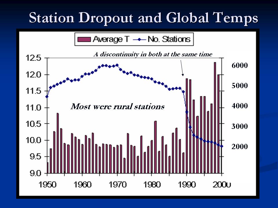